Xvisual
Overview
1. Product Concept
Xvisual is an HMI component application developed by SINSEGYE. It is a SCADA product oriented to configuration editing and human-computer interaction, enabling users and FAE to easily, quickly, and efficiently complete visual customization and automatic page control drawing.
Xvisual provides an easy-to-use development environment and rich functions, allowing configuration engineers to quickly establish, test, and deploy HMI visualization applications suitable for the current industry. It can be widely applied in business scenarios such as petrochemical, metallurgical steel, electric power, photovoltaic, 3C manufacturing, biomedicine, etc., providing customized HMI applications for users.
It is an ideal choice for creating large distributed industrial automation systems, running on servers, embedded computers, and the cloud. It enables real-time information exchange between nodes and interaction with external databases, supporting dozens of common industrial communication protocols, and integrating functions like reports, alarms, trend curves, and various scene controls. It also includes common templates for various industries to meet diverse production monitoring needs.
2. Product Features
| General | |
|---|---|
| Operating System | Windows (Win10 and above), Linux |
| Unlimited point locations, labels, and devices | ✓ |
| Remote configuration and maintenance of the project | ✓ |
| Safety | |
| HTTPS, SSL | ✓ |
| Protection against violent attacks | ✓ |
| CAPTCHA for login | ✓ |
| Connection monitoring | ✓ |
| Password encryption | ✓ |
| User activity records | ✓ |
| Redundancy | |
| Primary and backup servers with automatic data synchronization | ✓ |
| Central and remote servers with automatic data synchronization | ✓ |
| Filing | |
| Maximum number of standalone archives | 31 |
| Cycle-based writing | ✓ |
| Change-based writing | ✓ |
| Connection | |
| Industrial Protocols | OPC UA, Modbus, Simulator |
| Programmability | |
| REST API | ✓ |
| Sample module with source code | ✓ |
| Developer Documentation | ✓ |
3. Component Composition
| Product Components | Description |
|---|---|
| Xvisual-Server | Manages data archiving, performs mathematical calculations, and provides information to client applications. It writes data to the primary archive and creates a backup copy simultaneously. |
| Xvisual-Communicator | Interacts with devices and transfers data to Xvisual-Server. Communication with connected devices is performed in parallel through multiple lines. It receives current data from devices, archives data and events, and sends commands, aiding in troubleshooting communication lines and device issues. |
| Xvisual-Webstation | A web application accessible from any computer or tablet connected to the organizational network without software installation. Access is managed by system administrators who define user permissions. |
| Xvisual-Agent | Transfers configurations between Xvisual instances and the Administrator application, providing log files for display in the Administrator. It runs as a service on the server where the controlled Xvisual instance (including all or part of Server, Communicator, and Webstation) is installed. |
| Xvisual-Administrator | An integrated development environment for editing configuration databases, configuring major Xvisual applications, server modules, and device drivers. |
**1. Xvisual-Server **
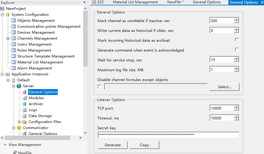
Xvisual-Server manages data archiving, performs mathematical calculations, and provides information to client applications. It writes data to the primary archive and makes a backup copy simultaneously.
As a service, it has no user interface and runs continuously in the background regardless of user login/logout. The graphical shell for configuring Xvisual-Server is built into the Xvisual-Administrator application. Additionally, the Xvisual-Server module allows extending server functions based on customer requirements.
**2. Xvisual-Communicator **
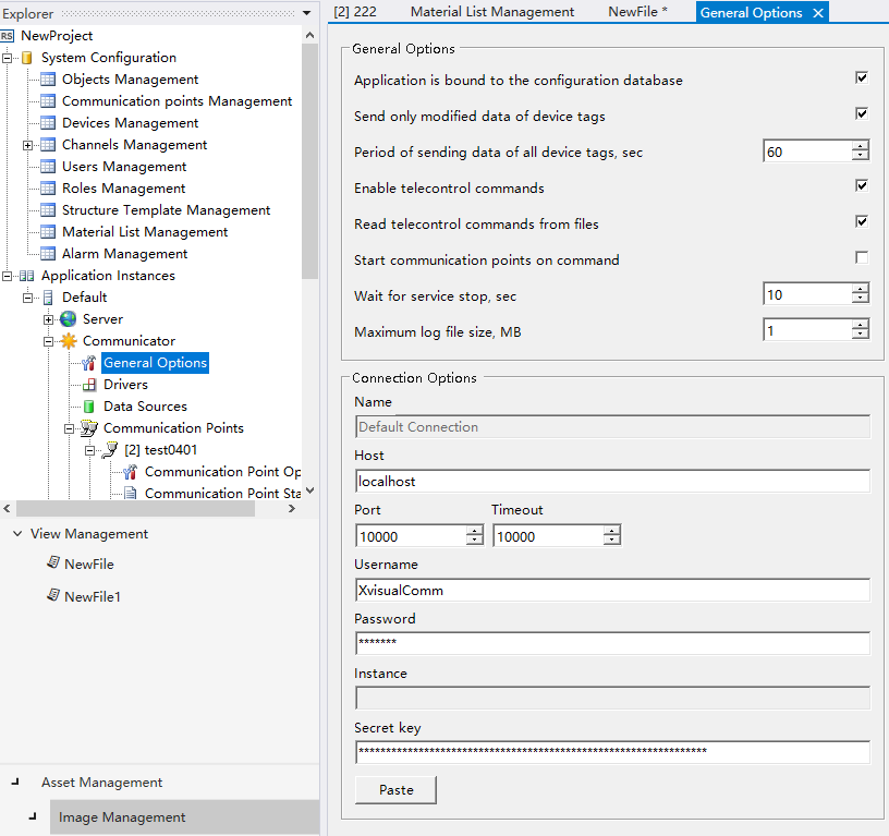
Xvisual-Communicator interacts with controllers and transfers data to Xvisual-Server. Communication with connected systems is performed in parallel through multiple lines, receiving current data, archiving data/events, and sending commands to controllers. This application assists in troubleshooting communication lines and devices.
As a service, it has no user interface, with configuration shells integrated into Xvisual-Administrator. Information about the application, communication lines, and connected devices is logged. Designed for uninterrupted operation, it allows developers to implement custom device drivers for various controllers.
**3. Xvisual-Webstation **
Xvisual-Webstation is a web application that displays information and sends commands via a browser. Below are the Schedule View and Table View of the Webstation application:
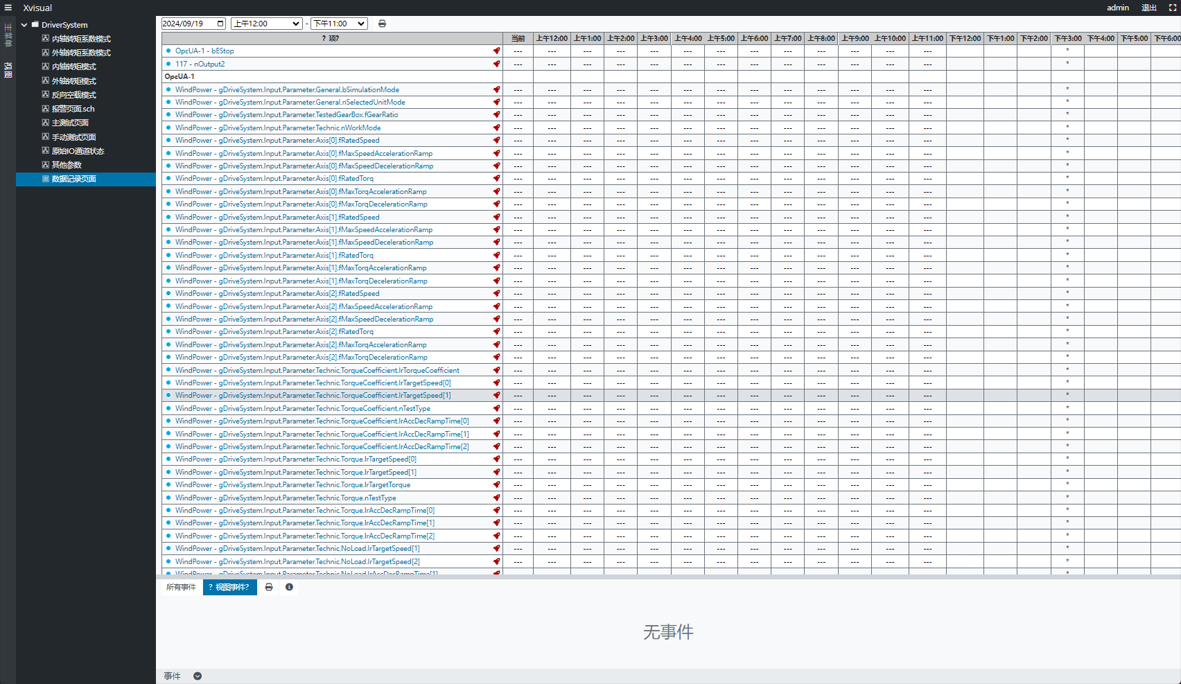
Users can select views (table/schedule) and access archived data by date. To display trends, click item icons in the table or elements in the schedule. Accessible from any network-connected device without installation, access is managed by administrators who define user permissions.
**4. Xvisual-Agent **
Xvisual-Agent transfers configurations between Xvisual instances and the Administrator application, providing log files for display in Administrator. Running as a service on the server where the controlled instance (including Server/Communicator/Webstation) is installed, it communicates with Administrator via TCP protocol (default port 10002). Firewall rules must allow this port for remote access.
It has no user interface; operation is checked via log files.
**5. Xvisual-Administrator **
Xvisual-Administrator is an integrated development environment for developing Xvisual projects and viewing automation system status, enabling configuration of major applications and server modules.
Key tools and features:
- Wizards for creating communication lines, devices, and point locations.
- Point location cloning to minimize manual input.
- Projects contain XML-formatted configuration files for easy cross-computer copying.
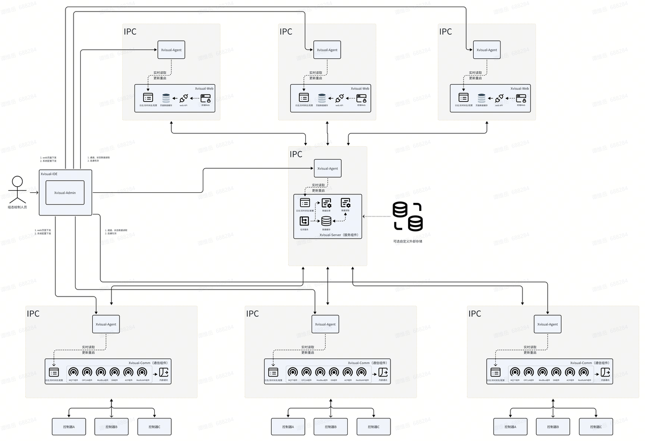
4. Software Architecture
Xvisual features a multi-layer architecture where applications (services) interact via TCP protocol. It supports both standalone and distributed deployment in IPC or client PCs.
-
Standalone Deployment Architecture within IPC:
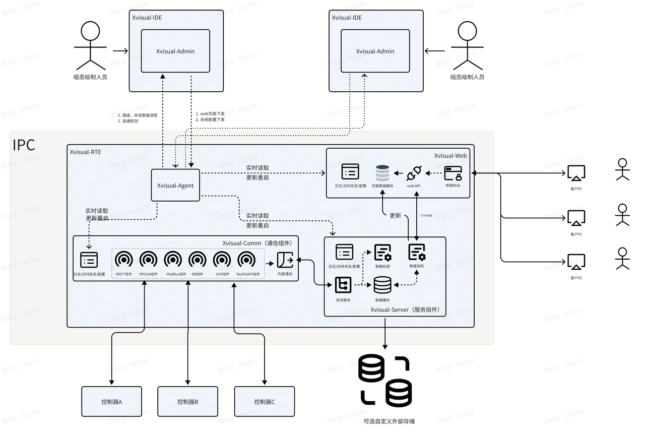
-
Distributed Deployment Architecture Using IPC:
Installation and Uninstallation
1. Installation Requirements
- Server Software Requirements
- Windows:
- OS: Microsoft Windows Server 2016/2019/2022, Windows 10/11
- .NET Runtime 8.0
- Linux:
- OS: Ubuntu (recommended), Alpine, CentOS, Debian, Fedora, OpenSUSE, Red Hat, etc.
- .NET Runtime 8.0
-
Server Hardware Requirements
Hardware configuration depends on the automation system size, with the minimum defined by OS requirements. Xvisual runs on physical or virtual machines. -
Workstation/Tablet Requirements
Latest Chrome, Firefox, Safari, or Edge browsers (IE10 or lower kernels are not supported for Web page viewing).
2. Installation Process
**1. Install IDE on Windows **
1.1 Download and Run the Installer
Download the latest Setup_Xvisual IDE.exe from SINSEGYE's official website, double-click to run, and select "Launch Setup Wizard".


1.2 Administrator Permissions
Confirm permissions if prompted, as the installer may need admin rights to write system files and registry entries.
1.3 Installation Wizard
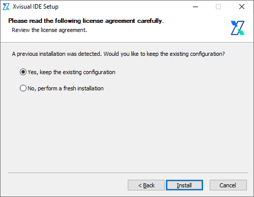
Click "Next", read and accept the User License Agreement, then click "I Accept" to proceed.

1.4 Retain Existing Configuration
If an older version is installed, choose "Yes" to retain configurations or "No" for a fresh install.
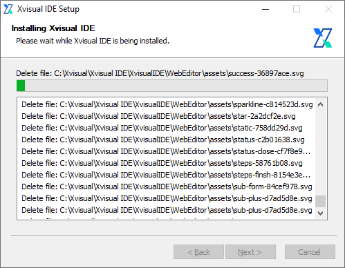
1.5 Install .NET 8 Desktop Runtime
The installer automatically installs/updates .NET 8 Desktop Runtime, a dependency for Xvisual IDE. This step may take time.
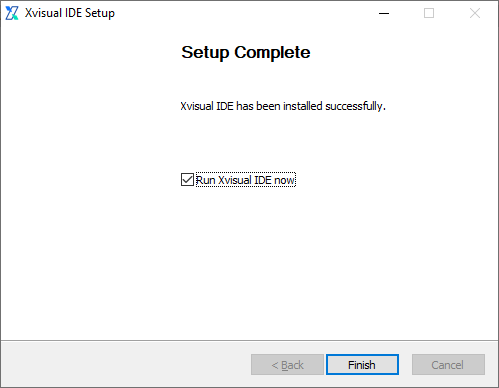
1.6 Installation Completion
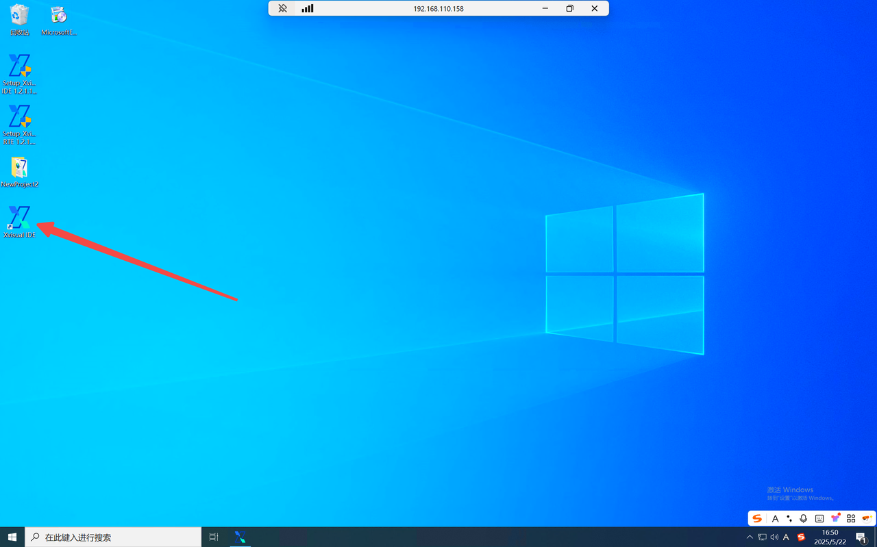
Click "Finish" to launch Xvisual IDE automatically. By default, it installs to C:\Xvisual\Xvisual IDE, with desktop and start menu shortcuts.
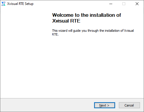
**2. Install RTE on Windows **
2.1 Download and Run the Installer
Download the latest Setup_Xvisual RTE.exe from SINSEGYE's official website, double-click to run, and select "Launch Setup Wizard".
2.2 Administrator Permissions
Confirm permissions if prompted, as the installer may need admin rights to write system files and registry entries.
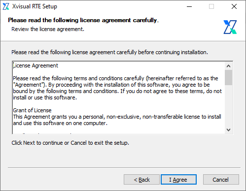
2.3 Installation Wizard
Click "Next", read and accept the User License Agreement, then click "I Accept" to proceed.
2.4 Retain Existing Configuration
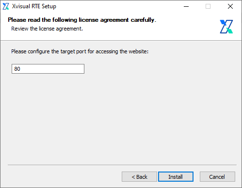
If an older version is installed, choose whether to retain configurations. Select "No" to prompt for website port configuration (if no old interface exists, this step is skipped).
2.5 Install and Configure Dependencies
Xvisual RTE depends on .NET 8 Runtime and ASP.NET Core Hosting. The installer automatically installs/updates the latest dependencies, which may take time.
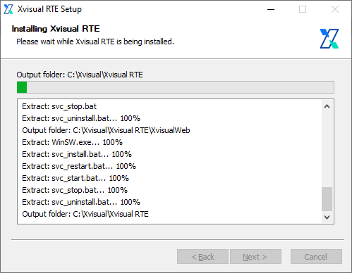
2.6 Installation Completion and Reboot
By default, it installs to C:\Xvisual\Xvisual RTE.
2.7 Access Xvisual
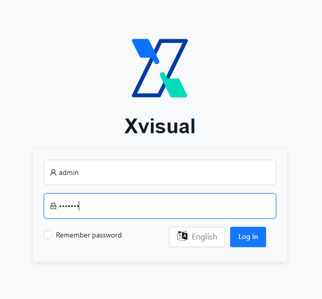
After rebooting, the Xvisual RTE service starts automatically. Access via browser using the server's IP/hostname (default HTTP port 80):
http://<your-server-ip>/The default login uses admin as the username and scada as the password.
The default administrator account is Admin, and the password is Xvisual.
**3. Install RTE on Ubuntu **
3.1 Download and Copy the Installer
Download the latest Xvisual RTE deployment package and install script from SINSEGYE's official website, then copy to any directory on the target server.
3.2 Run the Installation Script
Open a terminal, switch to the installer directory, and execute:
sudo bash ./install.sh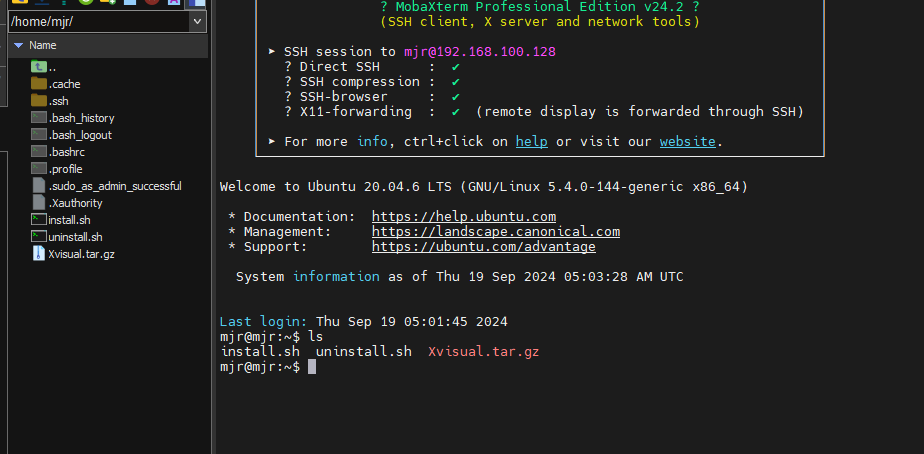
3.3 Administrator Permissions
The script requires root permissions for system file modifications and dependency installation. Enter the root password when prompted.
3.4 Install and Configure Dependencies
The installer automatically downloads/configures .NET 8 Runtime, a core dependency for Xvisual RTE. Installation time depends on system performance.
3.5 Installation Completion and Reboot
By default, it installs to /opt/scada.
3.6 Access Xvisual
After rebooting, access via browser as with Windows:
http://<your-server-ip>/Default login: username admin, password scada.
3. Update Installation
**1. Update IDE on Windows **
1.1 Download the Latest Installer
Get the latest IDE installer from SINSEGYE's website to overwrite the old version.
1.2 Run the New Installer
Double-click to run; the process is the same as initial installation, automatically detecting and updating without uninstalling the old version.
**2. Update RTE on Windows **
2.1 Download the Latest Installer
Get the latest RTE installer from the official website.
2.2 Run the New Installer
Double-click to run, updating automatically like the initial installation.
**3. Update RTE on Ubuntu **
3.1 Download the Latest Package and Script
Get the latest Xvisual RTE package and install.sh script.
3.2 Run the Update Script
Switch to the download directory and execute:
sudo bash ./install.shThe installer updates existing environments/RTE without uninstalling the old version.
4. Uninstallation Process
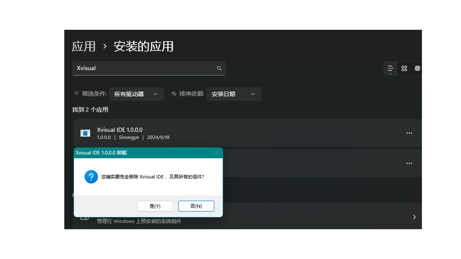
**1. Uninstall IDE on Windows **
Use Windows "Settings" or "Control Panel":
- On Windows 10/11: Go to Settings > Applications > Apps & Features, find Xvisual IDE, and click "Uninstall".
- On older Windows: Use Control Panel > Programs and Features to uninstall.
**2. Uninstall RTE on Windows **
Similar to IDE uninstallation, use Settings/Control Panel to find and uninstall Xvisual RTE.
**3. Uninstall RTE on Ubuntu **
Use the provided uninstall.sh script:
sudo bash ./uninstall.shThis deletes /opt/scada, related services, and configuration files. Back up project/database files if needed. To remove .NET 8 Runtime (if used only for Xvisual RTE):
sudo apt remove dotnetQuick Operation Guide
1. Preliminary Preparation
-
System and Permission Check
- Ensure the operating system meets requirements (Windows Server 2016/2019/2022, Windows 10/11, or Linux-Ubuntu).
- .NET 8 Runtime is installed (IDE/RTE dependency).
-
Download Software Packages
- Go to SINSEGYE's OnlineHelp official website: 中科时代Onlinehelp to download the latest Xvisual IDE and RTE installation packages.
2. Creating and Configuring Projects
-
Launch the Xvisual-Administrator application and click New Project on the start page.
-
Enter the project name, select the storage location, and choose a template (optional).
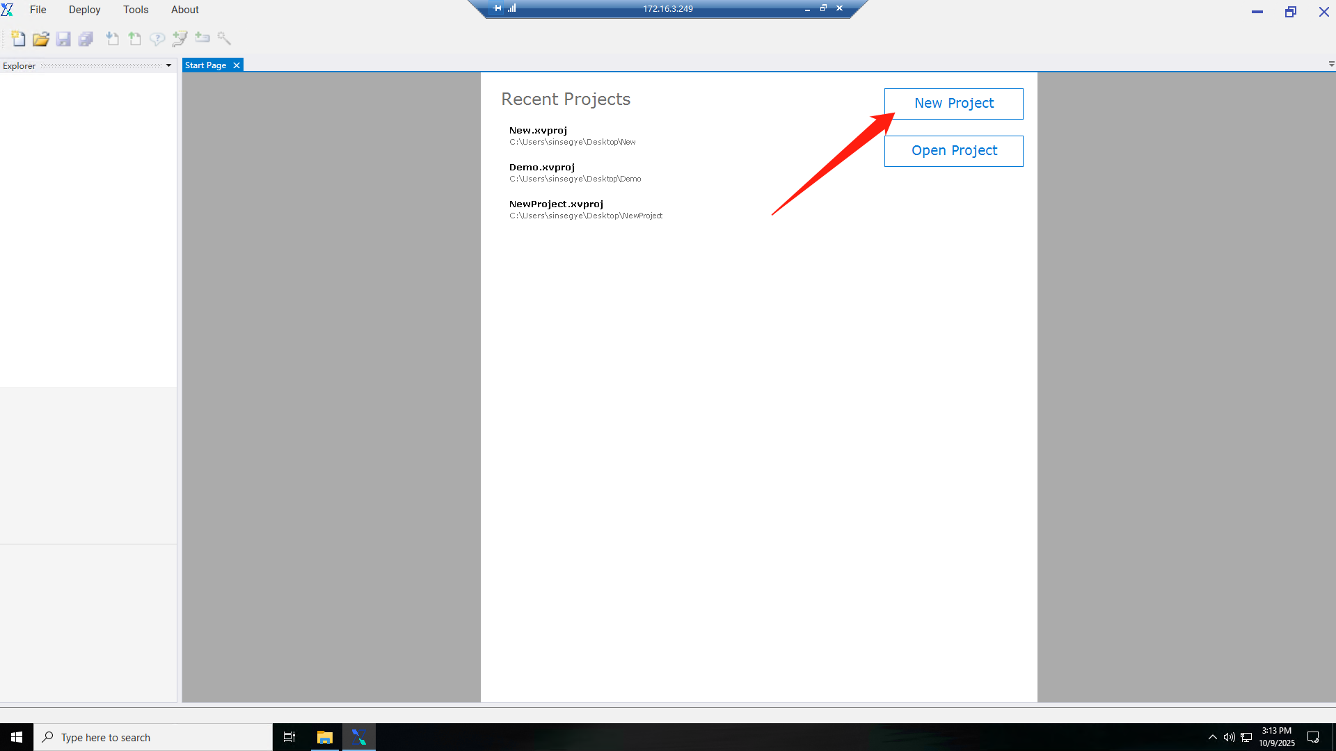
-
The project is created and displayed in the Project Explorer.
3. Core Configuration Process
**1. Create a Communication Node **
1.

**2. Create a Device **
1.
3. Create a Point Location (Tag)
1.
2.
3.
4.
5.
6.
7.
8.
9.

10.
11.
4. Creating a View
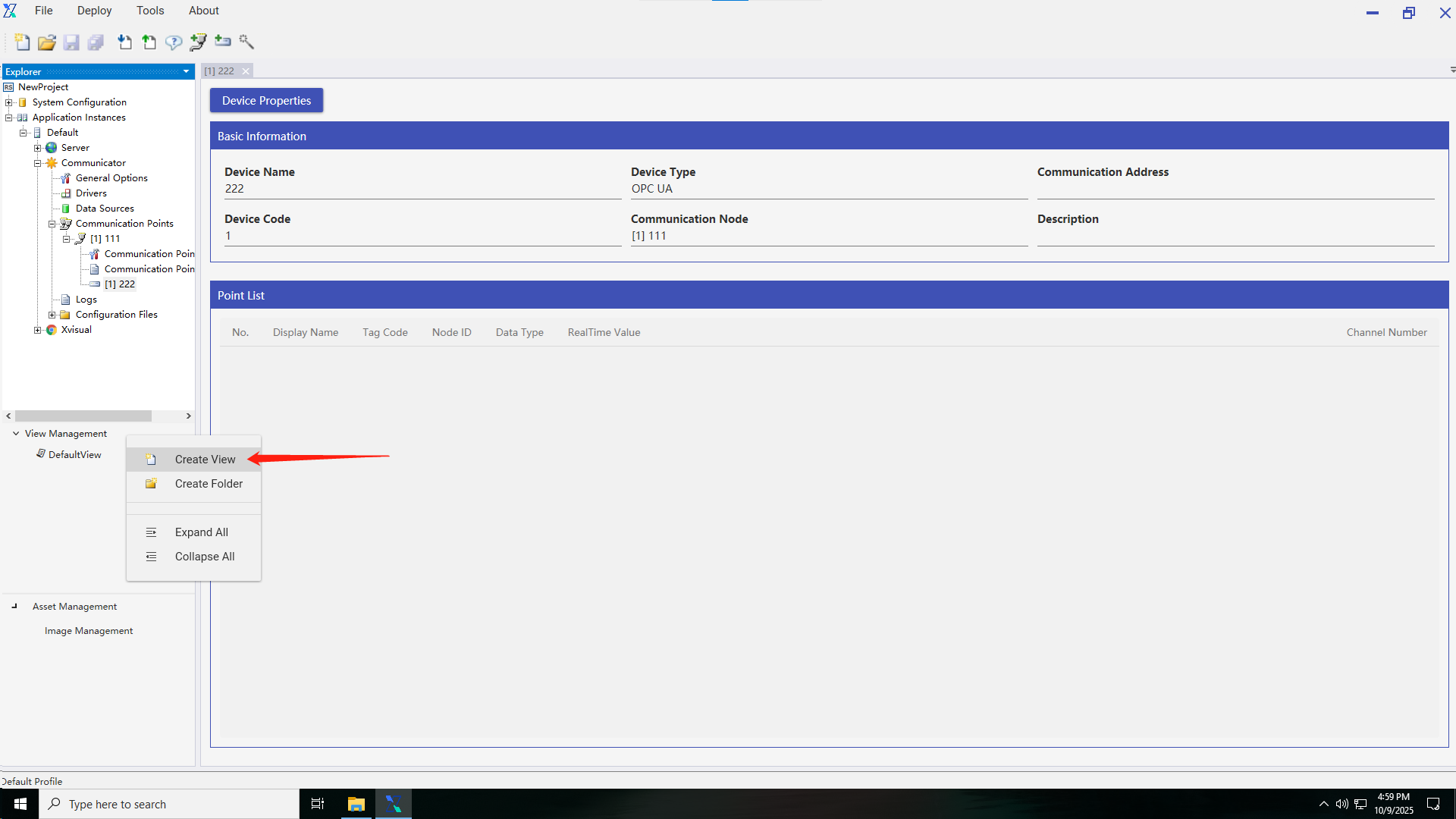
- Right-click
3.
5. Read-Write Channel Binding
- Bind channels to interact with PLC point locations:

3.
4.
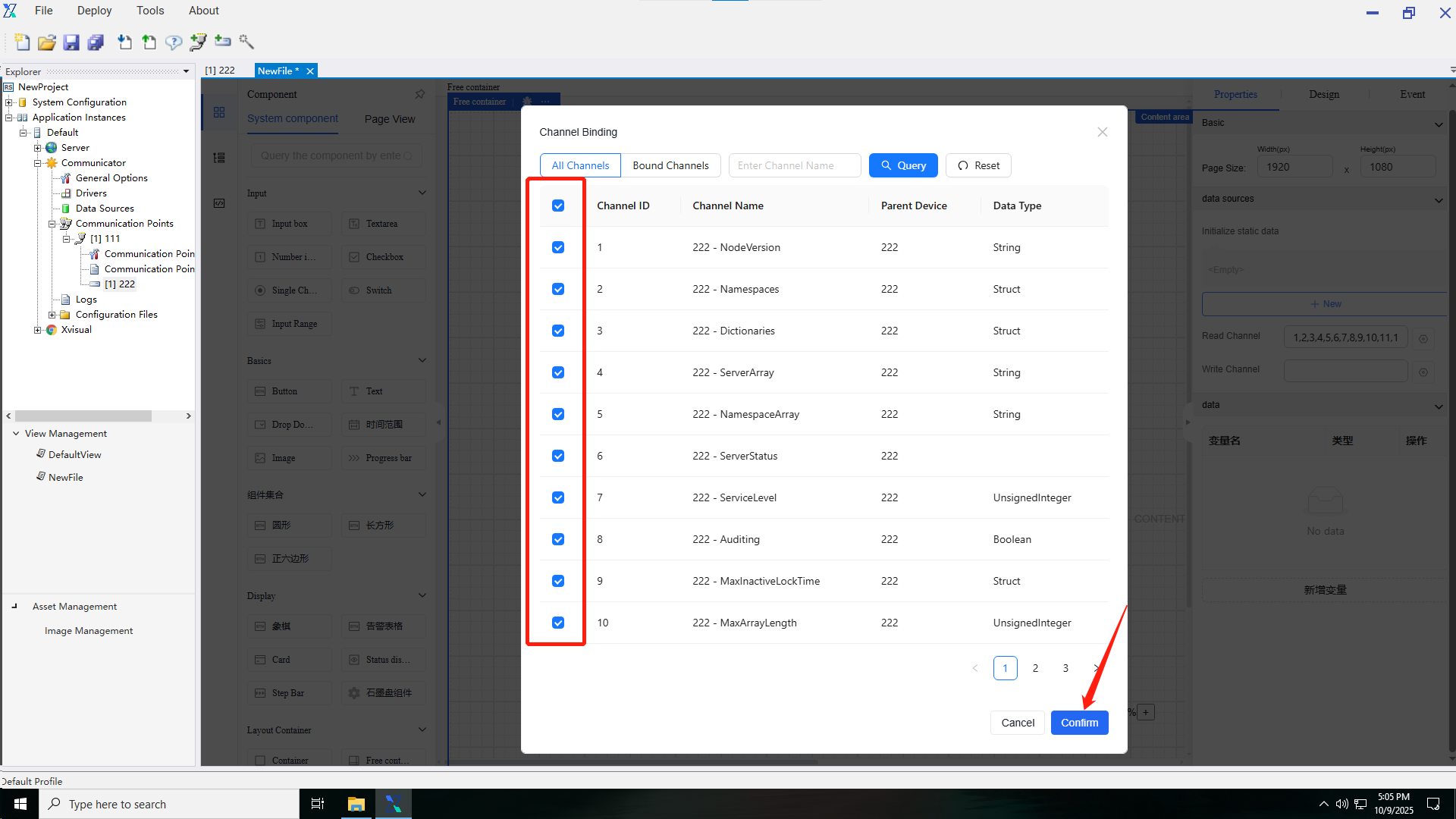
5.
6.
7.
8.

9.
10.Enter the publishing device's IP:port (e.g., 172.16.3.249:80).

11.

12.
6. Data Display and Conversion
- Convert data read from PLCs to other formats:
3.
4.
5.
6.Enter the publishing device's IP:port (e.g., 192.168.110.158:80).

7.
8.
7. Data Interception
Intercept data from PLCs (e.g., retain two decimal places):
1.

2.
3.
4.
5.
6.
7.Enter the publishing device's IP:port (e.g., 192.168.110.158:80).

8.
9.
8. Setting Events
Configure events (e.g., background color change based on data):
2.
3.
4.
5.
6.
7.
8.
9.
10.
11.
12.
13.Enter the publishing device's IP:port (e.g., 192.168.110.158:80).
14.
15.
Function Introduction
1. Project Basics
**1.1 Project Creation **
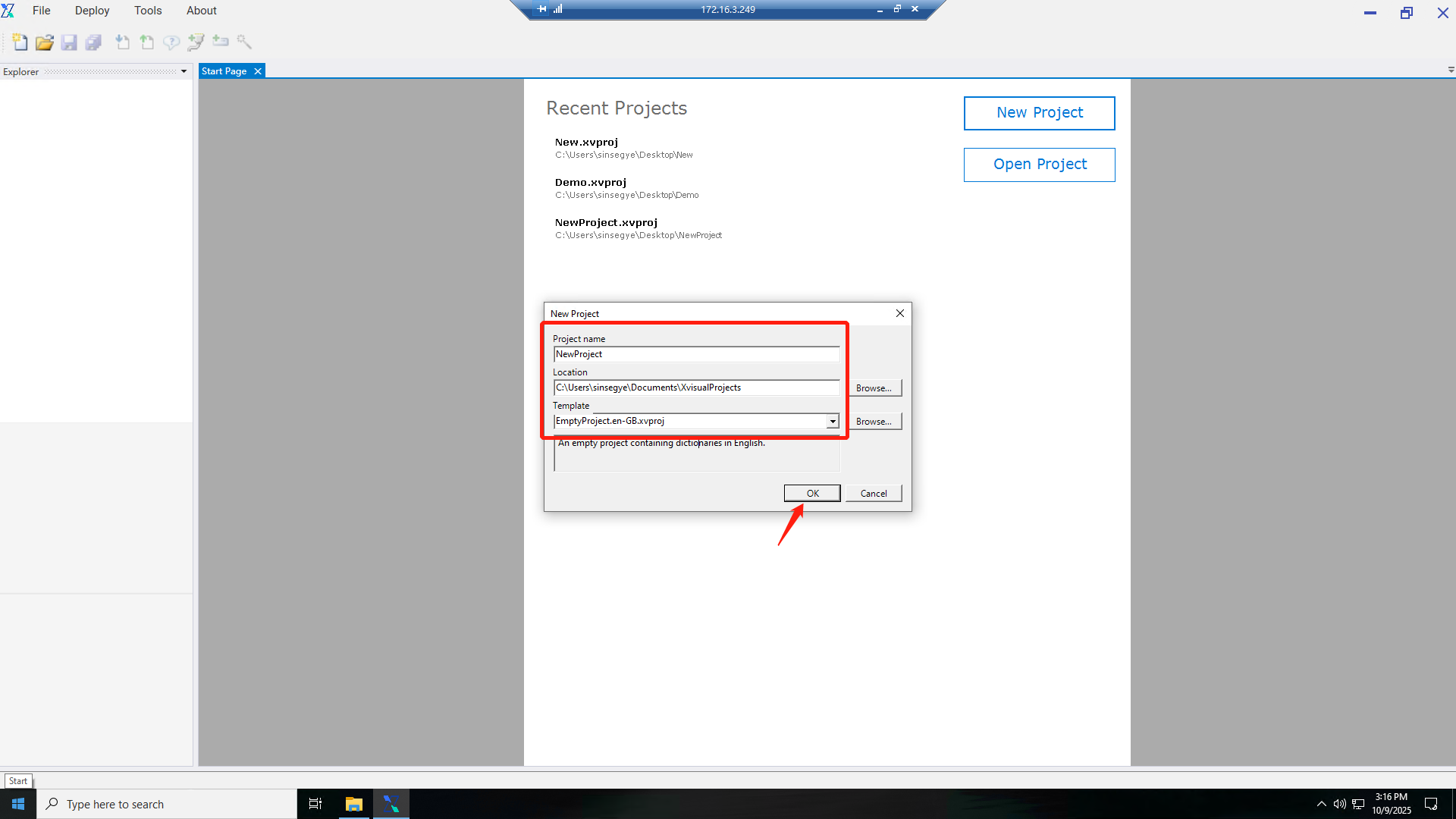
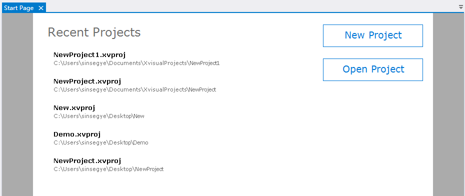
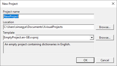
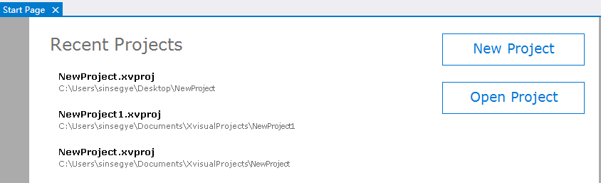
Xvisual configurations are project-based. A project is a set of files in various formats stored in the project directory. To create or edit a project, use the Administrator application. When Administrator starts, the Start Page displays buttons to create a new project or open an existing one.
In the new project pop-up window, enter the project name, select the creation location, and choose a template (an existing project can be used as a template to define initial configurations for the new project).

**1.2 Project Structure **
The project structure is displayed in the Project Explorer on the left side of the main Administrator window, including:
- System Configuration: Manages users, roles, communication nodes, devices, and point locations.
- Application Instance: Manages actually connected device instances.
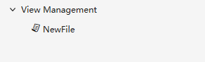
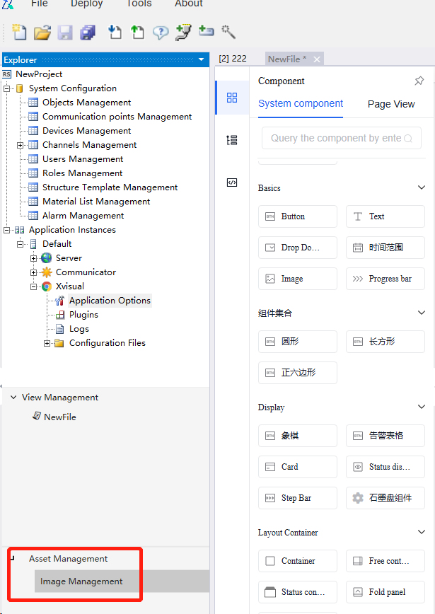
- View Management: Manages all component views.
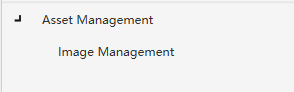
- Resource Management: Includes image management.
**1.3 General Project Configuration Sequence **
When starting with Xvisual, follow the recommended sequence below. Adjust the order for efficiency after understanding application dependencies.
1.3.1 Creating a Project
Create a new project or open an existing one in the Administrator application.
1.3.2 Creating a Communication Node
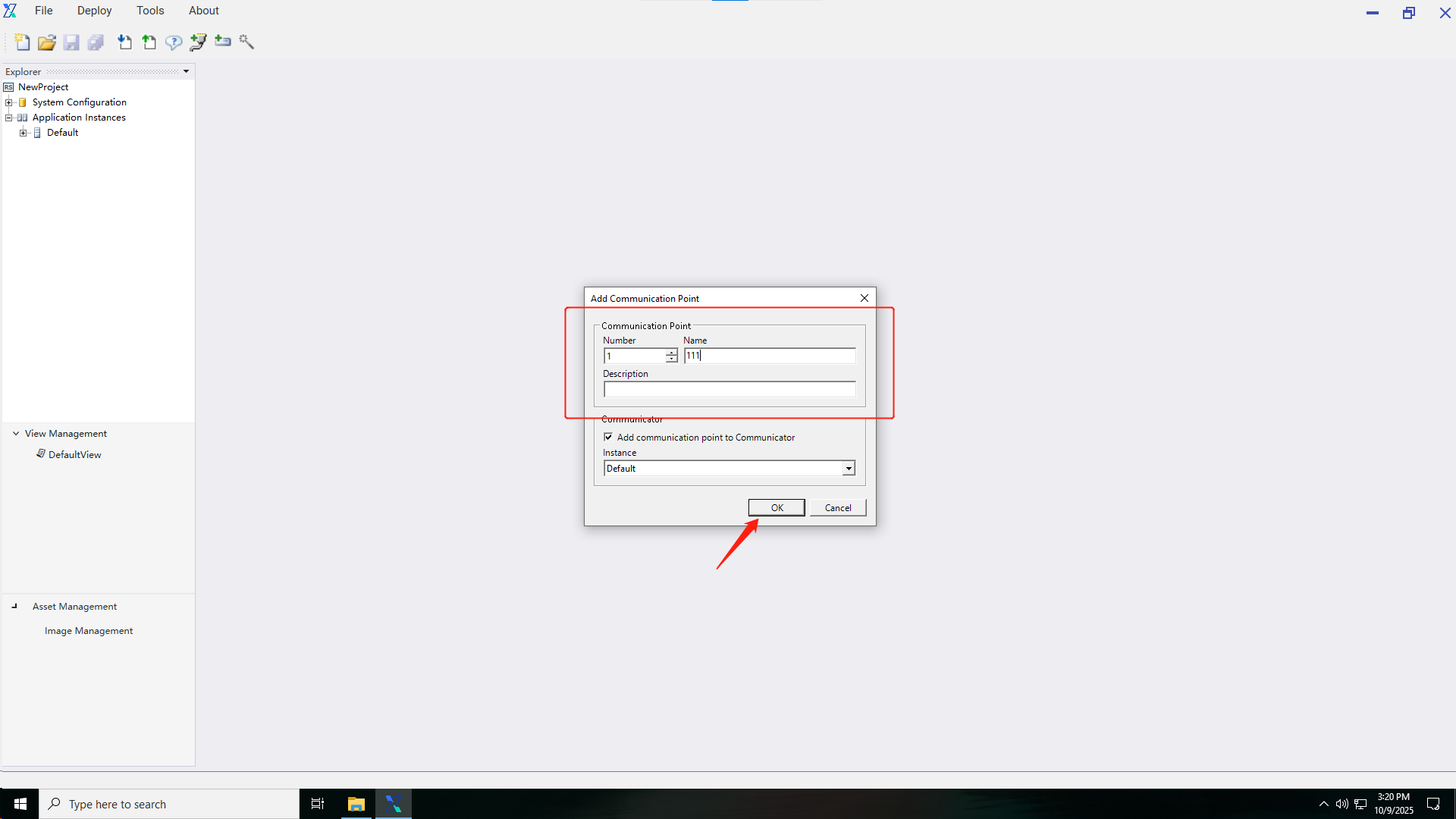
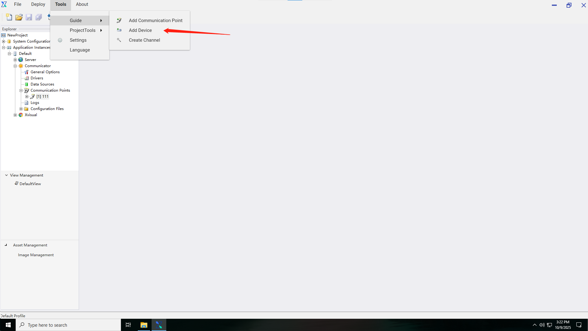
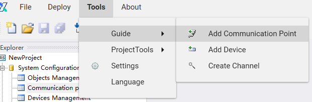
After creating/reopening a project, add a communication node via the toolbar or wizard:
-
Toolbar Method: Click the communication node icon.
-
Wizard Method: Use the configuration wizard.
-
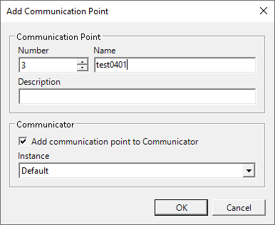
Settings Interface: Configure the node name, protocol, and connection parameters.
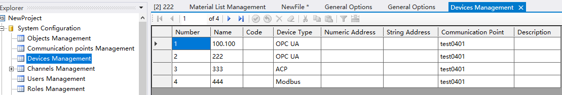
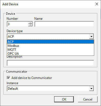
1.3.3 Creating a Device
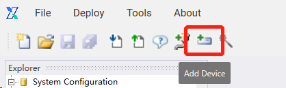
After establishing the communication node, add a device via the toolbar or wizard:
1.Use the toolbar to add a device.
2.Use the wizard to add a device.
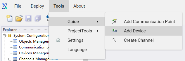
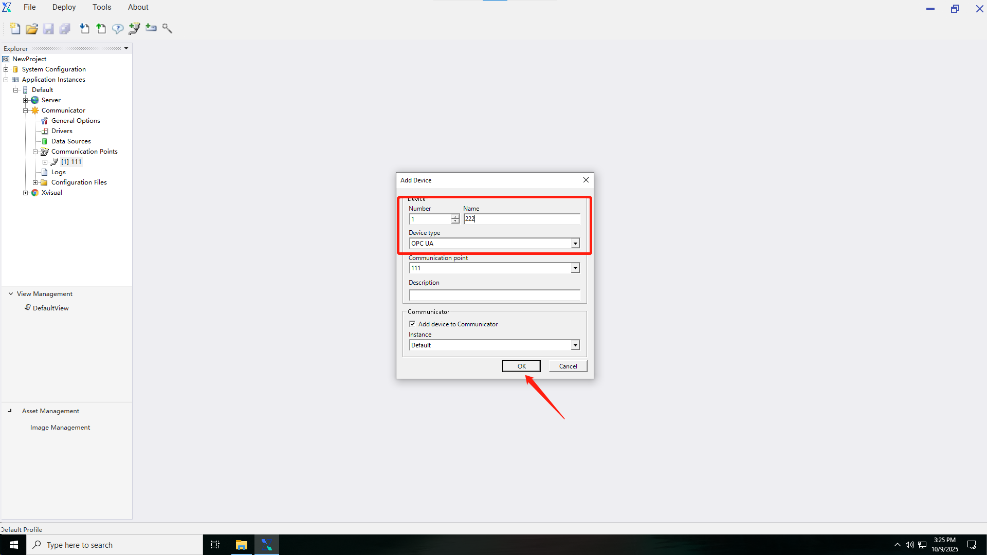
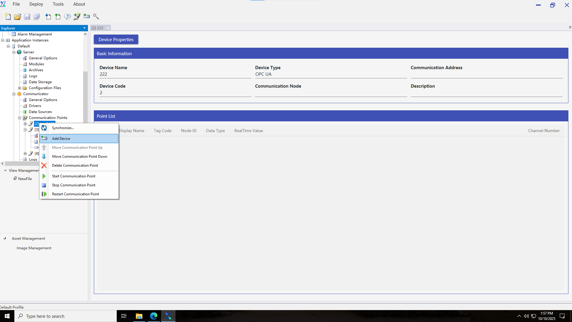
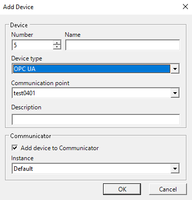
3.Add a device setting interface to set the device name and select the device type and the communication node.
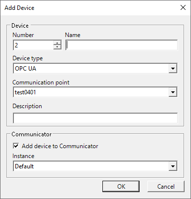
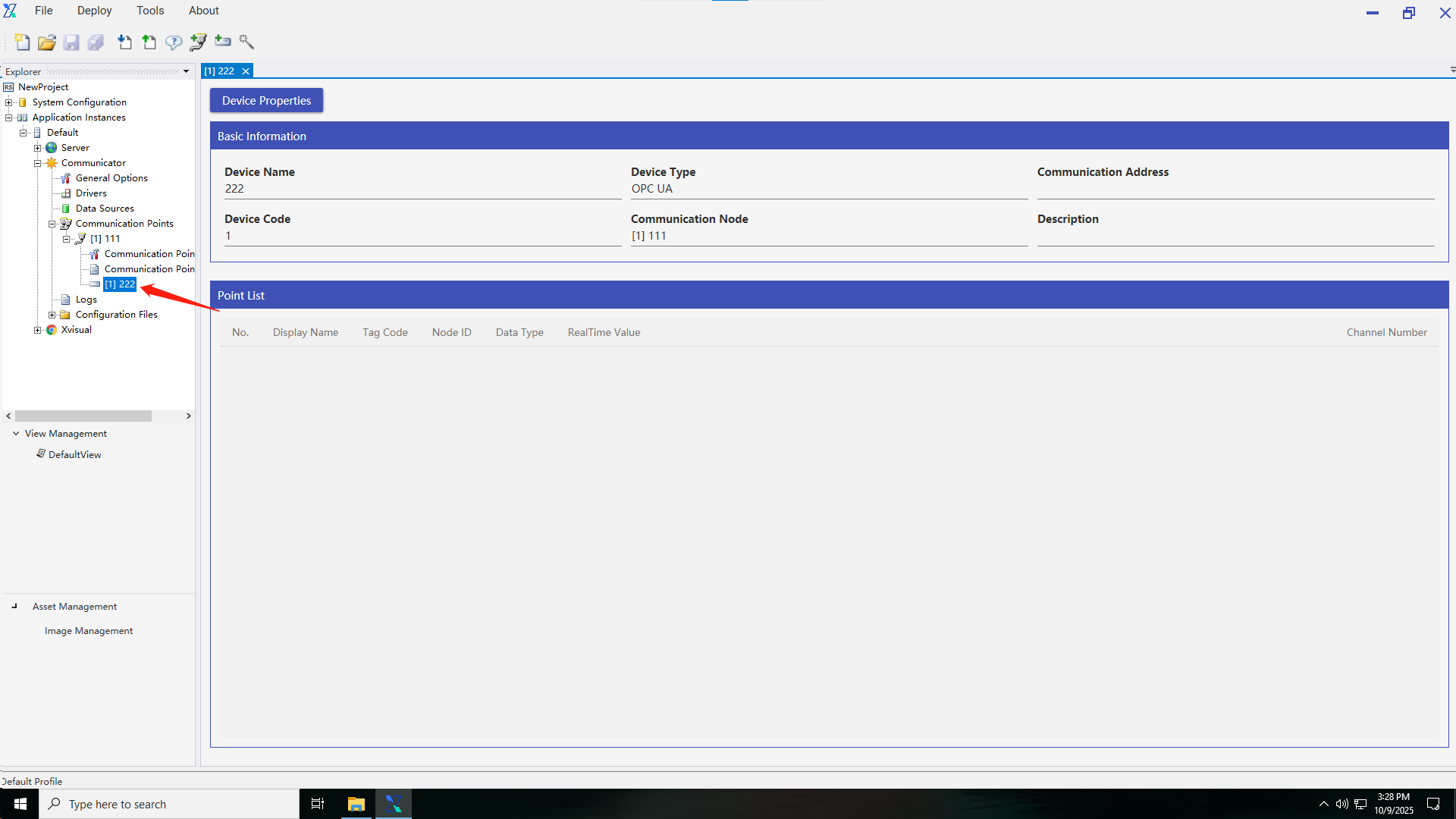
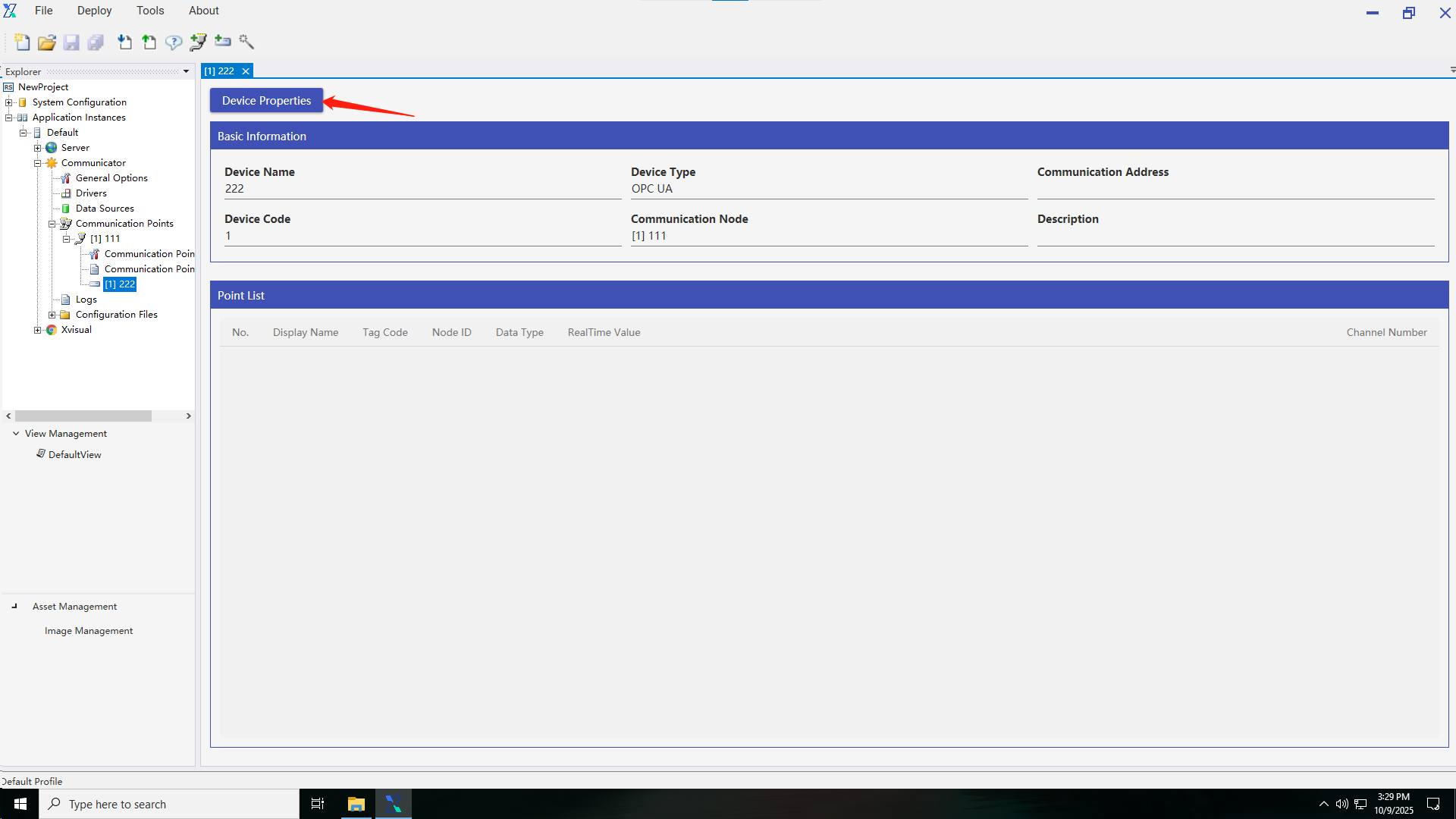
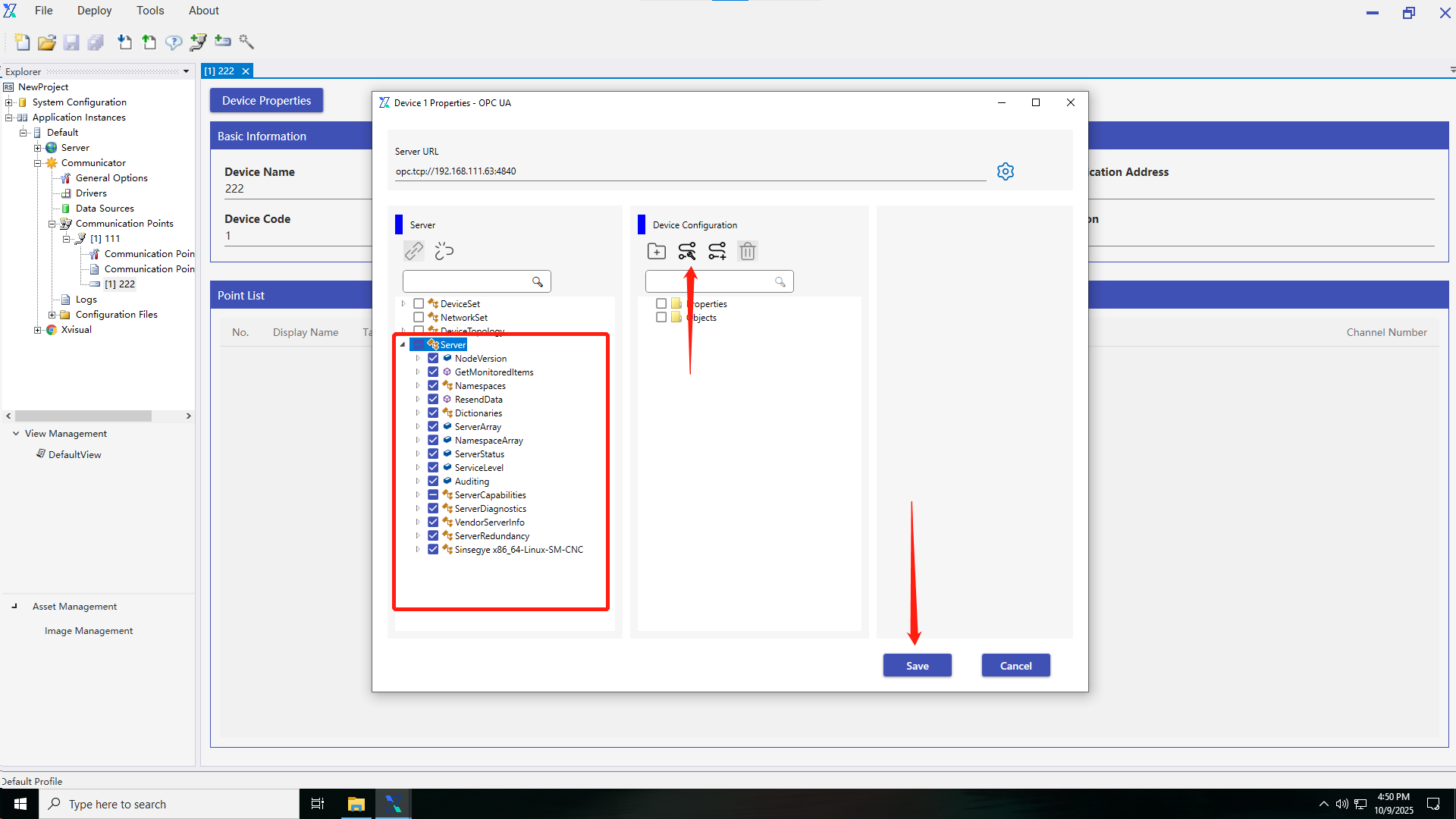
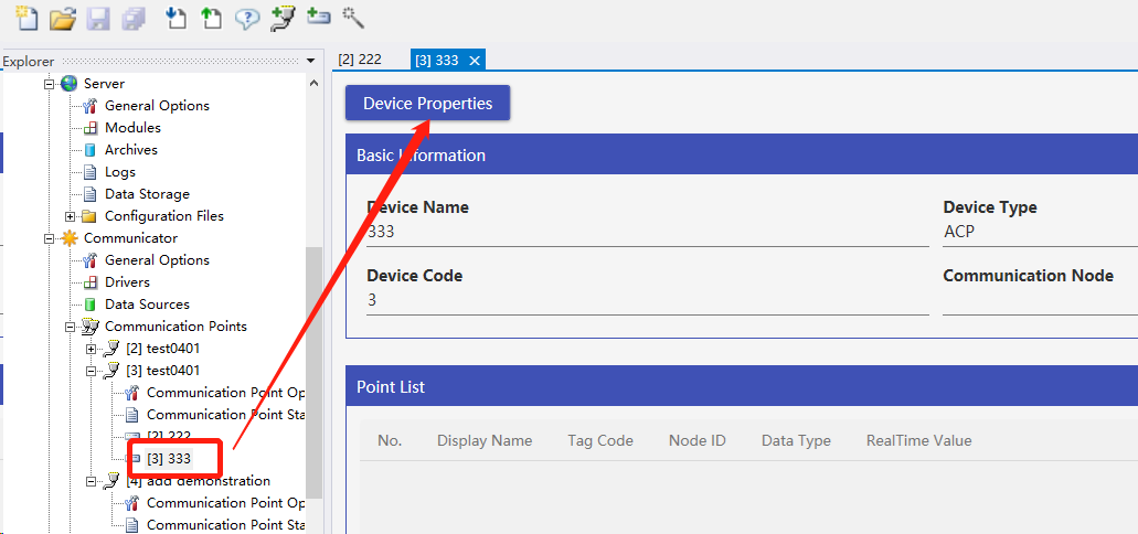
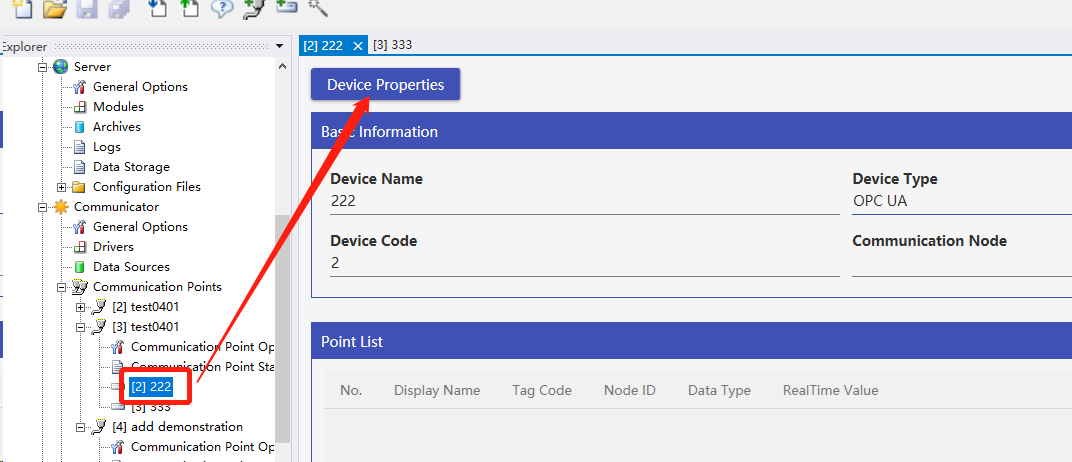
- The device property description interface displays the device status and some recent data; Click the "Device Properties" button to enter the detailed settings interface.

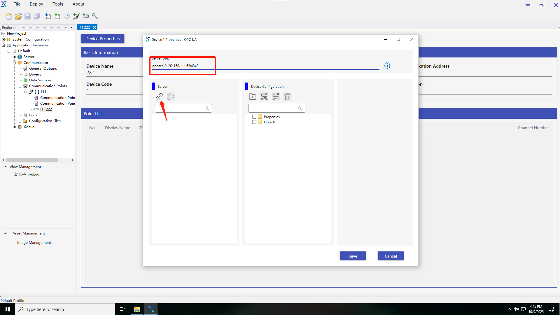
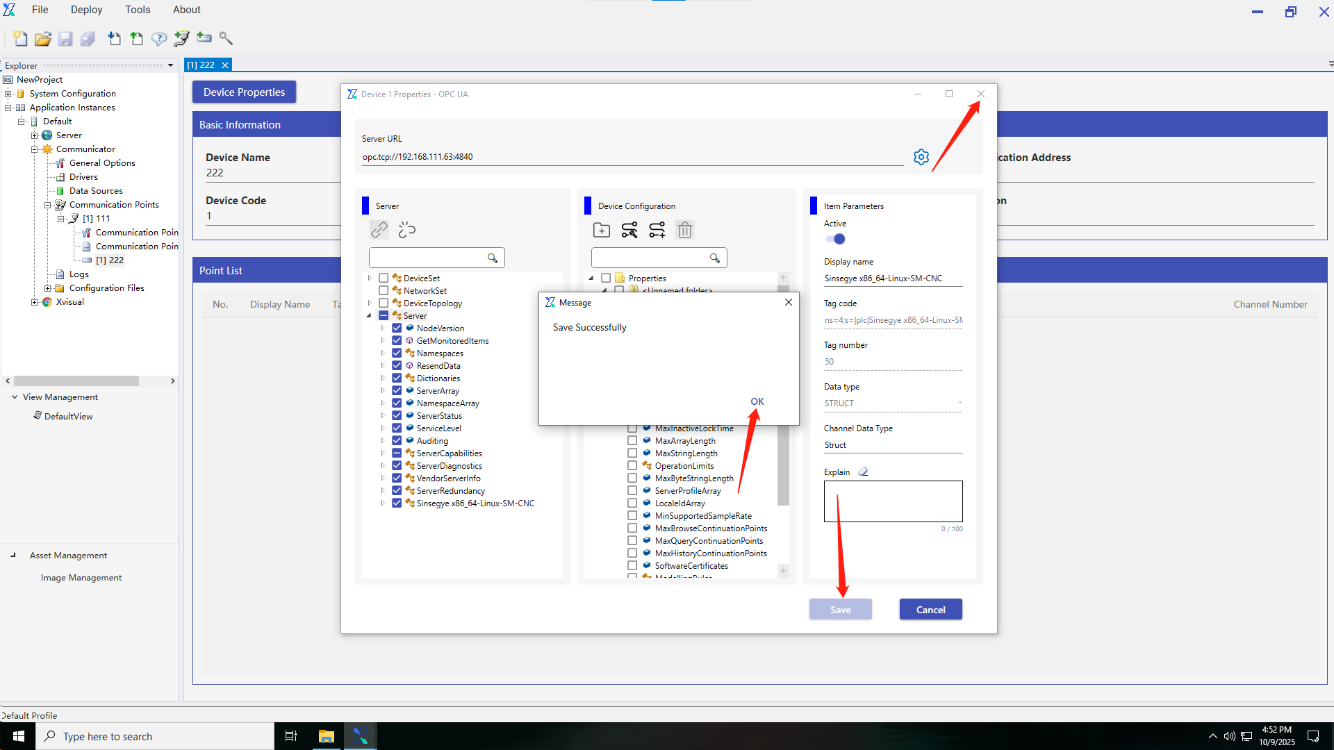
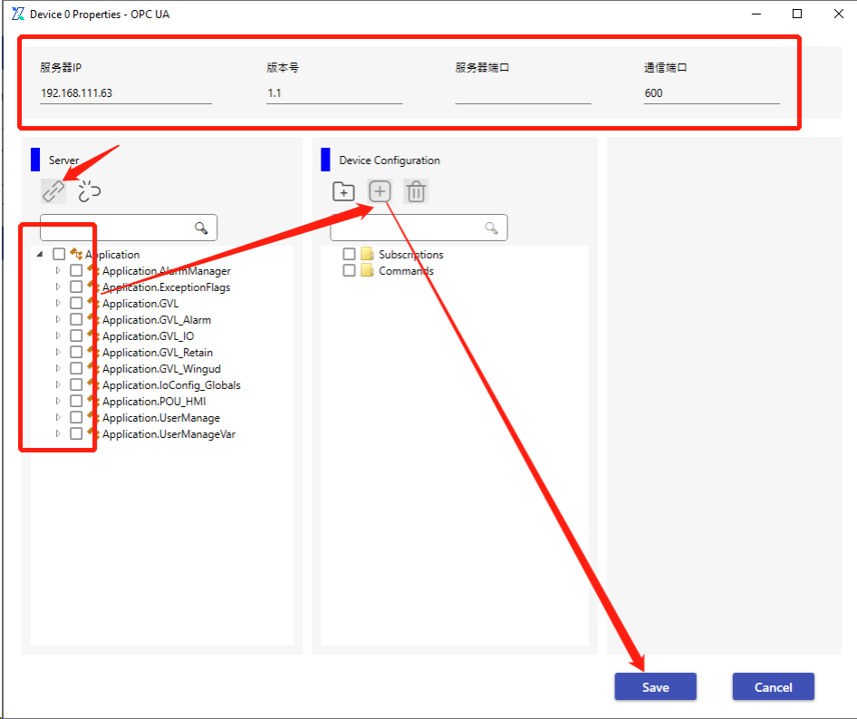
5.Add an OPC address, add a corresponding URL in the server URL, and then click the “Connect” button. If the connection succeeds, the devices that can transmit data will be displayed. Select the desired device, click “Add”, then click “Save”; If the connection fails, you should check the server URL for problems.
1.3.4 Creating a point location
After establishing the device, you can use the toolbar or wizard to add a point location.
1.Use the toolbar to add a point location.
2.Use the wizard to add a point location.
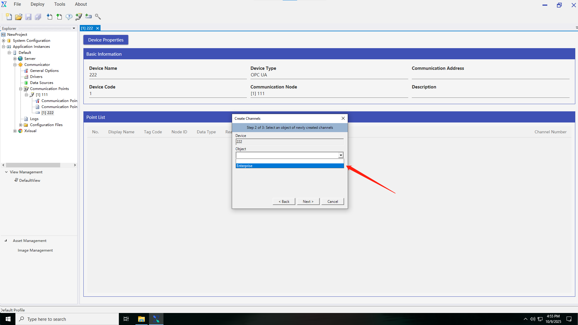
3.After adding the point location, a pop-up window for creating a point location will appear. Step 1 is set to select a device. You need to select the communication node and device where the new point location is located.

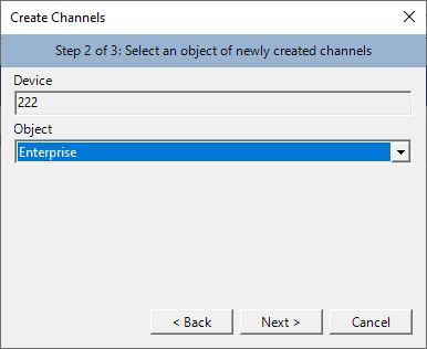
4.Step 2 of creating a point location is to select the object of the newly created point location, where the device is the one checked in Step 1. All objects can be viewed in the instance management.
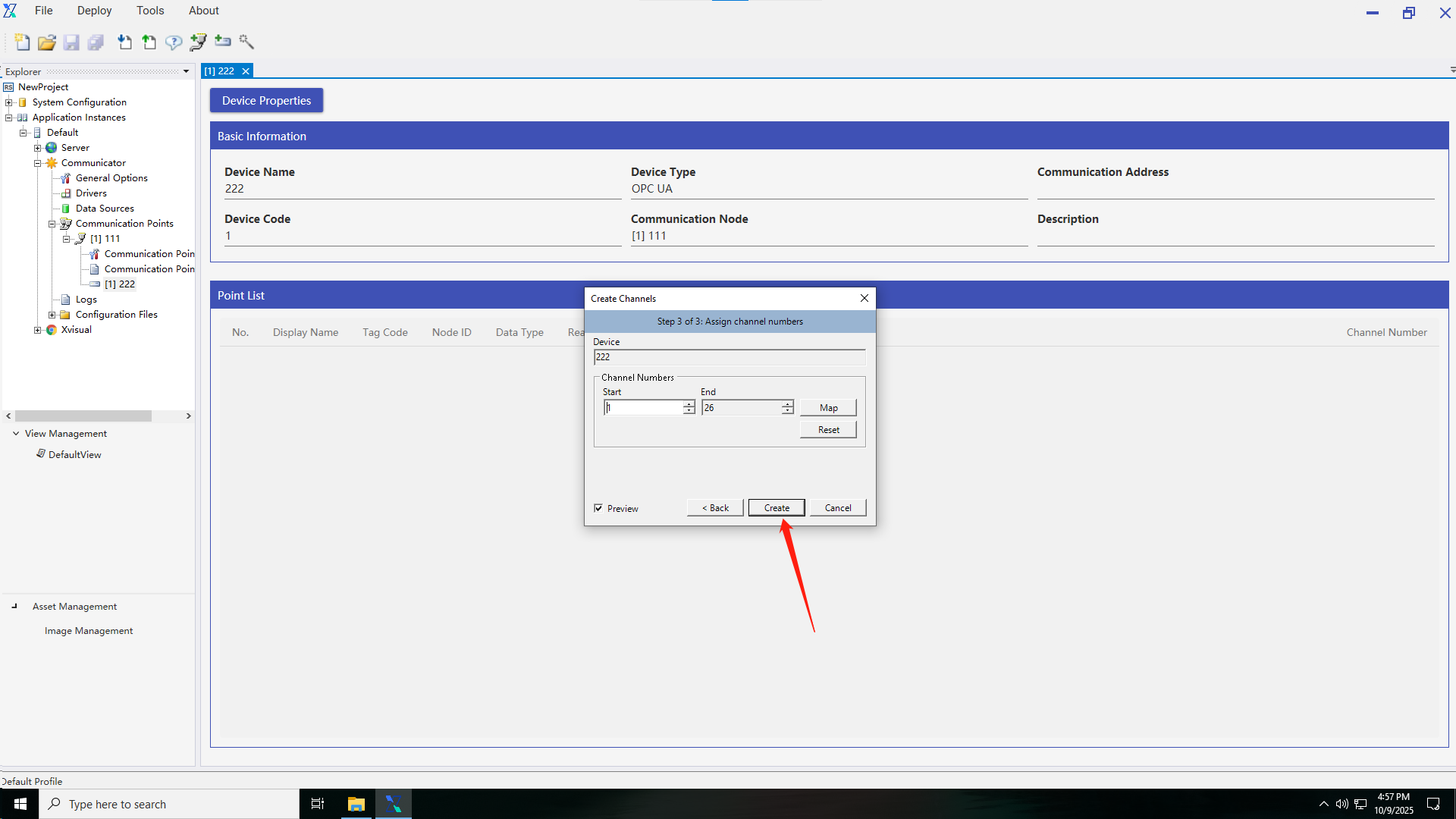
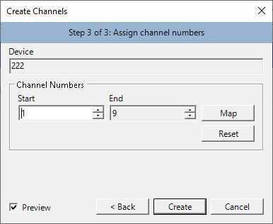
5.Step 3 of creating a point location is to assign a point location number, where the device is the one checked in Step 1, and the point location is the point location information that can be transmitted on the device.
1.3.5 Creating a view
After the communication node, the device and the point location are created, a view folder and a view can be created to obtain richer data information; You can also create and edit the view directly after the project is created.
1.3.6 Publishing configuration
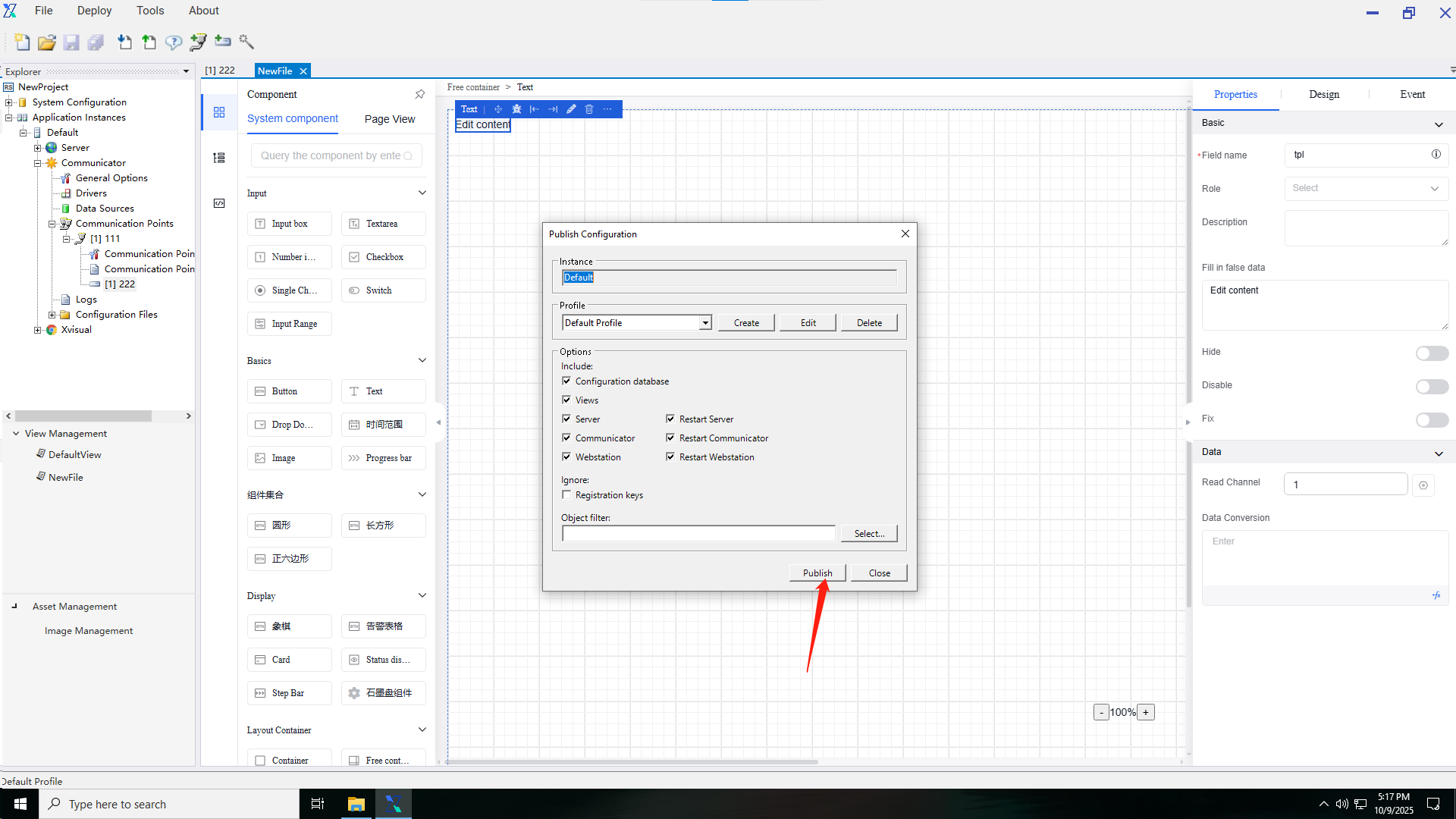
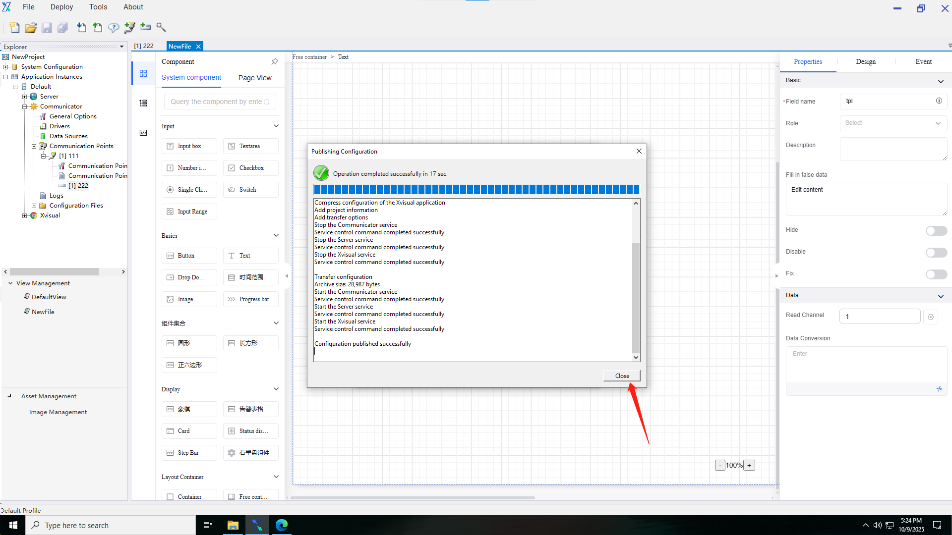
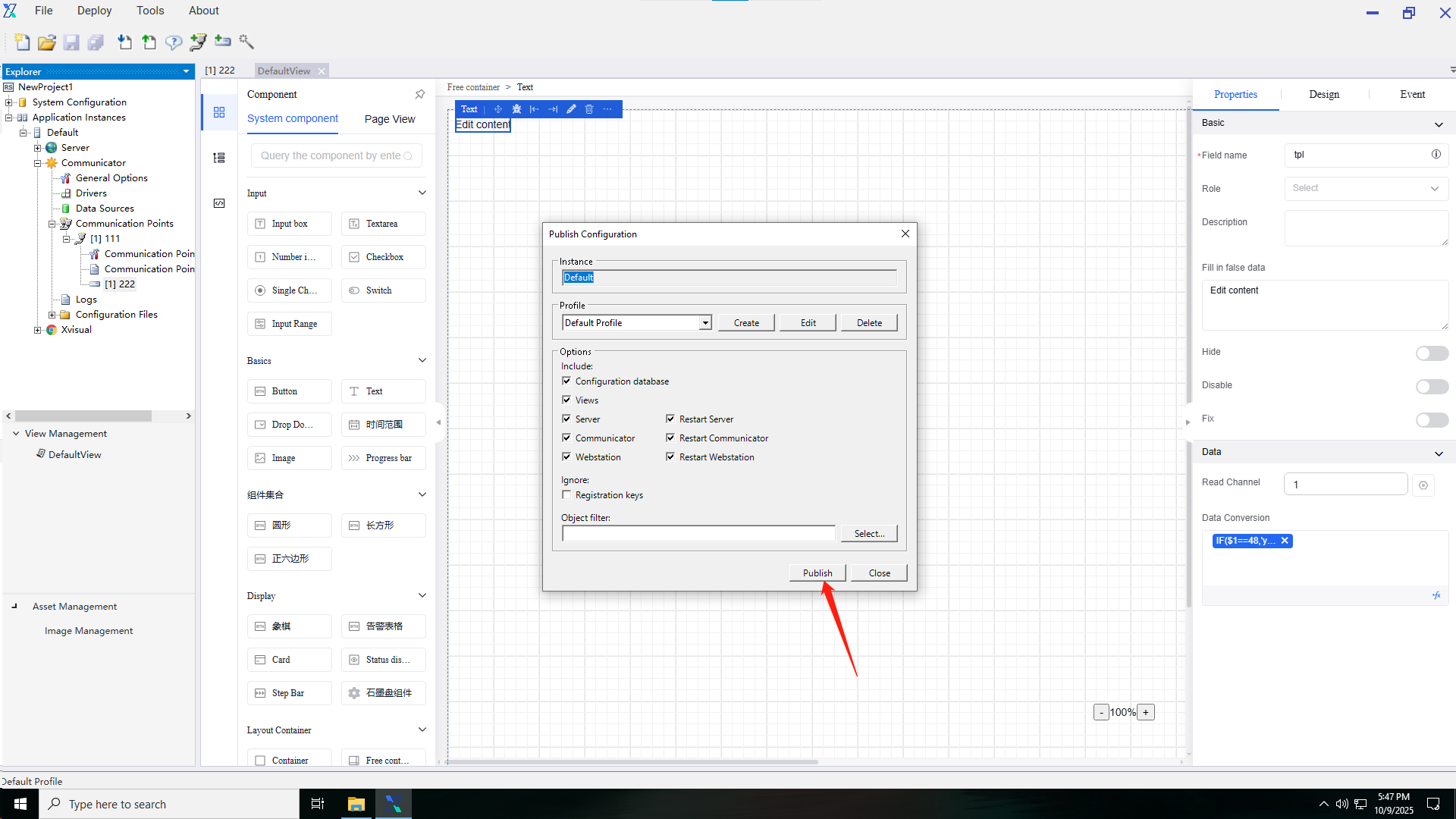
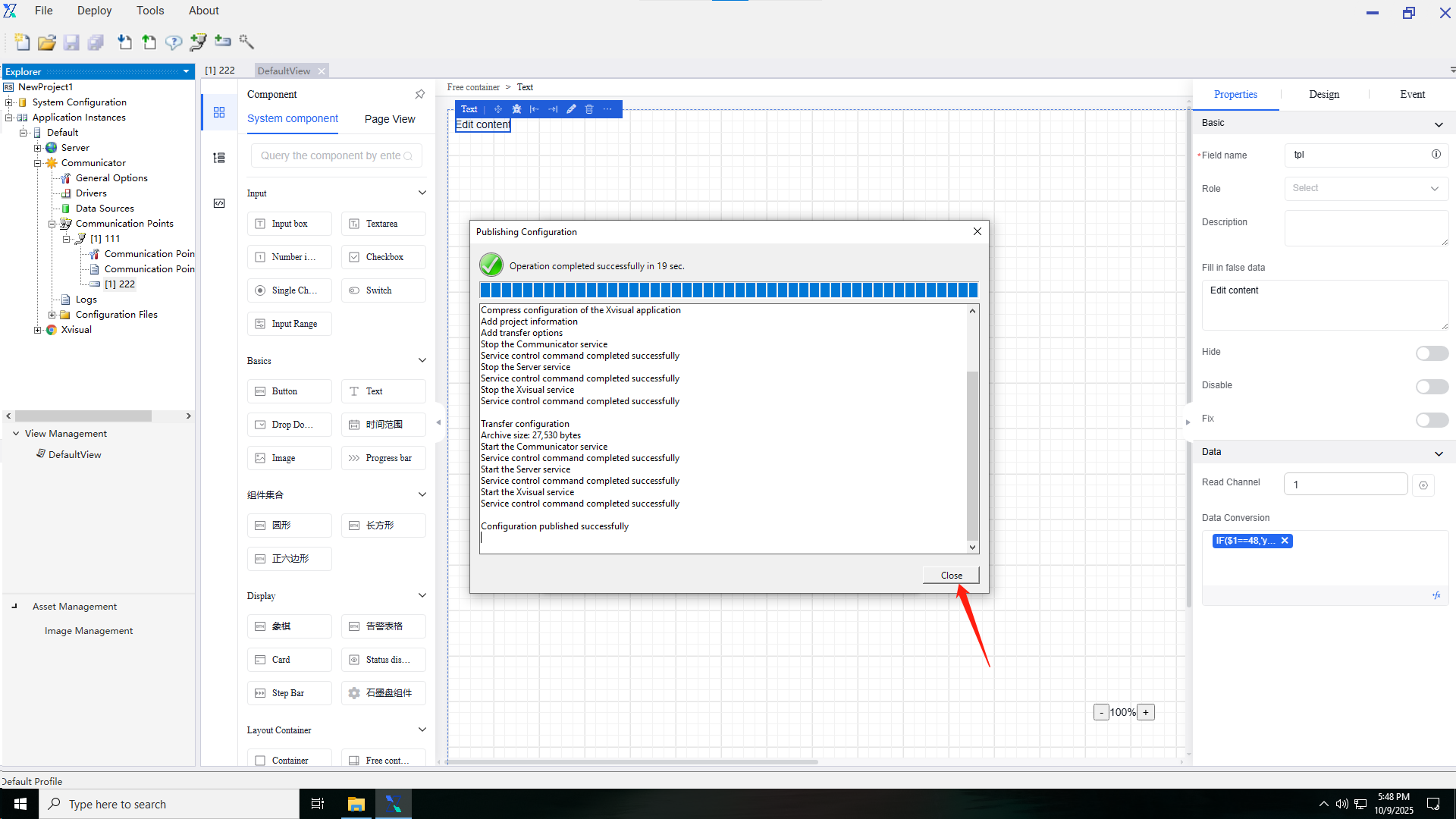
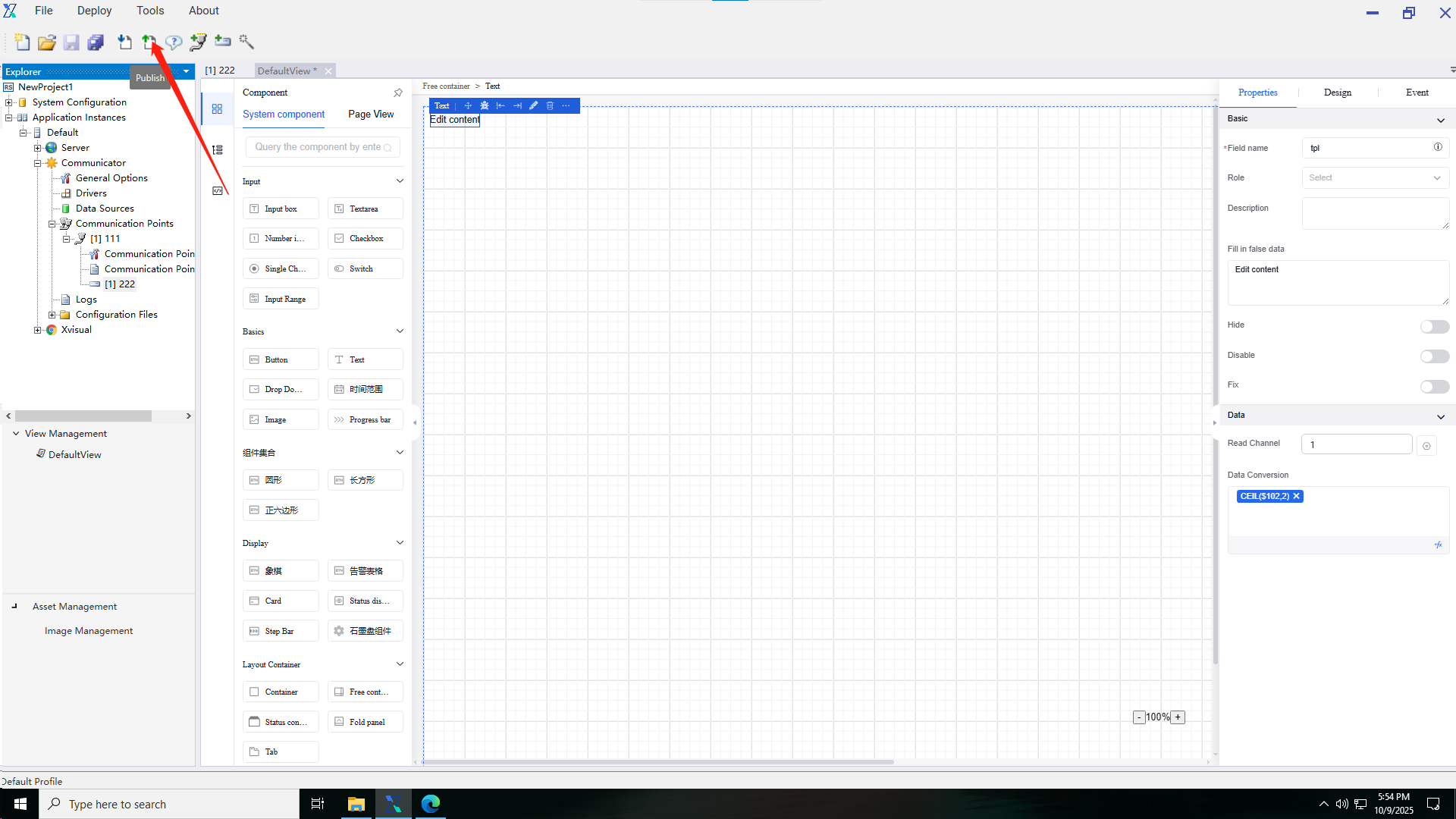
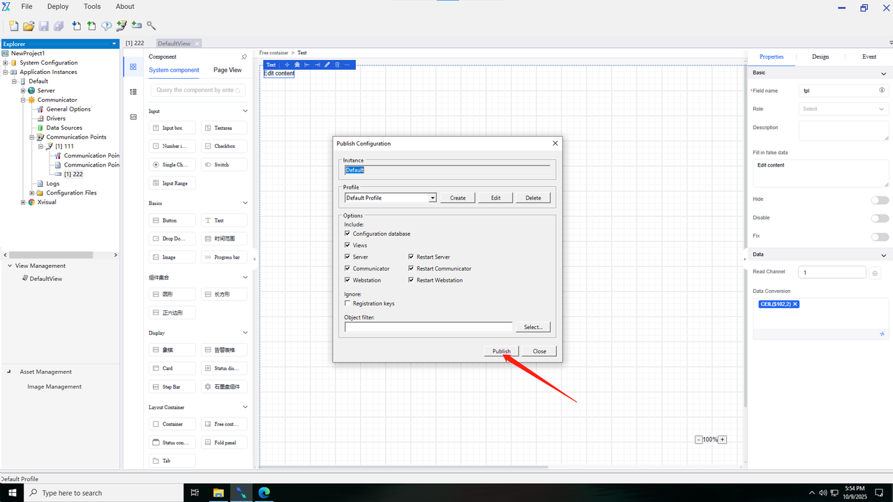
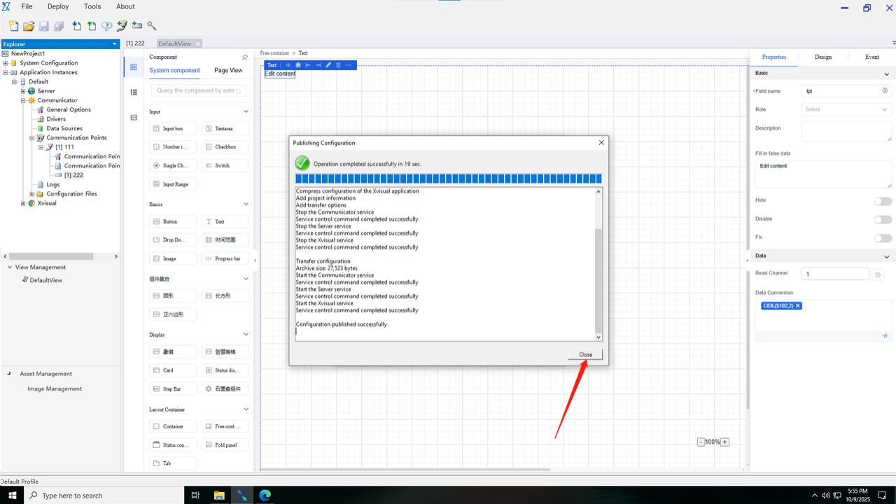
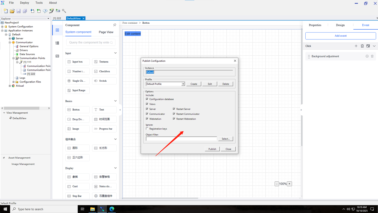
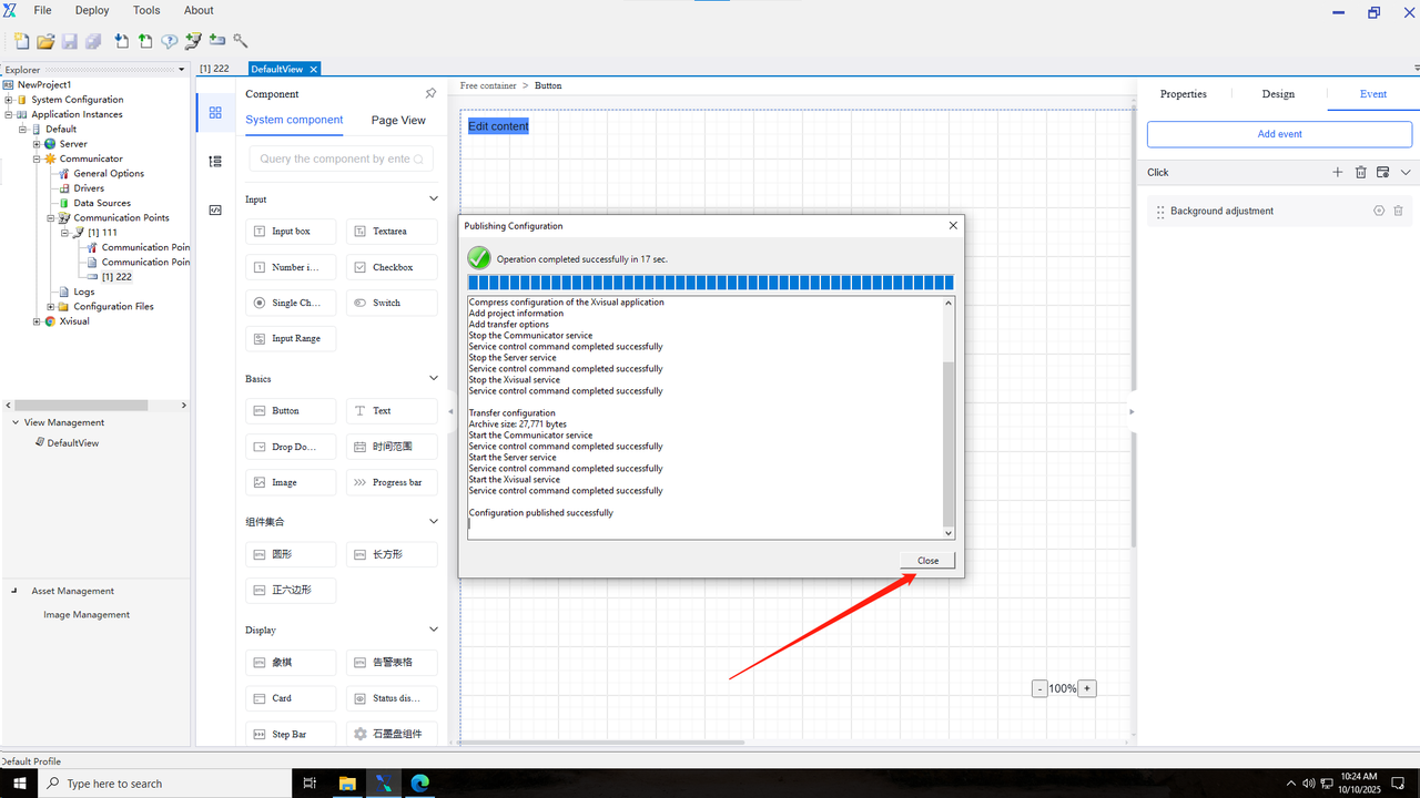
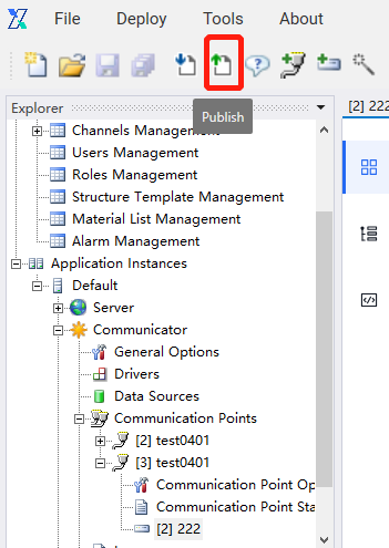
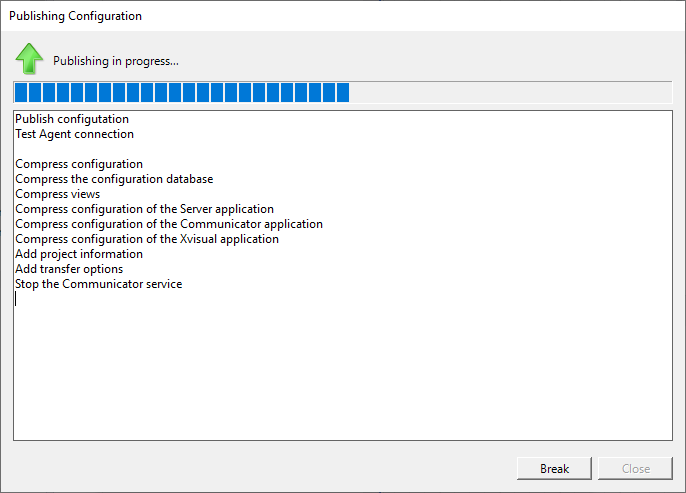
1.After completing the above configuration, you can select the “Publish” button in the bar to publish the configured project.
2.In the “Publish Configuration” interface, you can set the instance name and related options.
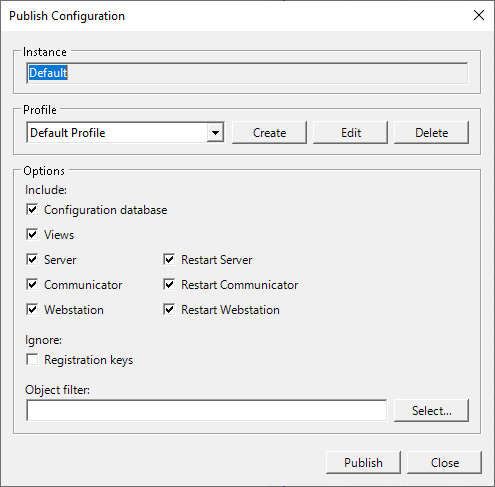
Explanation:
An instance is a set of Xvisual applications which are installed on the same computer and run the same project.
A single project can contain multiple instances of swap data. The Administrator application can be connected to a remote server, so configuration and control of Xvisual can be done by one engineer using one workstation.
2.System Configuration
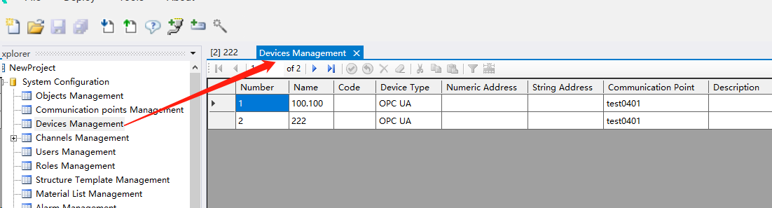
The system configuration module manages project data instances, communication nodes, devices, point locations, users, and roles.
2.1 Instance management
2.2 Communication node management
2.3 Device management
2.4 Point location management
A point location is an entity with a number and name, where both current/historical data and events are associated with it. Synonyms in other systems: variable and tag.
2.4.1 Creating a point location
After establishing the device, you can use the toolbar or wizard to add a point location.
1.Use the toolbar to add a point location.

2.Use the wizard to add a point location.

3.After adding the point location, a pop-up window for creating a point location will appear. Step 1 is set to select a device. You need to select the communication node and device where the new point location is located.
4.Step 2 of creating a point location is to select the object of the newly created point location, where the device is the one checked in Step 1. All objects can be viewed in the instance management.

5.Step 3 of creating a point location is to assign a point location number, where the device is the one checked in Step 1, and the point location is the point location information that can be transmitted on the device.

2.4.2 Cloning a point location
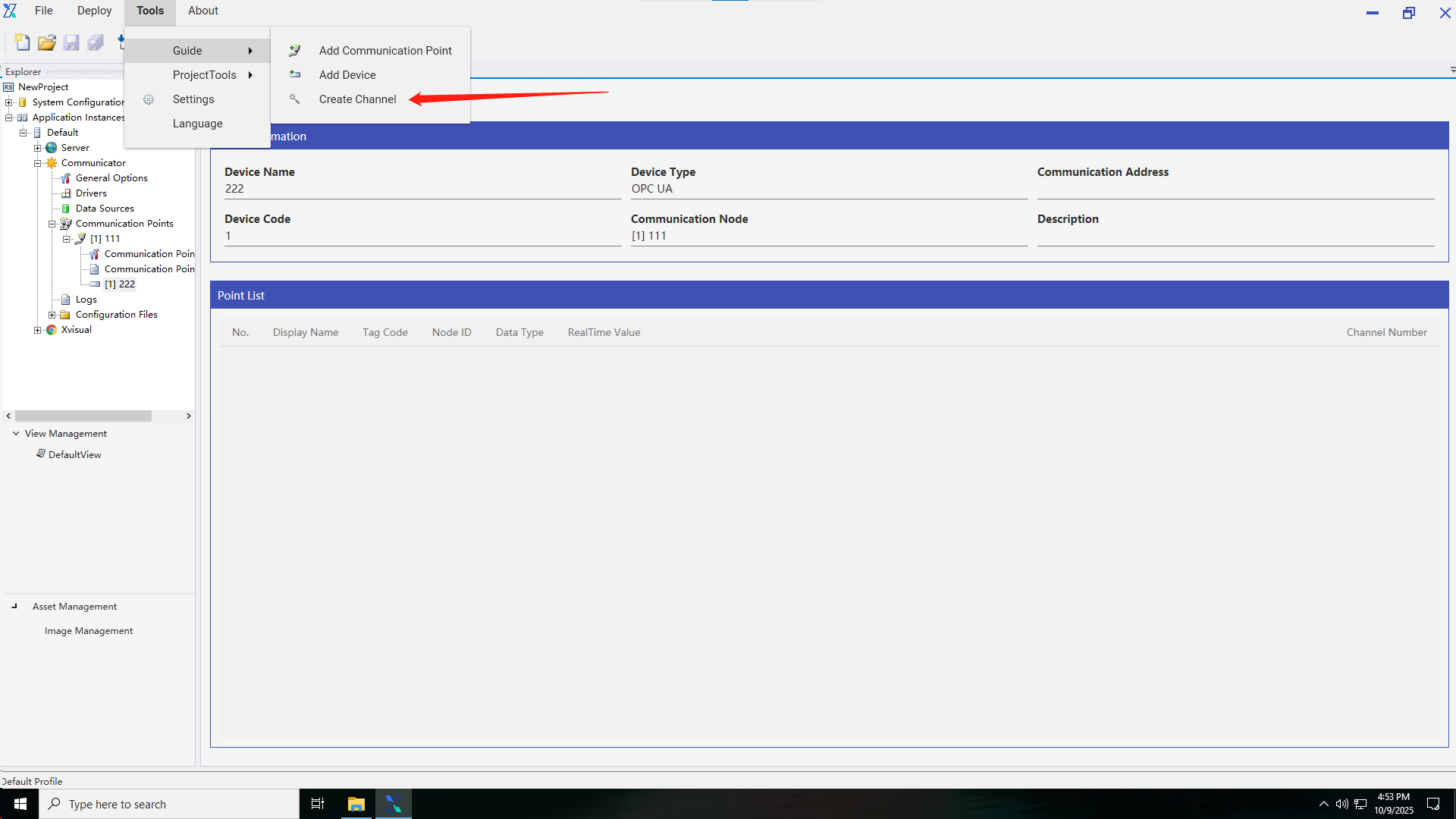
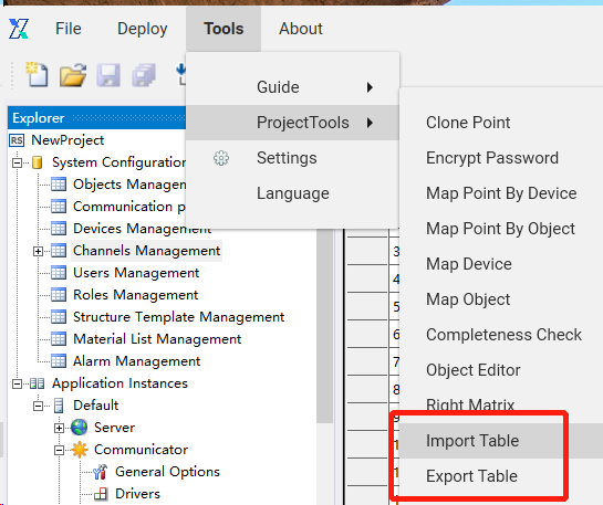
Cloning a point location allows you to quickly create a similar point location based on the existing point locations. You can access the cloning tool from Tools > Project Tools menu in the Administrator application.
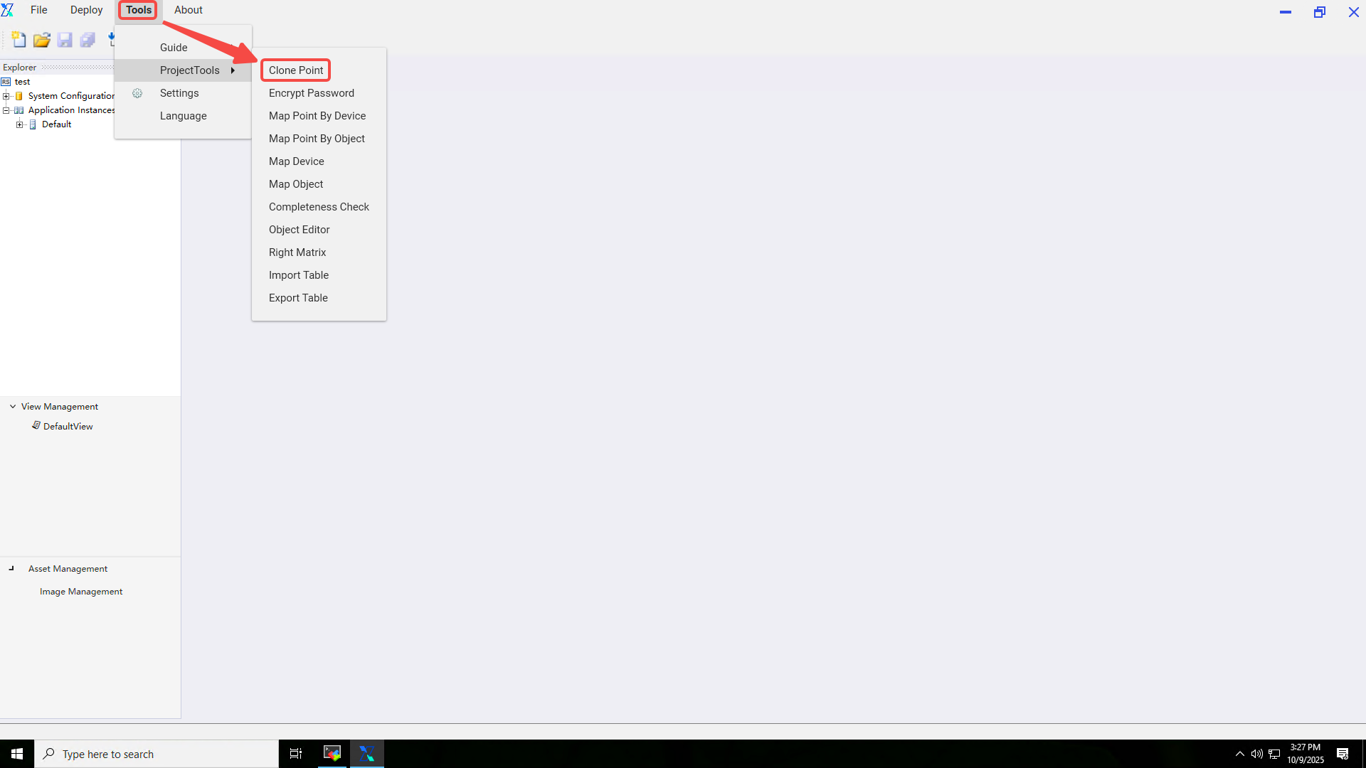
You can specify the source and destination point location number on the clone form, or select new objects and devices for the cloned point locations.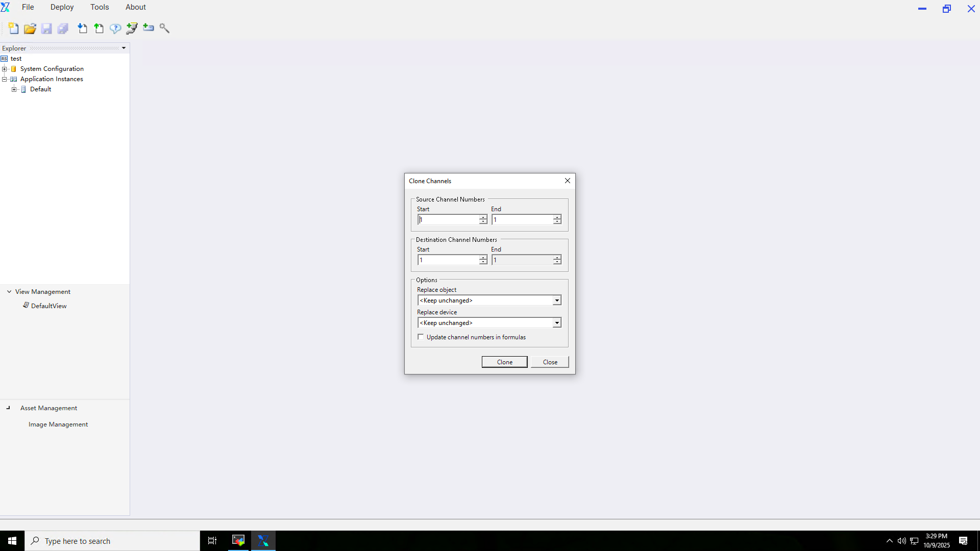
2.4.3 Setting of point location characteristics
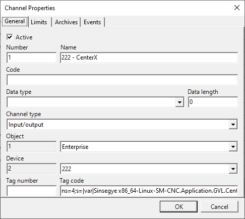
Open the point location management, select the point location to be modified in the table, and then click the button or double-click the table row to open the point location property pop-up window. Edit the point location in the point location property sheet. Open the point location management, select the point location to be modified in the table, and click the button or double-click the table row.
1.The generic page allows you to edit the name, data type, and data length of a point location. If no data type is specified, the Double type will be used. If a data type is specified and is greater than 1, the Server application will create several point locations with the series numbers. Point location types are described in a table with the same name. The tag code string field is used to connect point locations and device tags in the communicator.
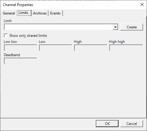
2.The restriction page allows you to set a restriction record to be used by one or more point locations. In the second case, the restriction is marked as shared. If the “bind to channels” option is enabled when the restriction is created, the actual value of the restriction is the point location number specified when the restriction is created.
3.The archive page allows you to specify the archive where the data are stored. If no archive is selected, i.e. the archive mask is empty or equal to 0, the point location data will be stored in the default archive.
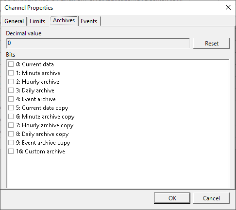
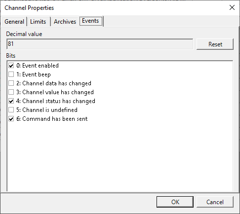
4.On the “Events” page, set the criteria for recording point location related events in the event archive.
2.4.4 Import and export tables
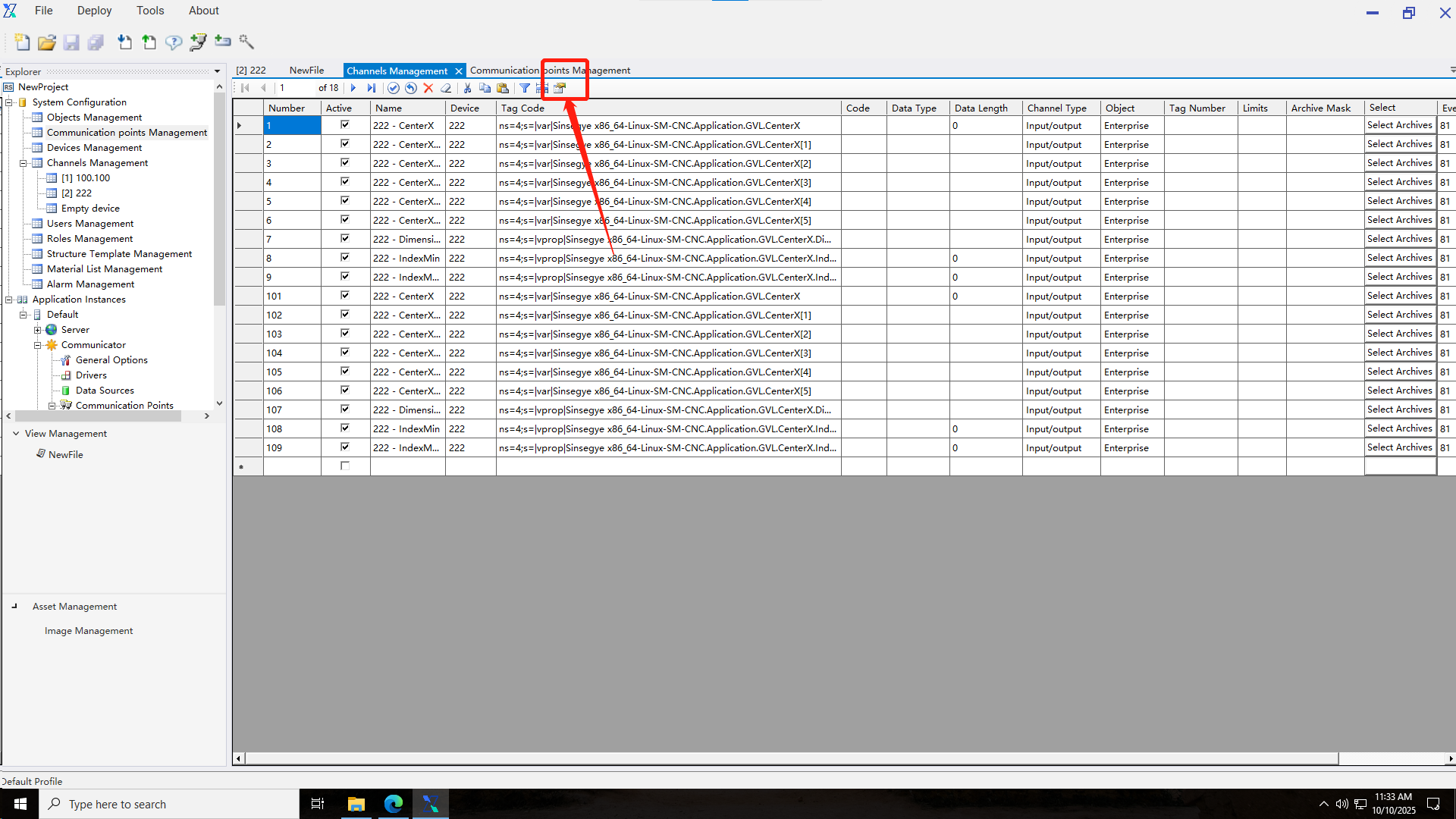
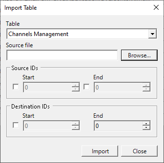
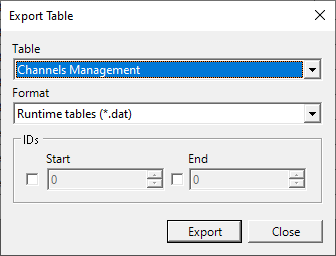
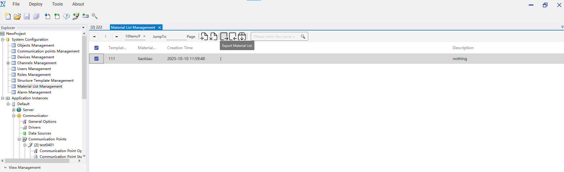
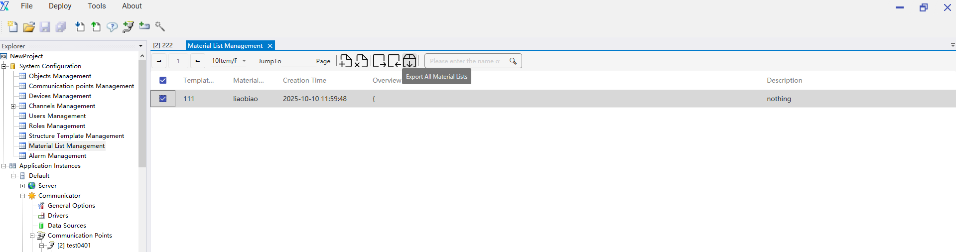
Tools for importing and exporting the configuration database tables make it easier to use the work done previously from other projects. You can access the import and export tools from Tools > Project Tools menu in the Administrator application. It supports DAT, XML, and CSV table formats. If you need to limit the range of imported and exported data, specify the start id and end id.
1.You can access the import and export tools from Tools > Project Tools menu in the Administrator application
2.Import table interface.
3.Export table interface.
2.5 User management
The user management module is used to manage user information in the project. The system comes with built-in admin and guest users, which cannot be edited or deleted. Users can add, edit, and delete custom users according to their needs, and can assign different role permissions to users.
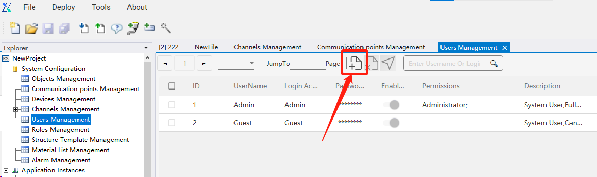
2.5.1 Creating a user
The user clicks the “Add” button in user management to perform the operation of adding a custom user.
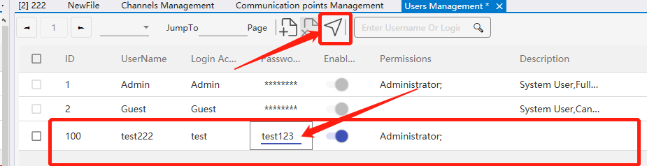
2.5.2 Editing a user
Double-click the user information that needs to be updated to edit the user. After completion, click the submit button to finalize user information editing. Login accounts are not allowed to be edited or modified.
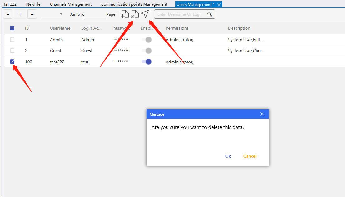
2.5.3 Deleting a user
To delete a user, you first need to select the user, then click the delete button. Afterward, click the submit button to synchronize the information to the server and complete the information synchronization.
2.6 Role management
The role management module manages all role information within the project, as well as the view access permissions associated with each role.
2.6.1 Built-in roles
Built-in roles are system default roles. Their names, enabled status, and descriptions cannot be modified, and they cannot be deleted.
2.6.2 Custom roles
Custom roles are created by project managers. Role IDs start from 100. Role names, default views, enabled status, and descriptions can be edited. Once a role is used by a user, it cannot be deleted.
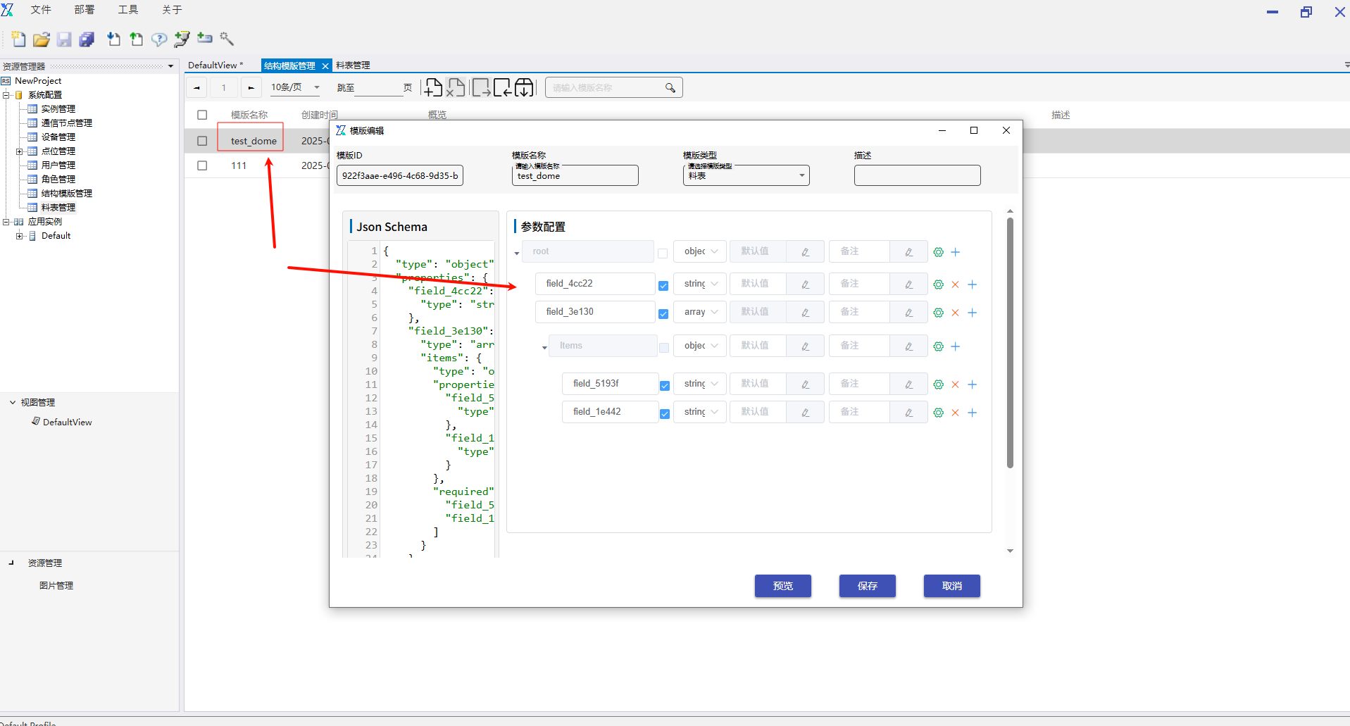
2.7 Structure template management
This module manages template files for material lists, supporting operations such as adding, editing, querying, deleting, importing, and exporting templates.
Template addition operation:
Template editing operation: Double-click the template name to enter the selected template editing popup.
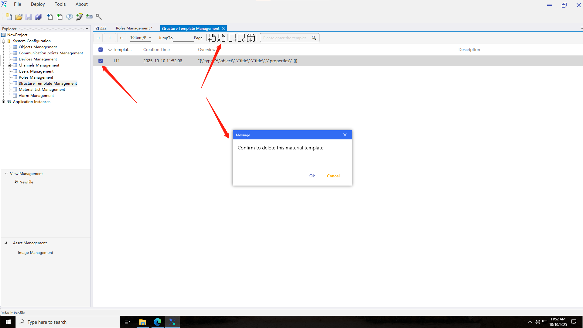
Template deletion operation: select the template to be deleted and click the delete button:
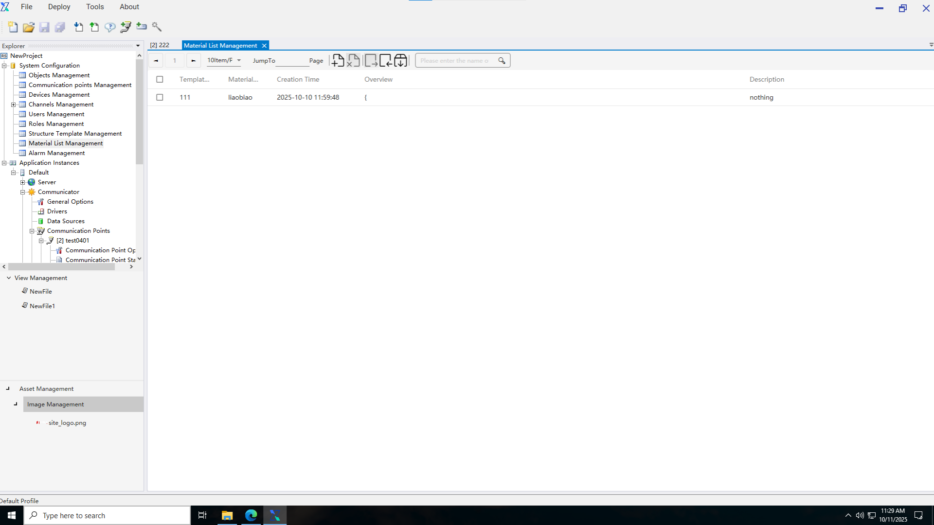
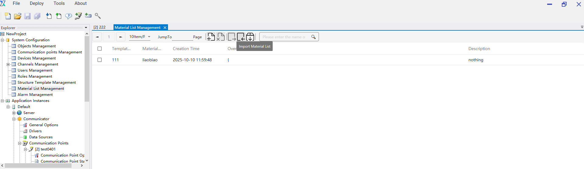
2.8 Material list management
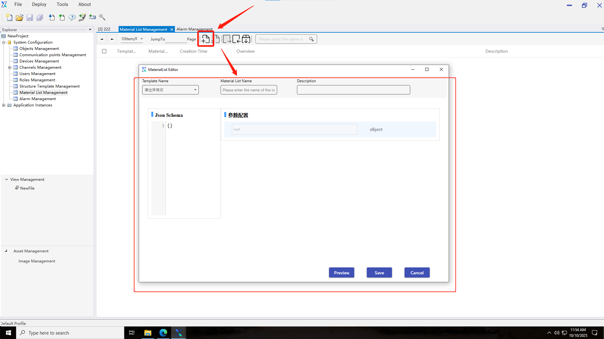
The material list management module is mainly used for configuring material list parameter values. Users can perform operations such as adding, editing, deleting, importing, and exporting material lists.
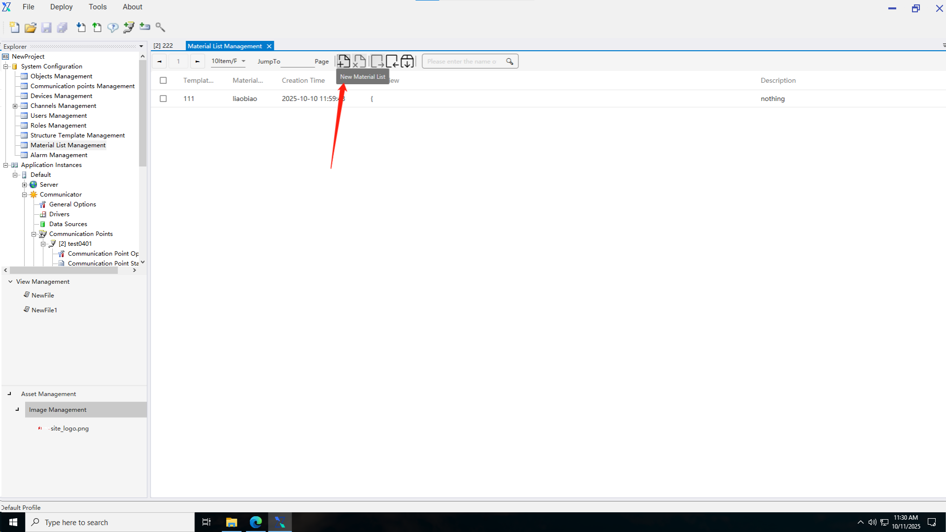
Material list addition: Users click the “Add Material List” button, a pop-up window appears for adding, select a material list template, then fill in parameter information, and save it.
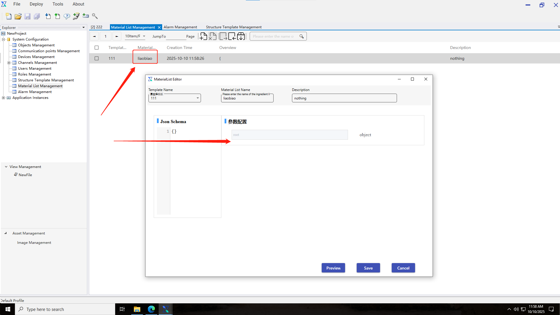
Material list editing: Users double-click the name of the material list to be edited, enter the material list editing pop-up window, modify parameter values, then save them to complete the editing operation of the material list.
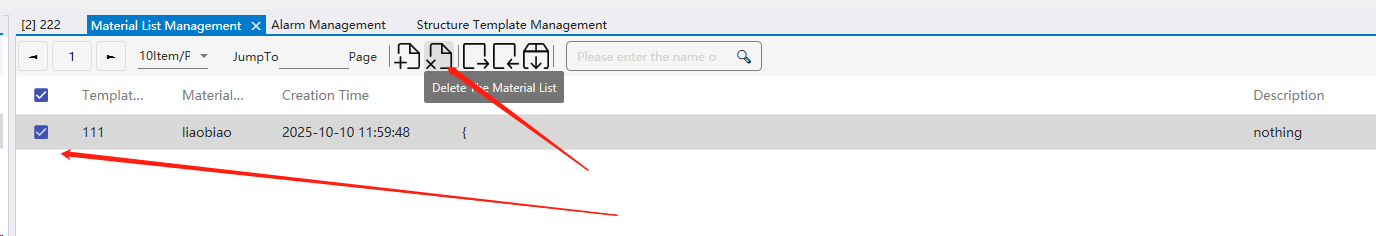
Material list deletion: Select the material list to be deleted, click the delete button, and confirm the deletion through secondary confirmation.
2.9 Alarm Rule Management
The Alarm Rule Management module is mainly used for adding, editing, and deleting alarm rules.
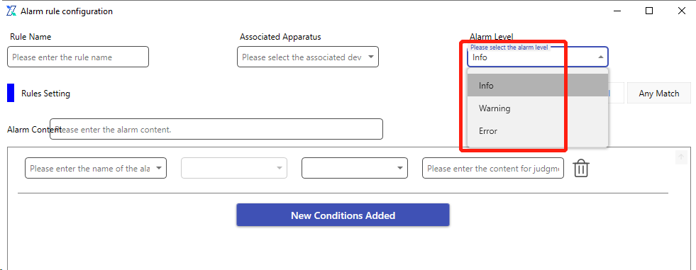
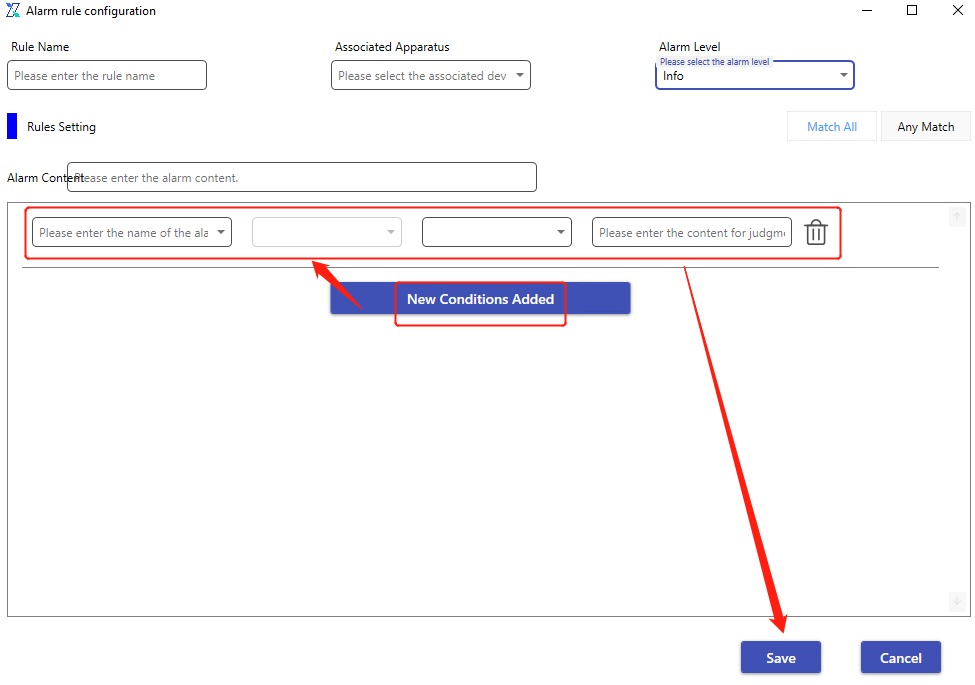
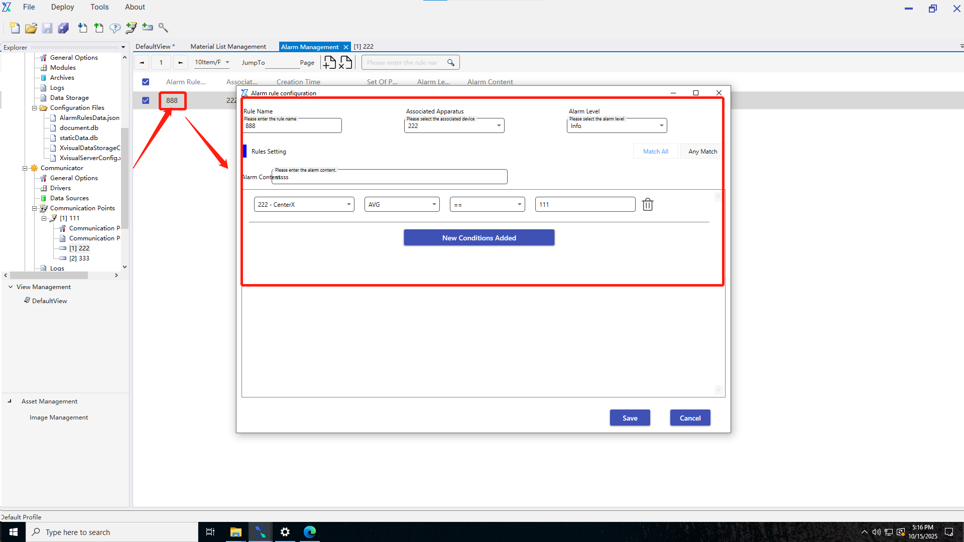
Add Alarm Rules: When the user clicks the "Add Alarm Rule" button and the add pop - up window appears, the user can configure the rule. For example, enter the rule name, alarm content, select the associated device and alarm level.
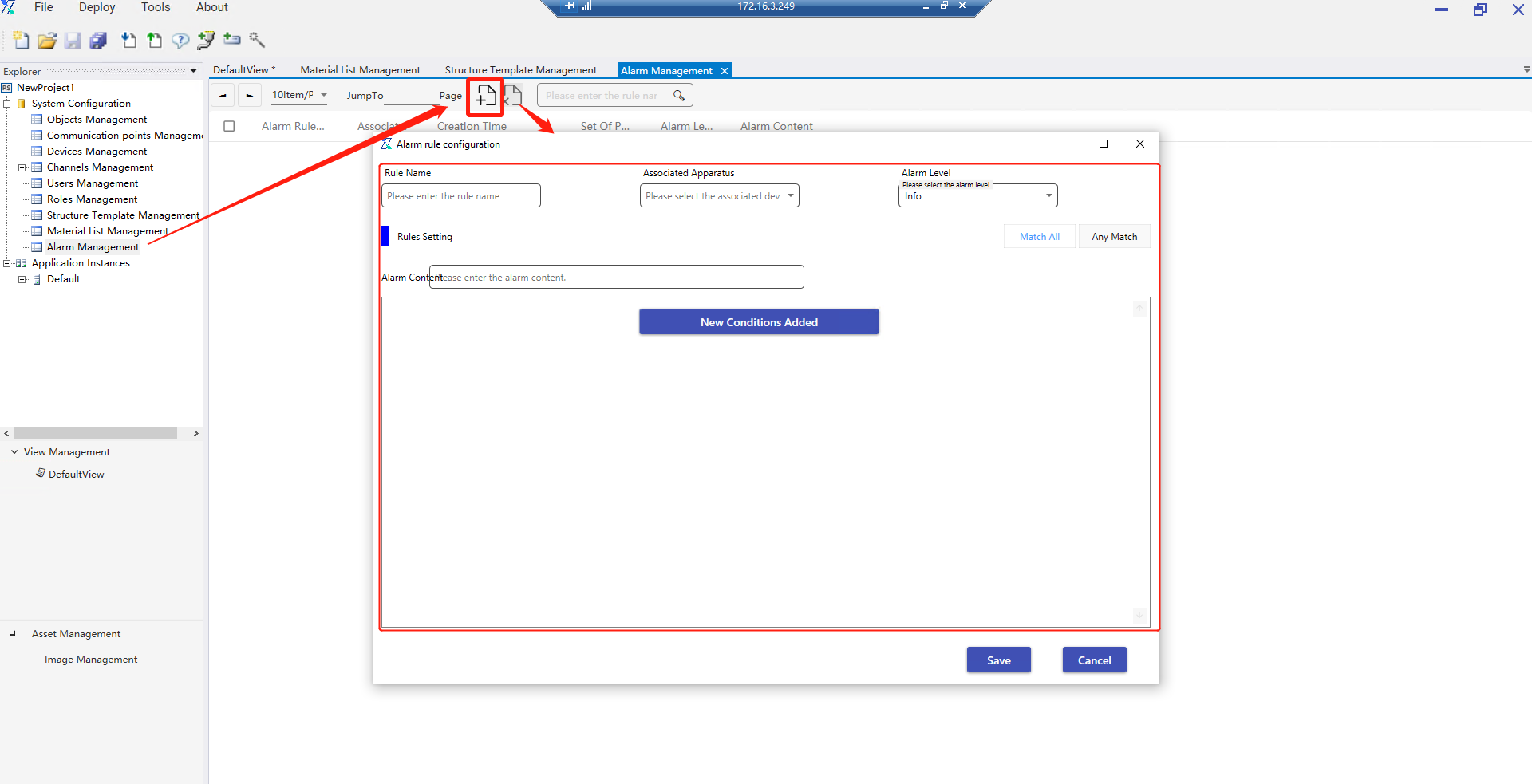
The user can also add new alarm conditions. After successful configuration, save the settings.
Edit Alarm Rules: The user double - clicks the name of the alarm rule to be edited to enter the alarm rule configuration pop - up window interface. After making modifications, save the changes to complete the alarm rule editing operation.
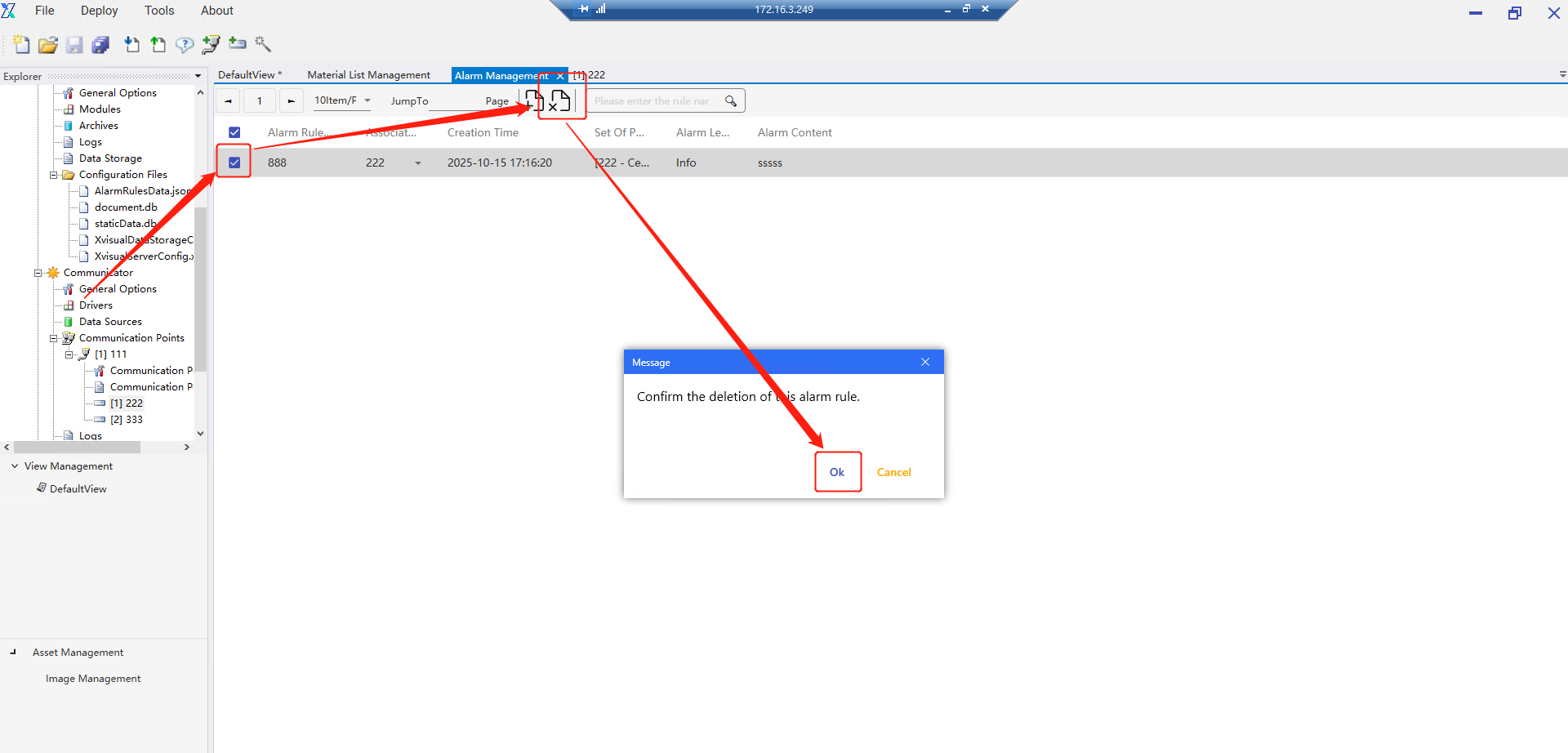
Delete Alarm Rules: Select the alarm rule to be deleted, click the delete button, and delete it after secondary confirmation.
3.Application Examples
3.1 Server
3.1.1 Data storage
The data storage module is mainly used for persistent data storage settings for the current project, including trend caching, real-time storage, and statistical storage. The data storage function is mainly used as a data source for subsequent chart components. When the rule is not enabled, no storage operation will be performed.
3.1.1.1 Trend storage
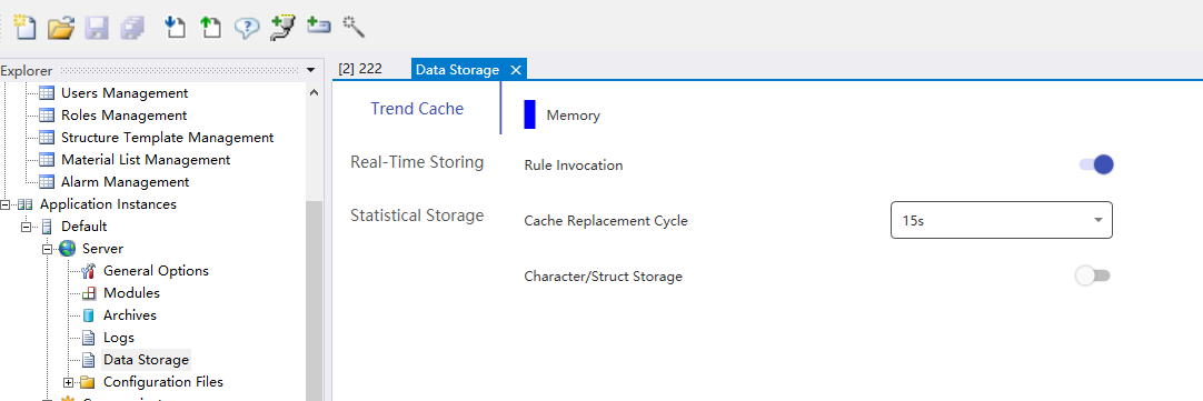
1.Only the [Rule Enable] switch needs to be enabled.
2.The cache overwrite cycles are 15s, 30s, and 60s respectively
3.No independent database configuration (depends on system’s default cache area)
4.Character/structure storage switch (located at the bottom of the interface): non-numeric data will be ignored when the switch is turned off.
3.1.1.2 Real-time storage
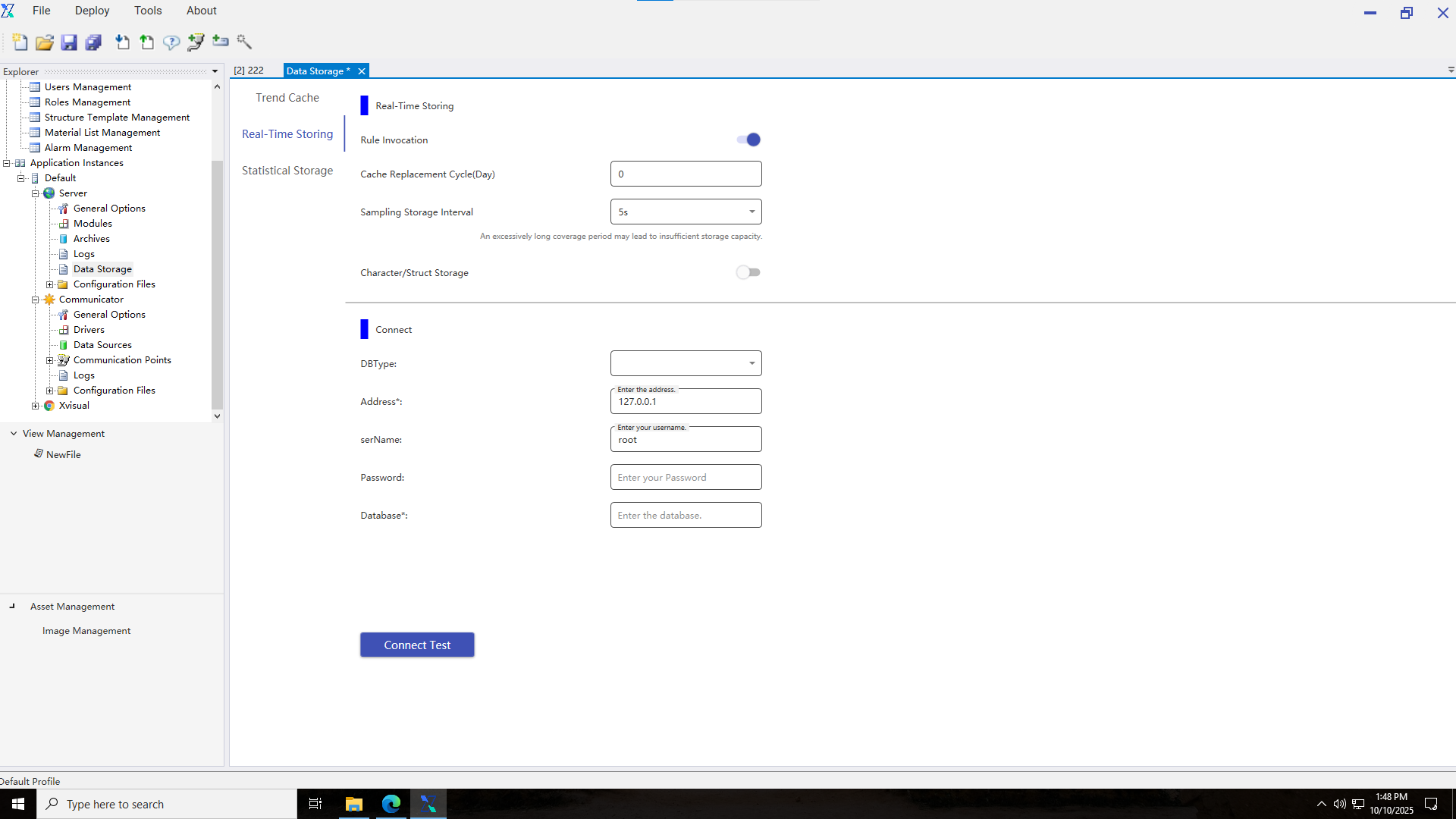
1.Enable [Rule Enable]
2.Adjust sampling frequency: [Sampling Storage Interval] setting (100ms-30s)
3.Database connection configuration:
- Type: Select InfluxDB
- Address: Enter the complete URL (e.g. http://127.0.0.1:8086)
- Username/Password: Enter authentication information
- Database name: Required field
4.Click “Connection Test” to verify connectivity.
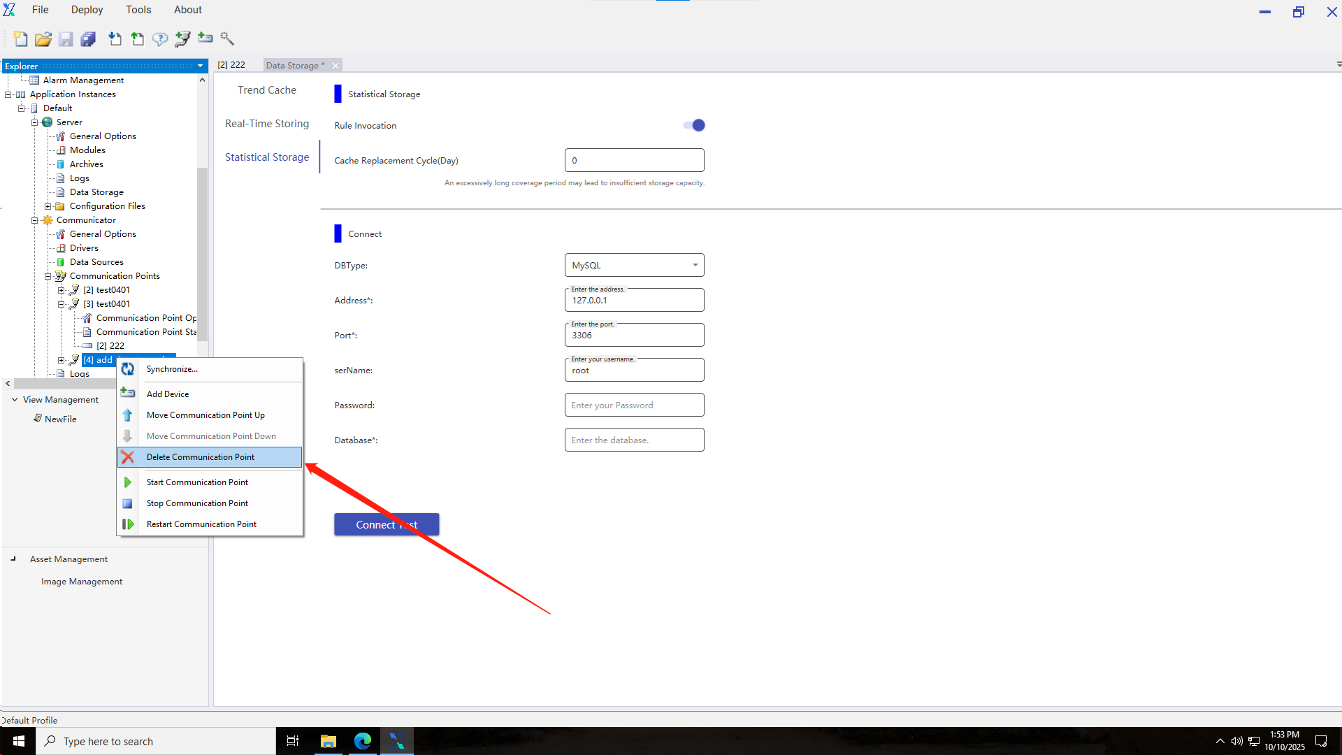
3.1.1.3 Statistical storage
1.Enable [Rule Enable]
2.Set [Cache Overwrite Cycle]: An excessively long overwrite cycle may lead to insufficient storage space
3.Database connection configuration:
- Type: Select PostgreSQL, MySQL, SQLite (No configuration needed, system default storage)
- Address: Enter server IP (e.g. 127.0.0.1)
- Port
- Username/Password: Enter authentication information
- Database name: Enter the target database name
4.Click “Connection Test” to verify the validity of the configuration.
3.2 Communicator
All communication nodes and devices in the project are managed in the Communicator module.
3.2.1 Communication node
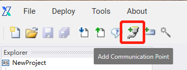
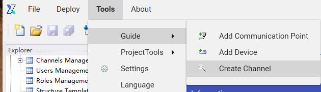
3.2.1.1 Adding a communication node
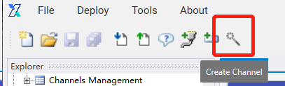
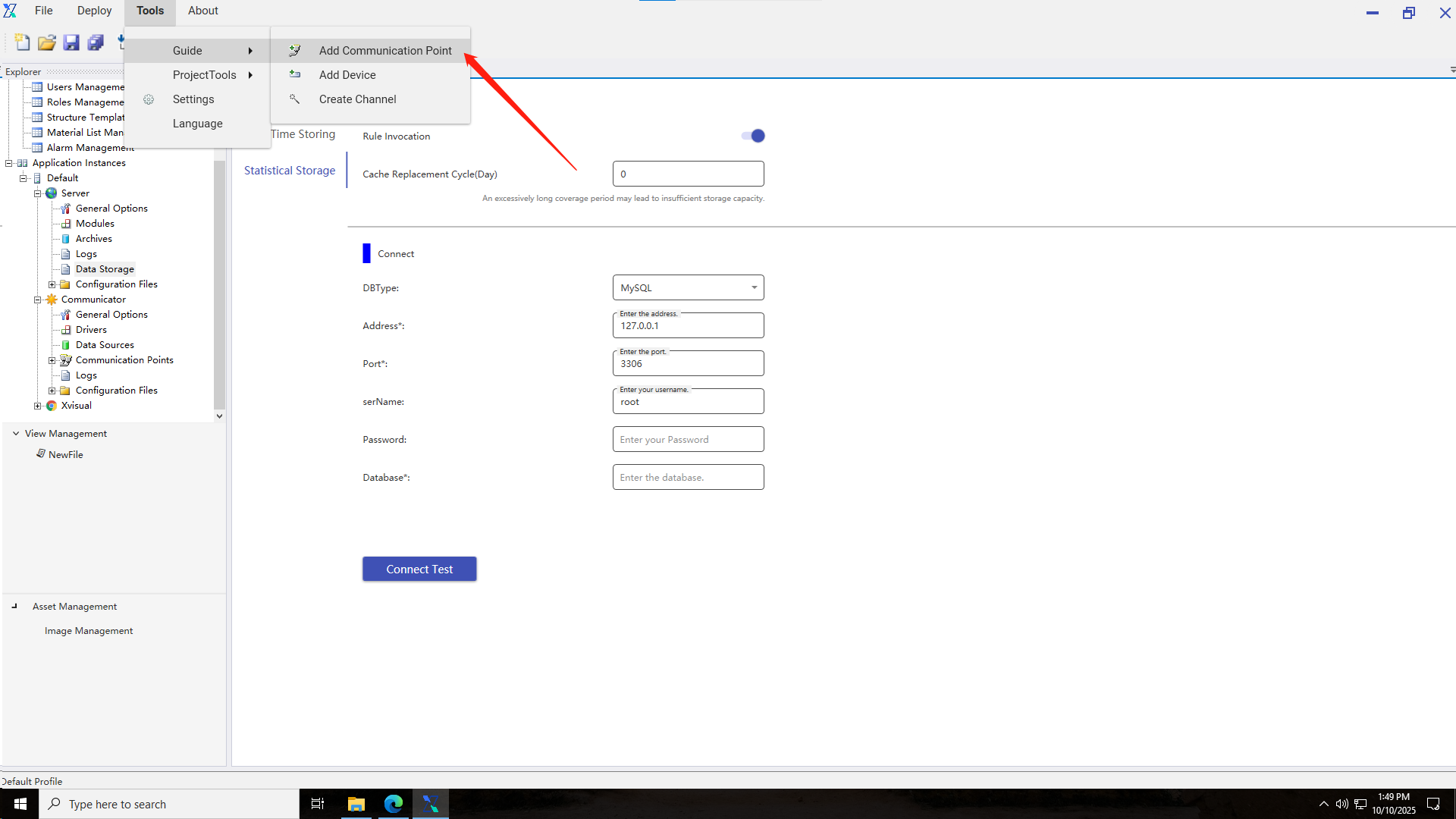
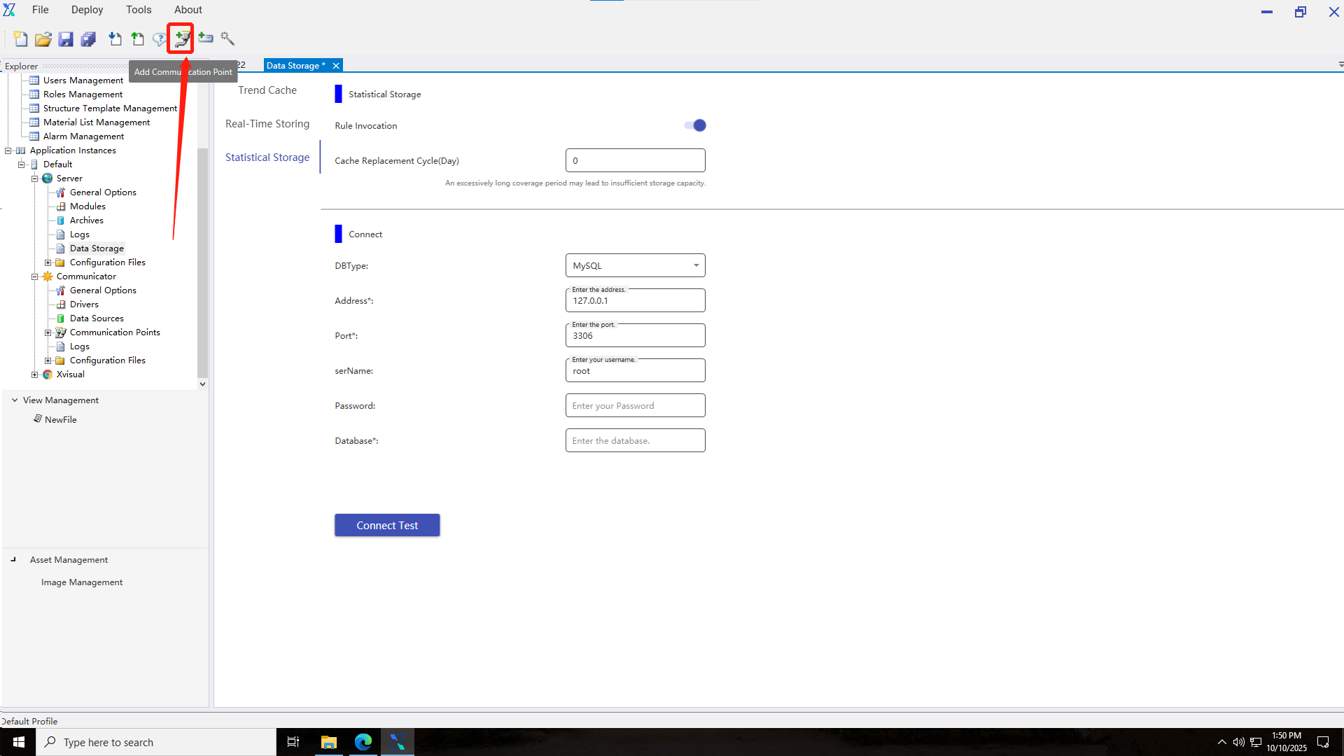
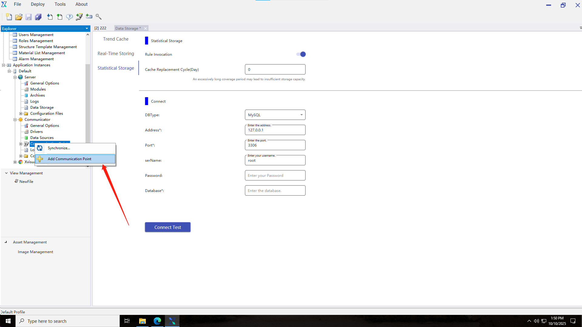
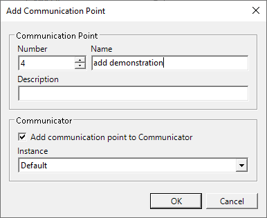
Communication nodes can be added in three ways: Tools → Wizard → Add Communication Node, clicking the Add Communication Node button in the menu bar, or right-clicking the "Communication Node" in the Communicator.
3.2.1.2 Deleting a communication node
Select the communication node to be deleted, right-click to bring up the selection menu, then click "Delete Communication Node". After the secondary confirmation pop-up window appears, confirm the deletion to perform the deletion operation.
3.2.2 Device
3.2.2.1 Creating a communication device
After successfully adding a communication node, a device can be added via the toolbar, through Tools-Wizard, or by right-clicking the communication node.
1.Use the toolbar to add a device.
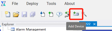
2.Use the wizard to add a device.
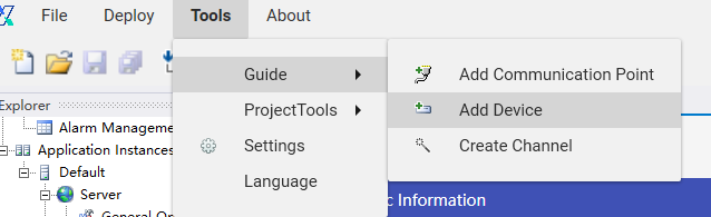
3.Add a device via a communication node.
4.The default device type for addition is OPCUA, with options including Acp, Modbus, OPCUA, custom data types, and Simulator.
3.2.2.2 Device management
3.2.2.3 Configuration properties
a.ACP device
1.In the application instance, click on the ACP device under "Communication Node" to view basic device parameters. Click the "Device Properties" button to enter the property settings interface.
2.On the property settings interface, enter the server IP, click the "Connect" button, select the devices to be monitored, click Add, then click the "Save" button to save the data.
b.OPCUA device
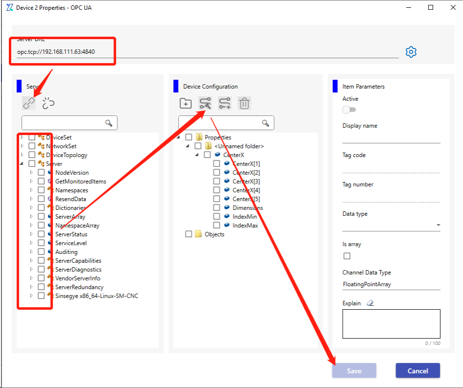
1.In the application instance, click on the OPCUA device under "Communication Node" to view basic device parameters. Click the "Device Properties" button to enter the property settings interface.
2.Enter the server URL in the property settings interface, click the "Connect" button, check the devices to be monitored, click Add, then click the "Save" button to store the data.
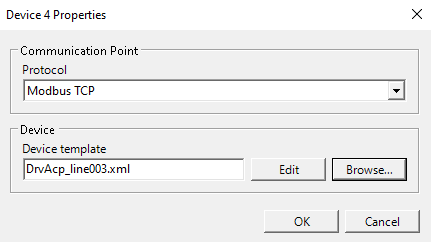
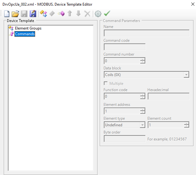
c.MODBUS Device
1.In the application instance, click on the MODBUS device under "Communication Node" to view basic device parameters. Click the "Device Properties" button to enter the property settings interface.
2.Select the Modbus TCP protocol and edit the template.
3.Add members in the MODBUS device template editor.
d.Custom data type device
1.In the application instance, click the custom data device under "Communication Node" to view basic device parameters. Click the "Properties" button to enter the property settings interface.
2.On the custom data device management page, you can perform functions such as querying custom data, adding individual data entries, editing, deleting, exporting data files, importing data files, and downloading template files.
3.3 Xvisual
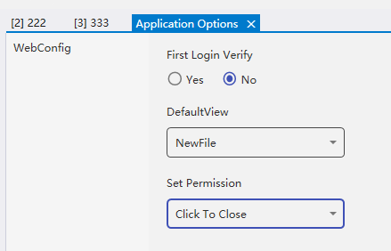
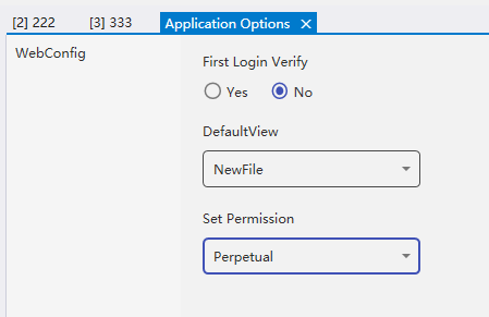
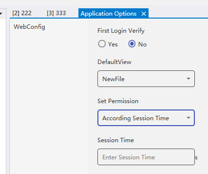
Xvisual's ApplicationOptionsNode allows configuring whether a user is required to log in for the first time and the valid duration of user permission verification.
First-time login verification is enabled by default, requiring users to log in before accessing the settings page after opening the web page. If "No" is selected, users do not need to log in when entering the web page, and will be automatically logged in as the guest user to access the default view page of the settings.
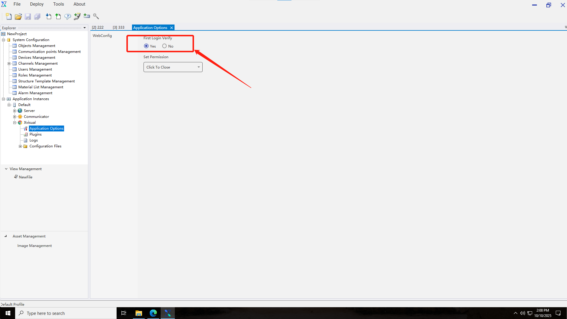
The permission setting option determines the validity period after successful role permission verification. “Permanent” means the verification remains valid once completed. “Click to close” means permissions become invalid after one operation. According to the Session duration, users need to set the permission duration themselves, with seconds as the default unit.
4. View Management
View management is the core function of Xvisual software, and users can complete the drawing of view files in the current module, as well as the data interaction settings between channels and display pages. This section is divided into two parts: view file management and view drawing.
4.1 View file management
4.1.1 View addition
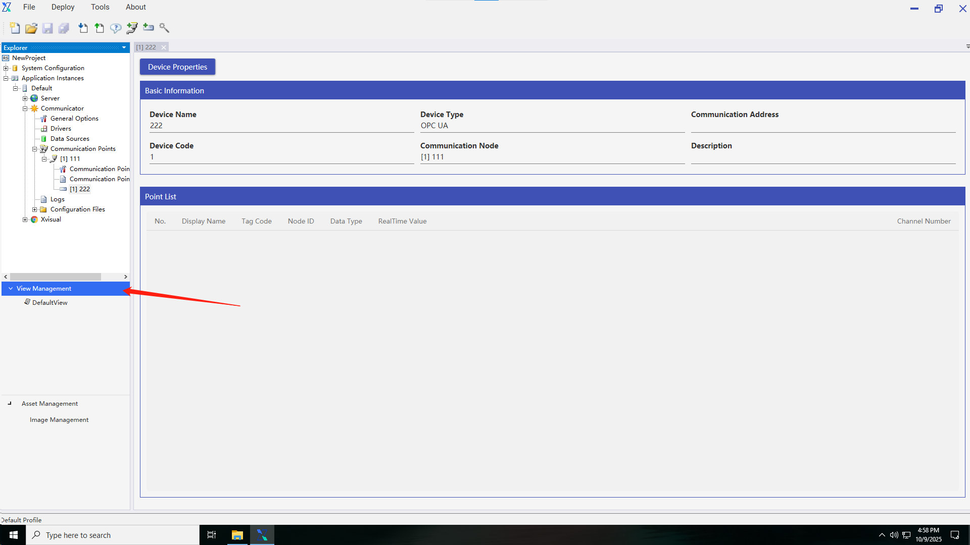
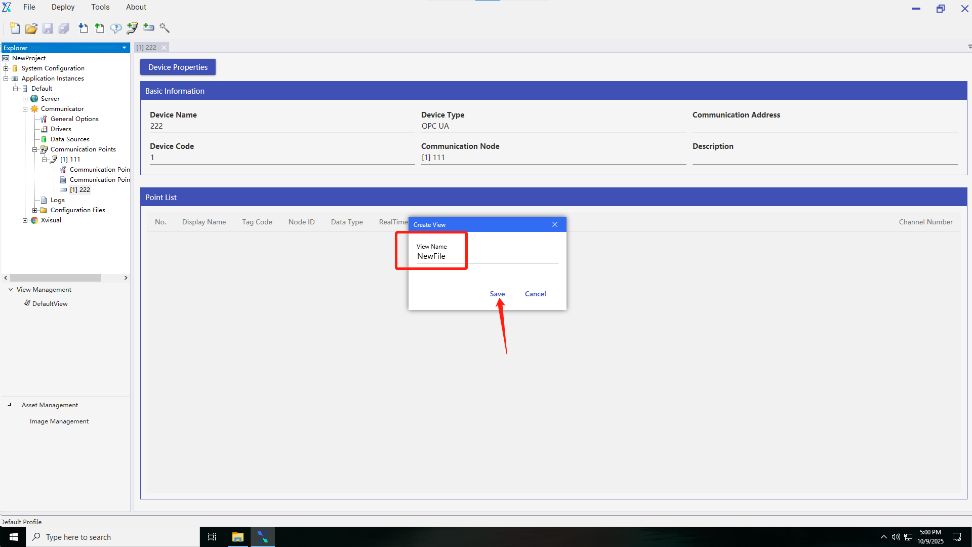
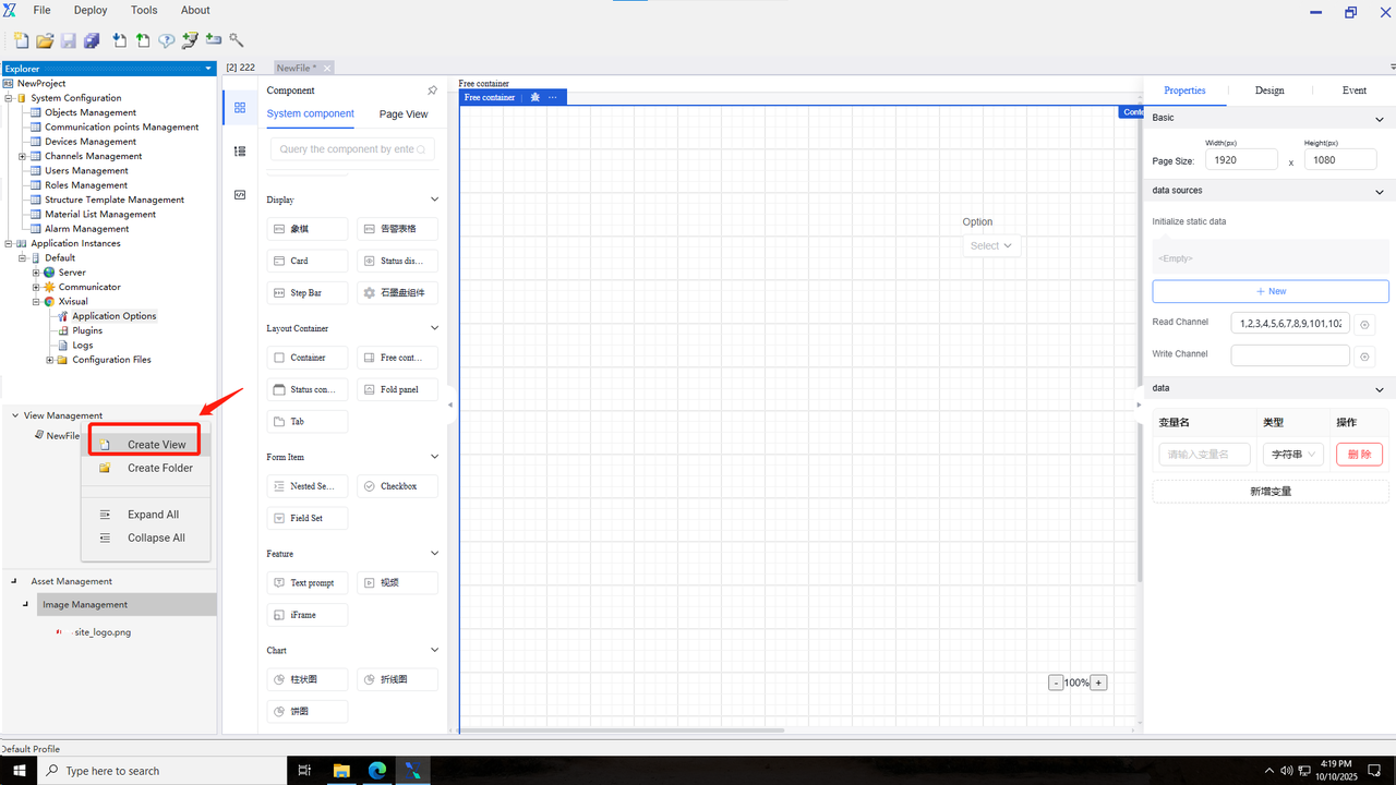
View file management consists of views and view folders. The system automatically adds a default view named DefaultView to view management. Users can also right-click "View Management" to create view folders or view files, but the addition of views or folders with duplicate names is not allowed.
4.1.2 View editing
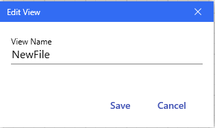
By right-clicking an added view or view folder, users can edit or modify the name of the view file or view folder.
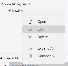
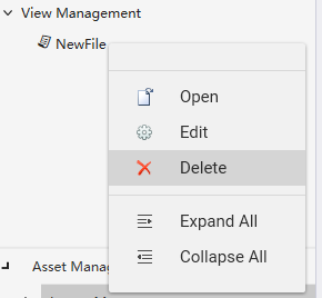
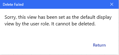
4.1.3 View deletion
To delete a view file or view folder, right-click the target file to be deleted and then click the delete button. However, opened views or files set as default views cannot be deleted.
4.2 View drawing
View drawing involves operations within an open view file, and it is divided into three main parts: view components, drawing canvas, and component properties. The view components section is further categorized into components, view structure, and source code.
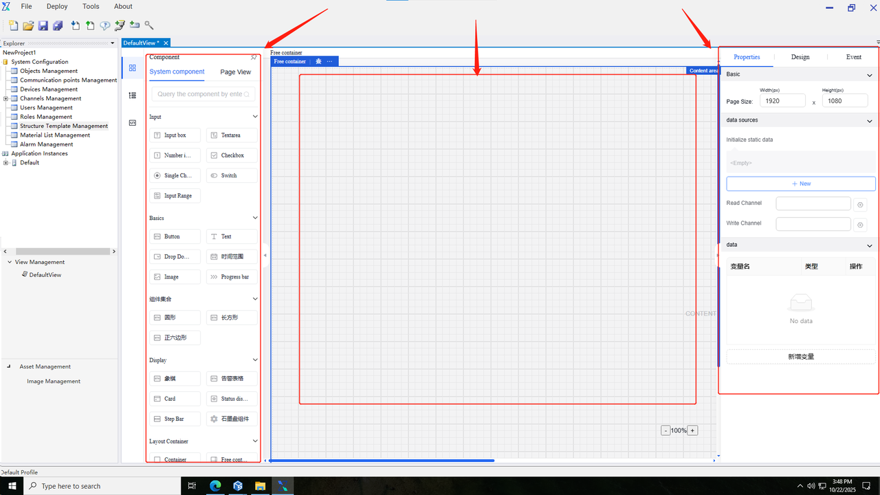
4.2.1 Components
Components refer to the basic units for creating diagrams, including default basic system components provided by the system. Users can also independently create page view components and repetitive canvas templates.
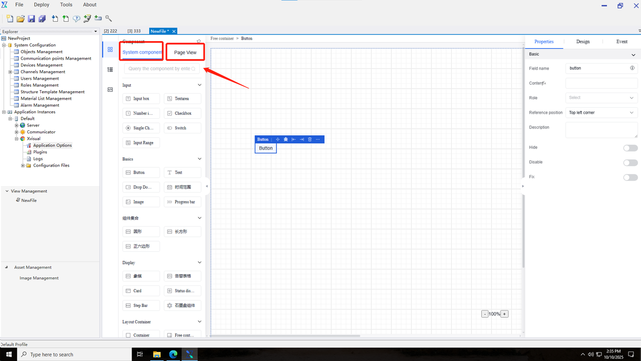
General operation steps
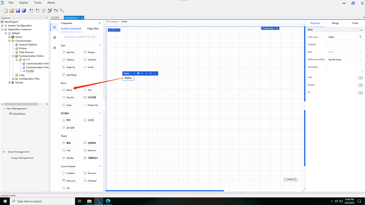
Step 1: Drag components onto the diagrams
i.In the configuration editor, click the component button on the left panel to switch to the Components tab.
ii.Locate the component to be drawn in the components, and then drag it onto the canvas.
Step 2: Configure the component
i.Configure properties: Select the component dragged onto the canvas, and then enter its property information in the right panel.
ii.Configure data binding: In the Data tab of the Properties panel, select the channel and set the data transformation content.
iii.Configure component appearance: In the right panel, click “Appearance” to switch to the appearance style setting page, where users can set the component appearance or write a custom CSS code to set its style.
iv.Configure component events: In the right panel, click “Events” to switch to the event settings page, select an event trigger type, and customize trigger actions and execution results.
Within the component page, users can utilize fuzzy search to quickly locate the desired components. Simply enter component keywords during search, and then click the query icon or press “Enter” to find relevant components.
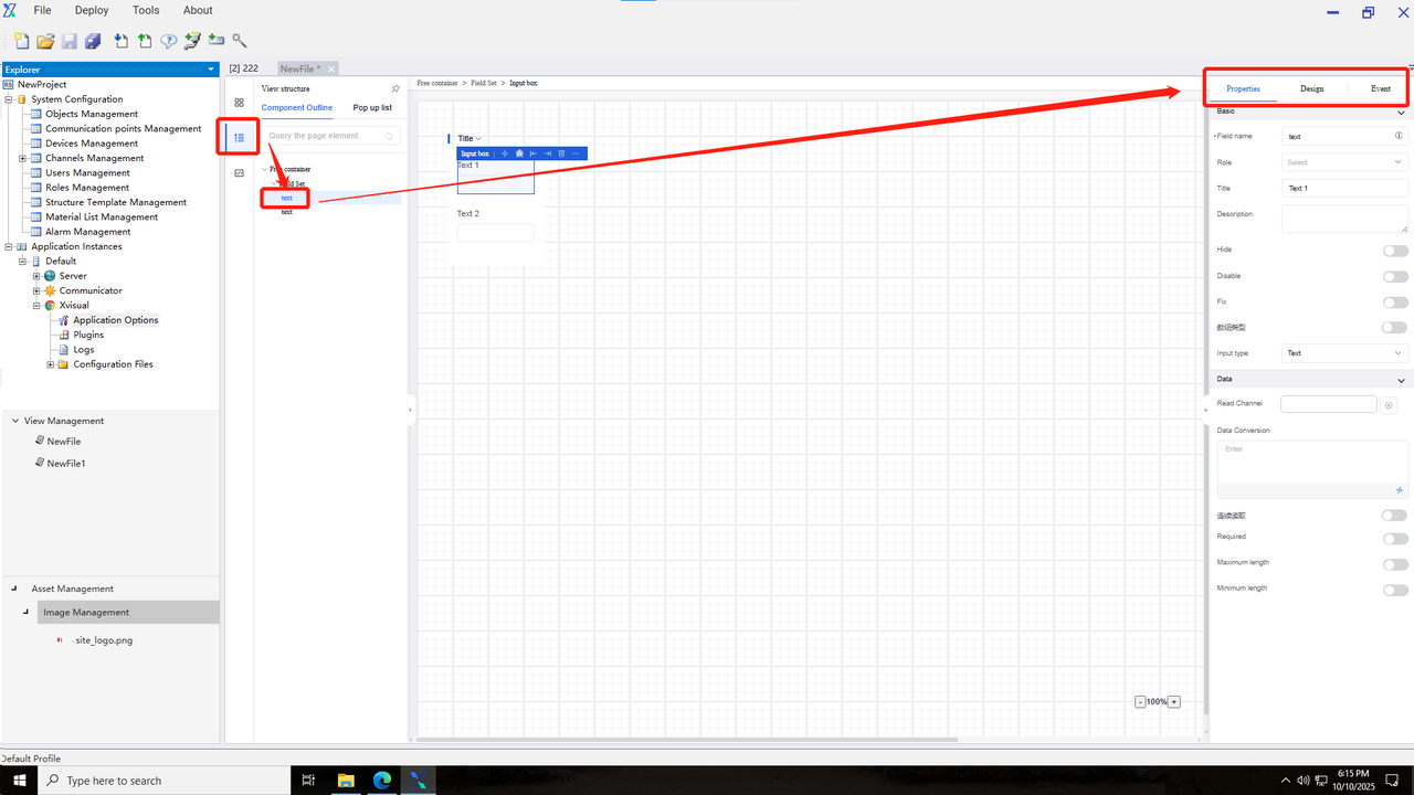
4.2.2 View structure
A view is the structure for all components used in the configuration editor, and the usage method is as follows:
i.In the configuration editor, click the component button on the left panel to switch to the Components tab.
ii.Click the View Tree button to switch to the View tab.
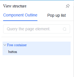
Within the View Structure page, users can quickly locate the desired component elements using fuzzy search. Simply enter component keywords during search, and then click the query icon or press “Enter” to find relevant components.
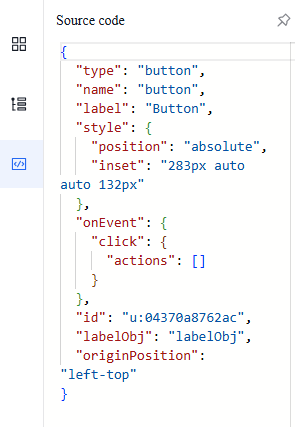
4.2.3 Source code
The source code is the structure for all components used in the configuration editor, and the usage method is as follows:
i.In the configuration editor, click the component button on the left panel to switch to the Components tab.
ii.Click the Source Code button to switch to the Source Code tab.
iii.Click a specific component to view its source code content.
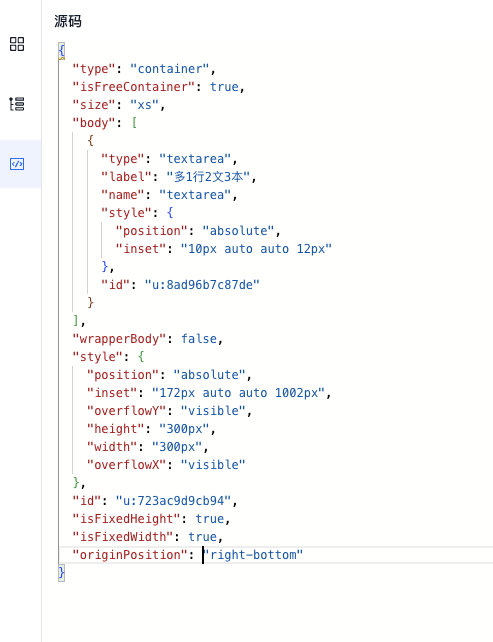
Within the Source Code page, users can directly adjust component properties such as component name and font size according to business requirements. Users can also copy the source code and import it into other drawing pages. The configuration editor source code of Xvisual is in JSON format, and all page contents are ultimately nested into a single JSON file. Invitation
4.2.4 Canvas
The canvas is the operational area for drawing diagrams and icons, and it is located in the central region of the configuration editor. All components will be displayed and arranged within the canvas area. When the canvas size exceeds the editor area, a scroll bar will appear.
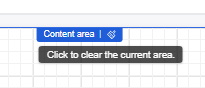
Specific method for one-click canvas clearing: Select the outermost component (free container) and click the Delete/Clear button to remove all components from the page.
4.2.5 Property bar
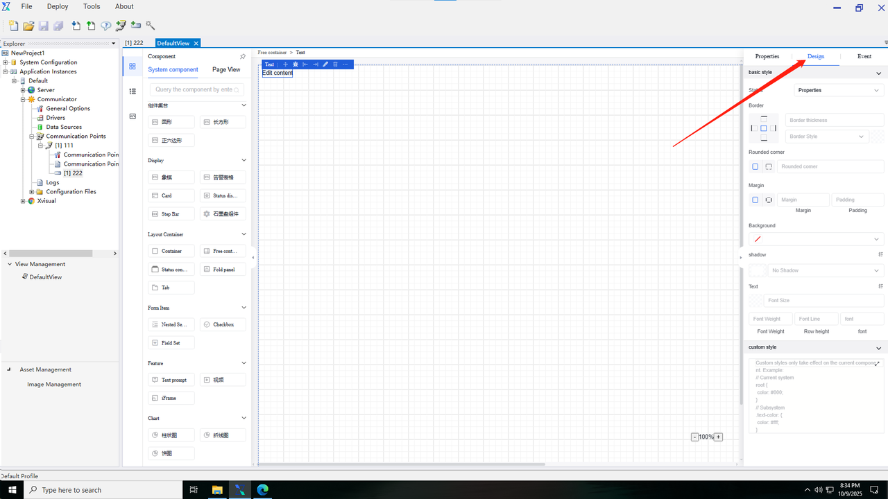
The property bar is located on the right side of the editor and displayed in expanded mode by default, and it can be also collapsed by clicking the Fold button. The property bar consists of three sections: Properties, Appearance, and Events.
4.2.5.1 Property
Property information includes basic component details and data content, and it varies across components. Refer to the component list for specific description.
The property information adds a role binding button, allowing users to set operation permissions for other users under specified roles after component events are triggered.
4.2.5.2 Appearance
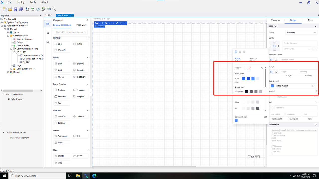
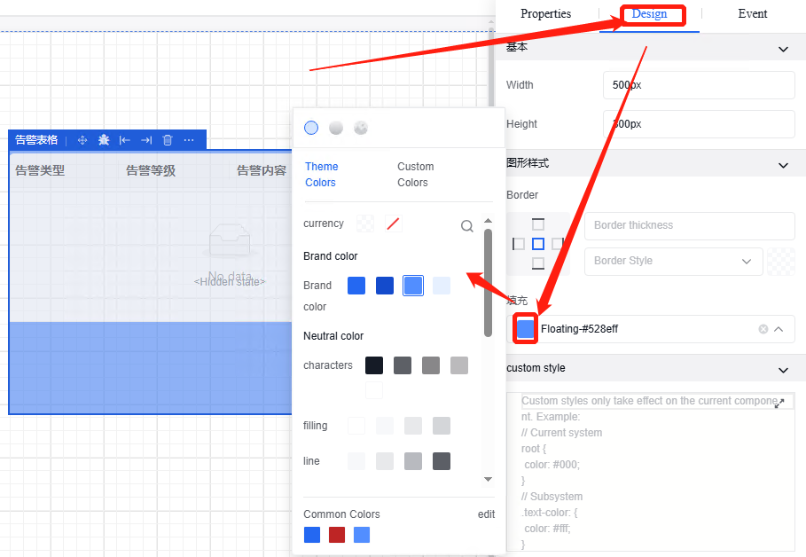
The appearance information includes the basic appearance, background details, position and size information, as well as custom styles of a component. Settings for appearance content vary across different components. For specific details, refer to the descriptions in the component list.
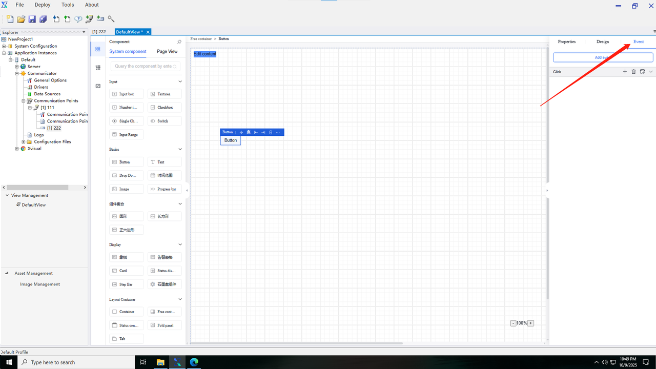
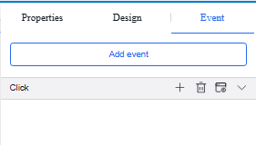
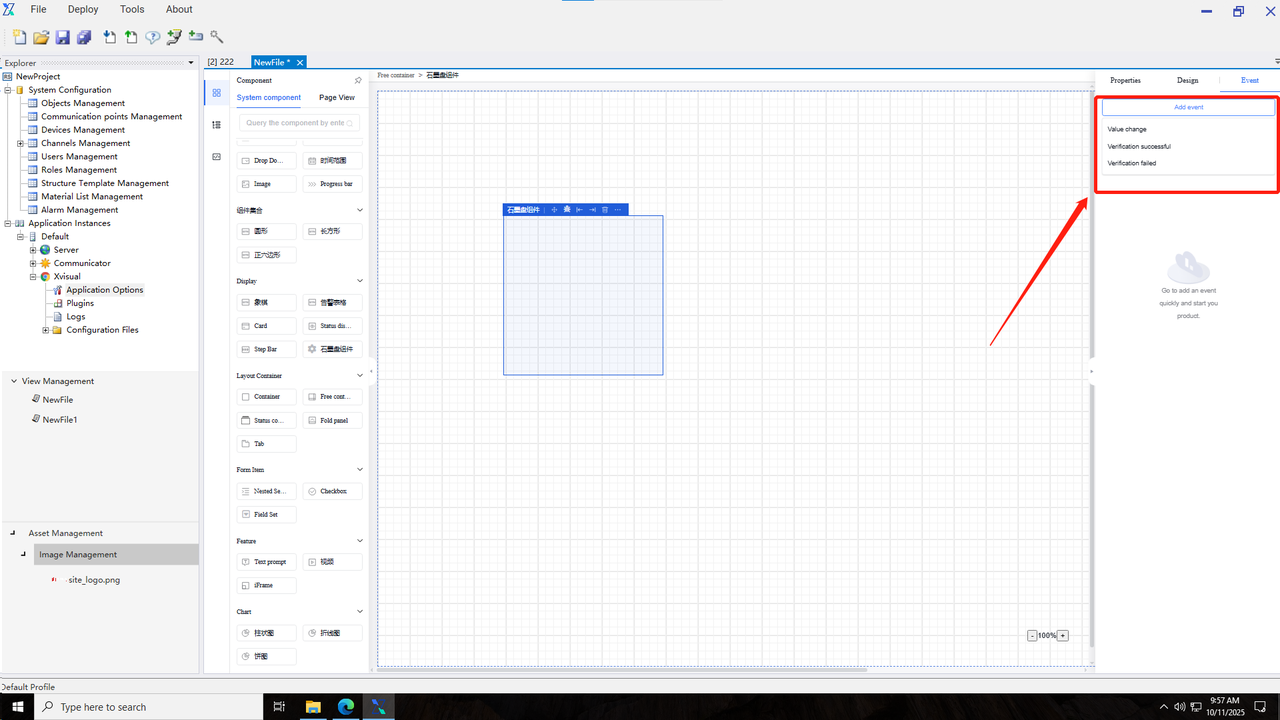
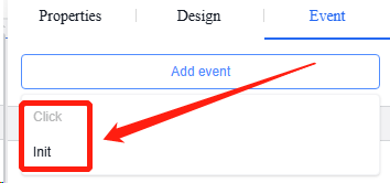
4.2.5.3 Event
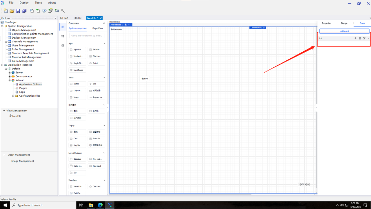
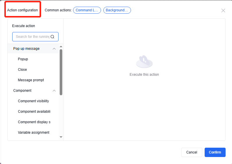
Event is a user-defined triggered operation that occurs when specific execution conditions are met, such as value changes in the input box, gaining focus, or losing focus. During this time, pop-up windows, custom JavaScript, and command issuance operations can be performed. As shown in the figure below:
General operation steps
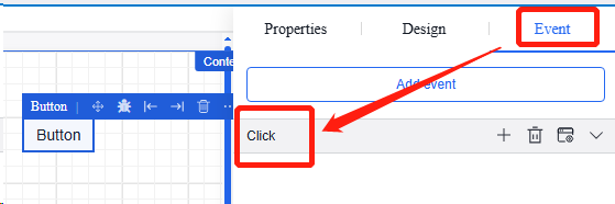
Step 1: Add Event
1.In the configuration editor, select the component you need to design, and then click the "Event" tab in the right property bar to switch to the event bar.
2.Click "Add Event”, select the trigger condition for the event, and create such an event.
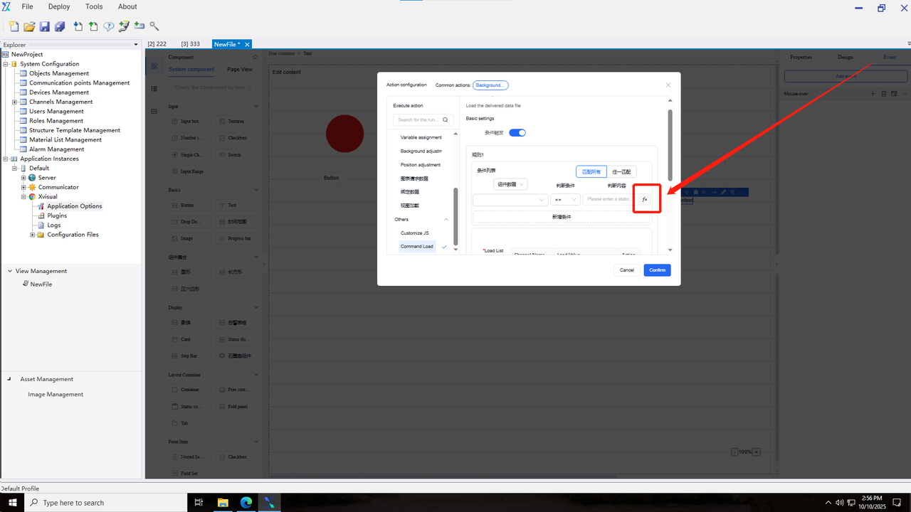
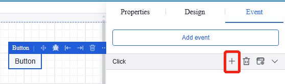
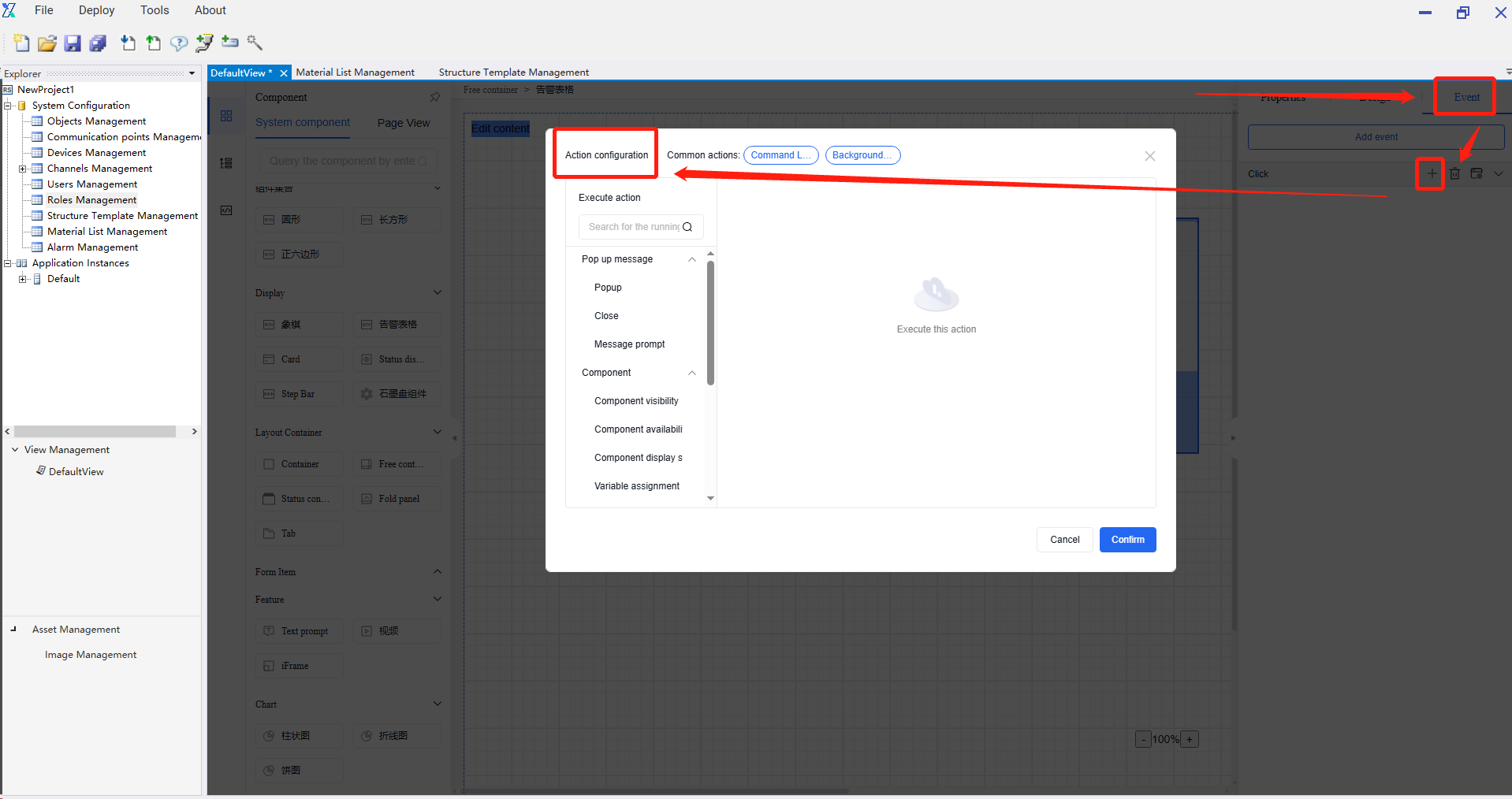
Step 2: Add Action
1.Select the time you need to add, click “Create”, and the time creation page will pop up.
2.Select the trigger time type and fill in the event content.
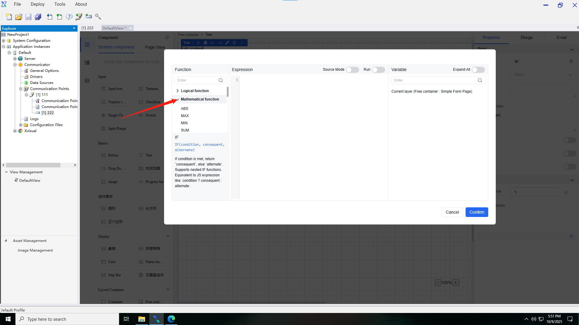
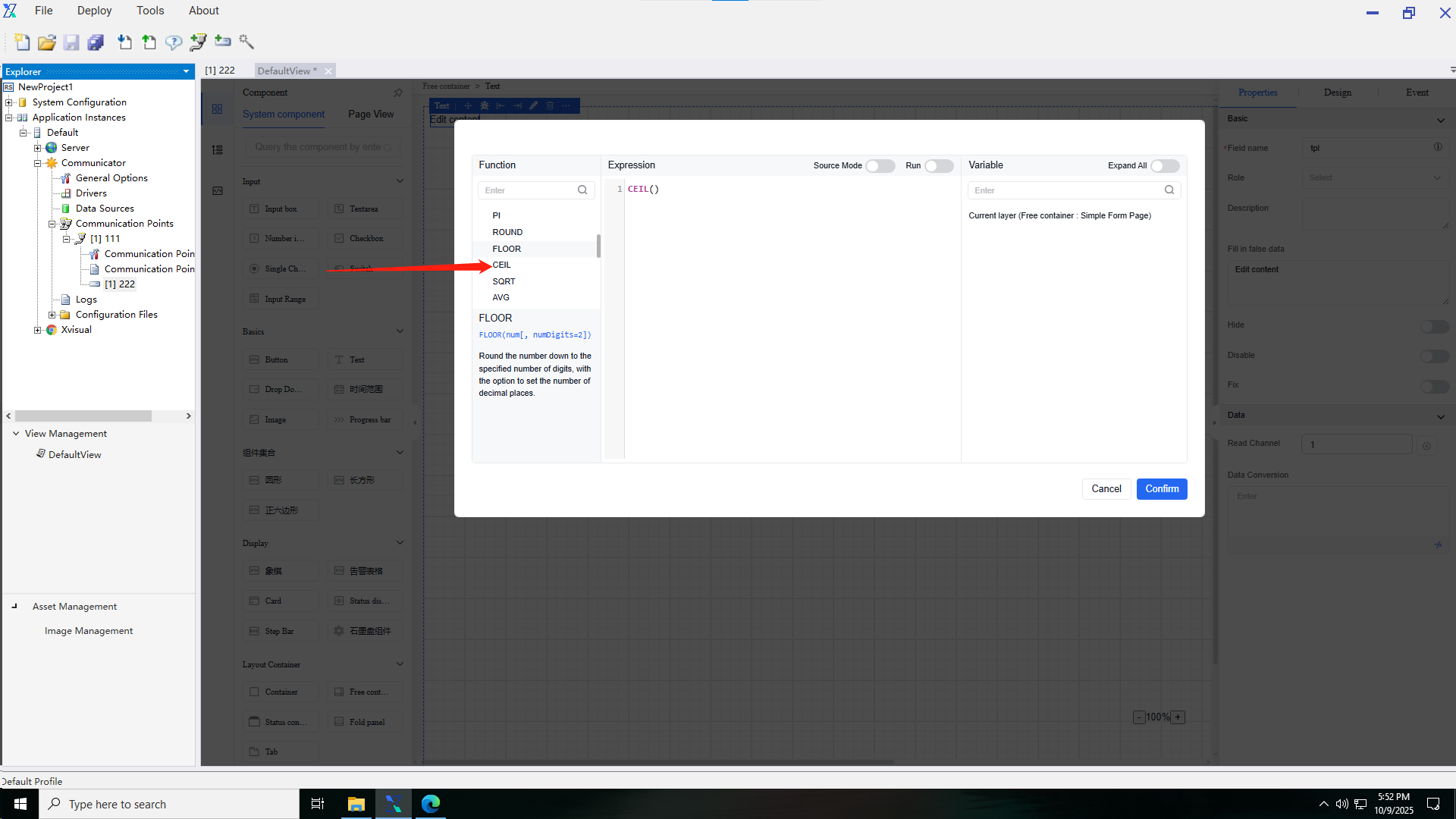
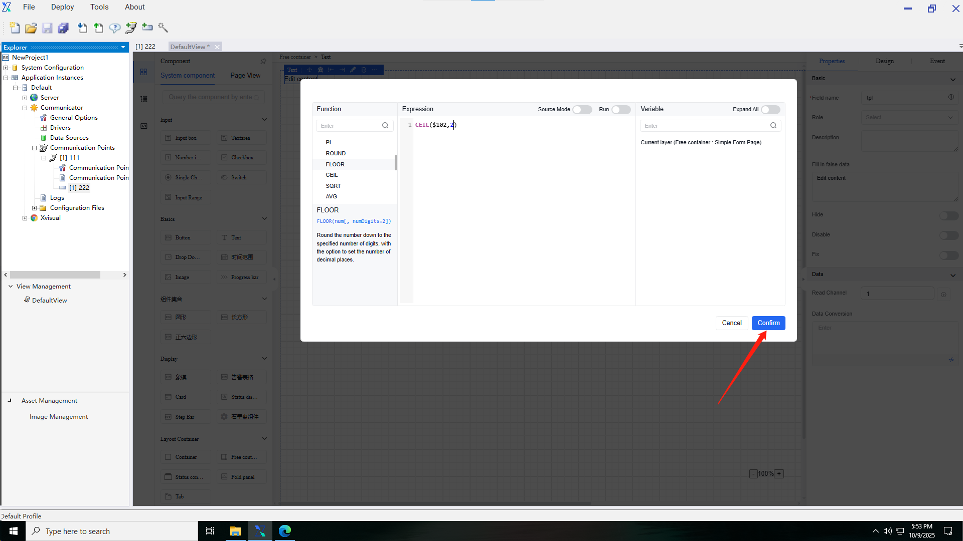
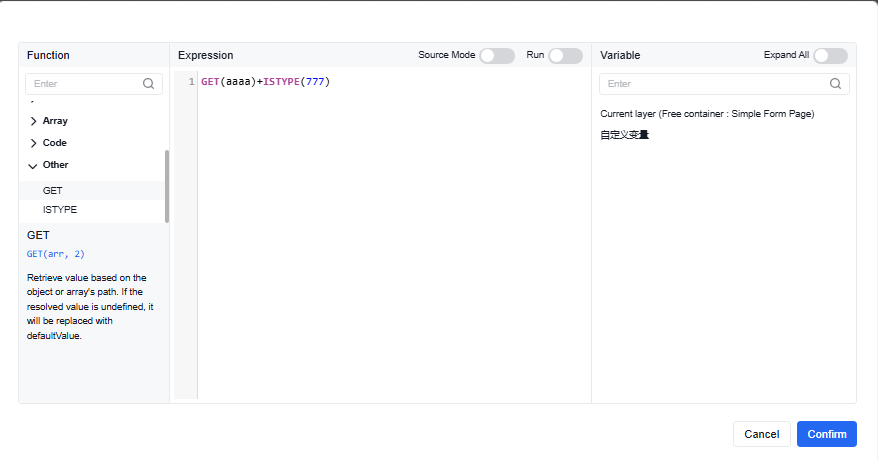
4.2.5.4 Custom functions
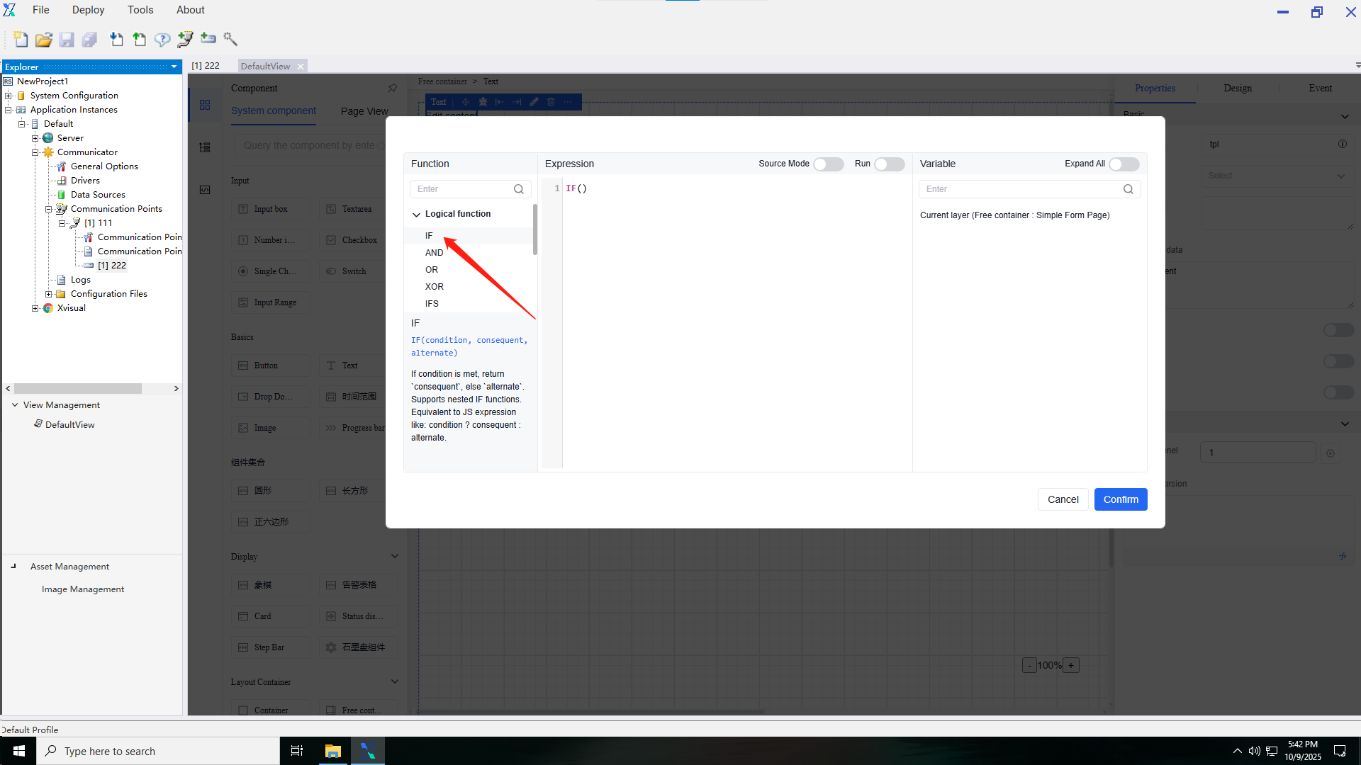
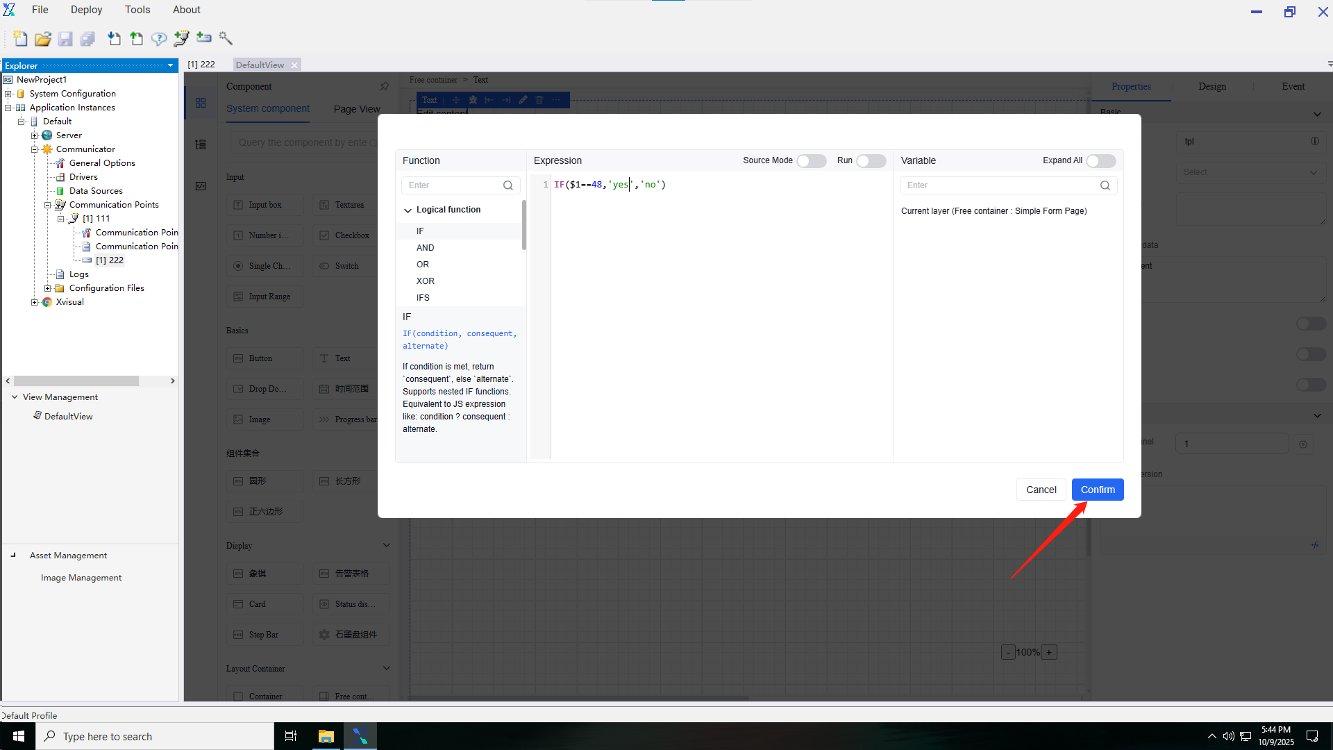
Custom functions allow users to define data processing and conversion independently. Custom functions support operations such as logical functions, mathematical functions, text functions, date functions, arrays, and encoding. It applies to the sections requiring data conversion in properties and events.
The function operation steps are as follows:
i.Open the custom function popup and select the function to be set.
ii.Enter the variables that need to be adjusted in the current layer within the function.
iii.Click “OK” to echo the data back to the text box of the custom function.
Variables used in custom functions can be preset key values from free containers, component field name within the current page, or currently bound channels. When using key values or component field name, simply enter the field name or key directly. If using channels, prefix the channel number with . For example, to use the value of channel 2, you can use 2.
5. Component Introduction
5.1 Introduction to basic component functions
5.1.1 Property
5.1.2 Appearance
5.1.3 Event
5.2 Underlying free container
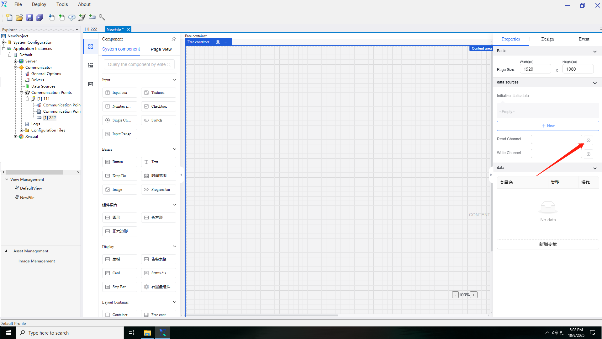
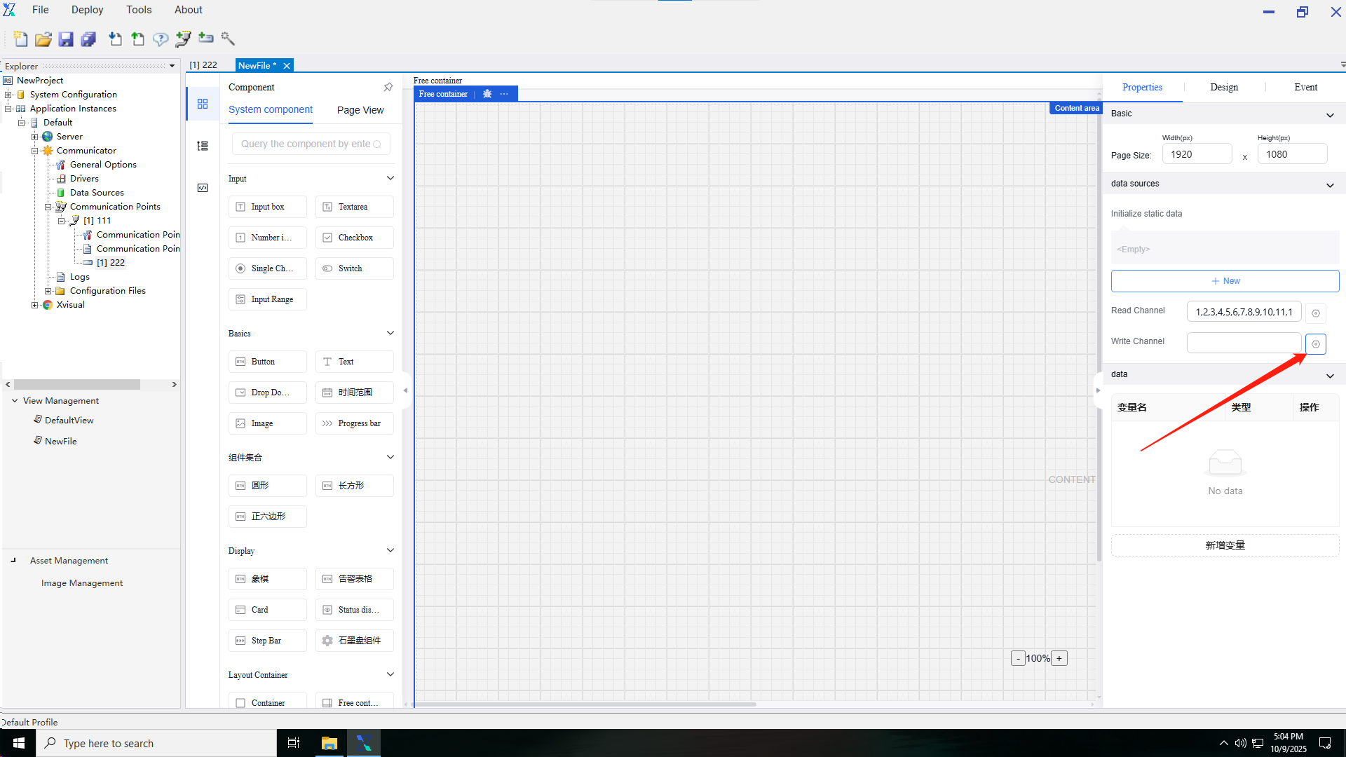
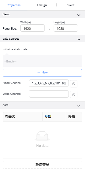
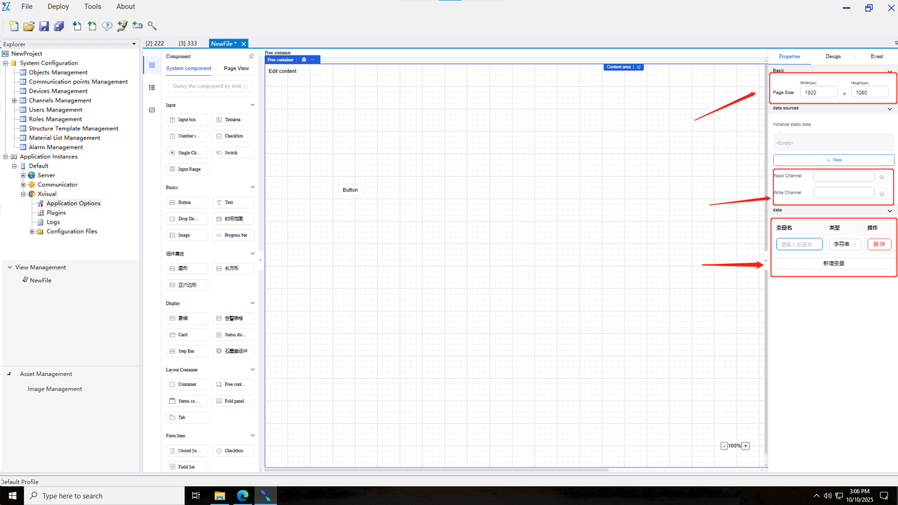
After opening the view, the default view page displays the underlying free container with a default page size of 1920x1080. Users can bind the point channels to be displayed and written in the underlying free container and can customize variables in the current canvas for later use.
The events supported by the underlying container are initialization events, where the triggered actions are configured during page load display.
5.3 Input components
5.3.1 Input box
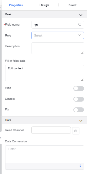
A form component for single-choice text input and display. Input types include text, email, password, and URL. When email is selected, automatic validation is enabled to check if the input complies with email format requirements. Properties and events are shown in the following table:
| Type | Content | Name |
|---|---|---|
| Property | Basic | Reference Position |
| Field Name | ||
| Title | ||
| Description | ||
| Visible | ||
| Disable | ||
| Fix | ||
| Data | Read Channel | |
| Data Conversion | ||
| Event | Value Change | |
| Gaining Focus | ||
| Losing Focus | ||
| Validation Success | ||
| Validation Failure |
Operation Instance*
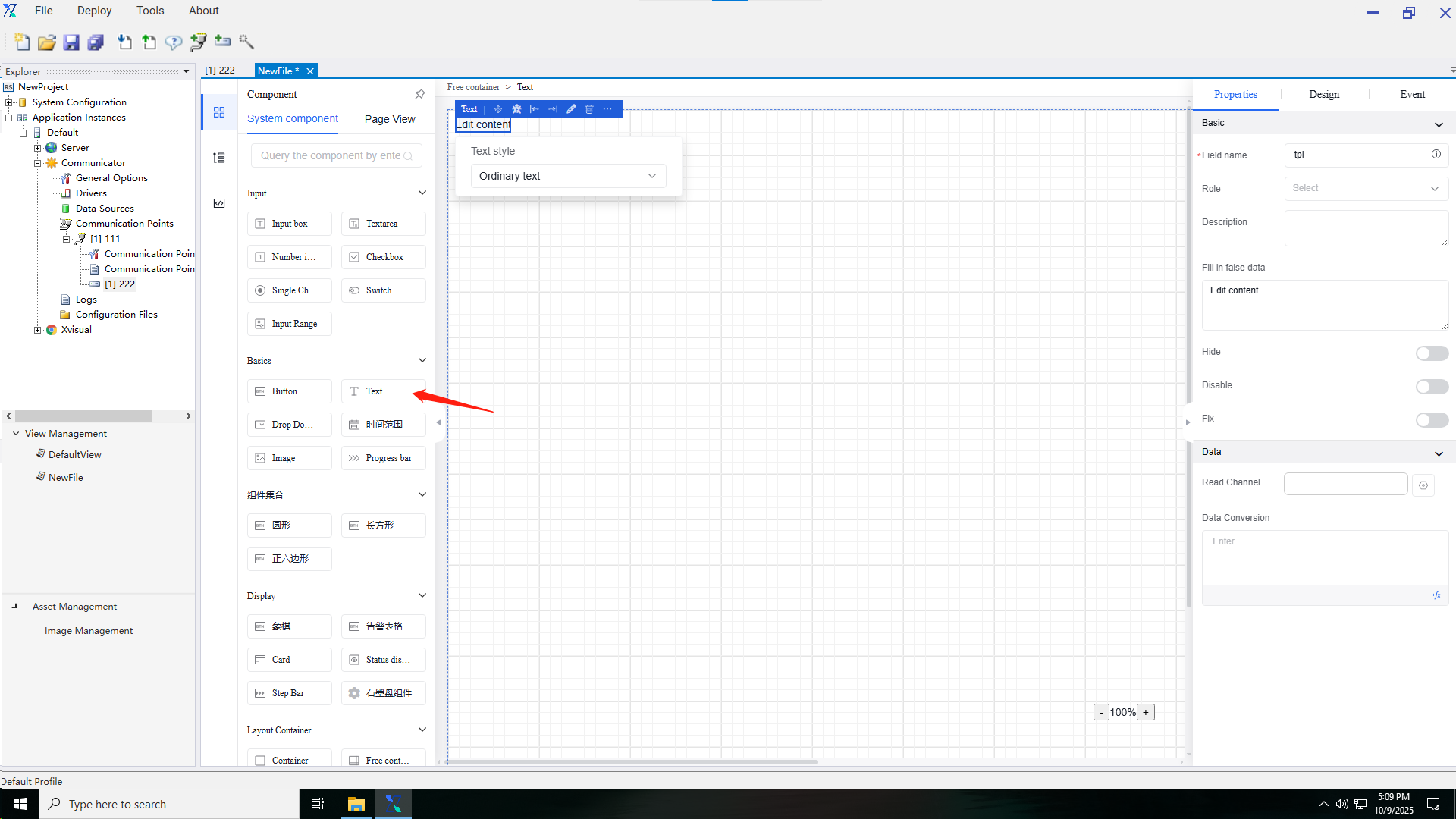
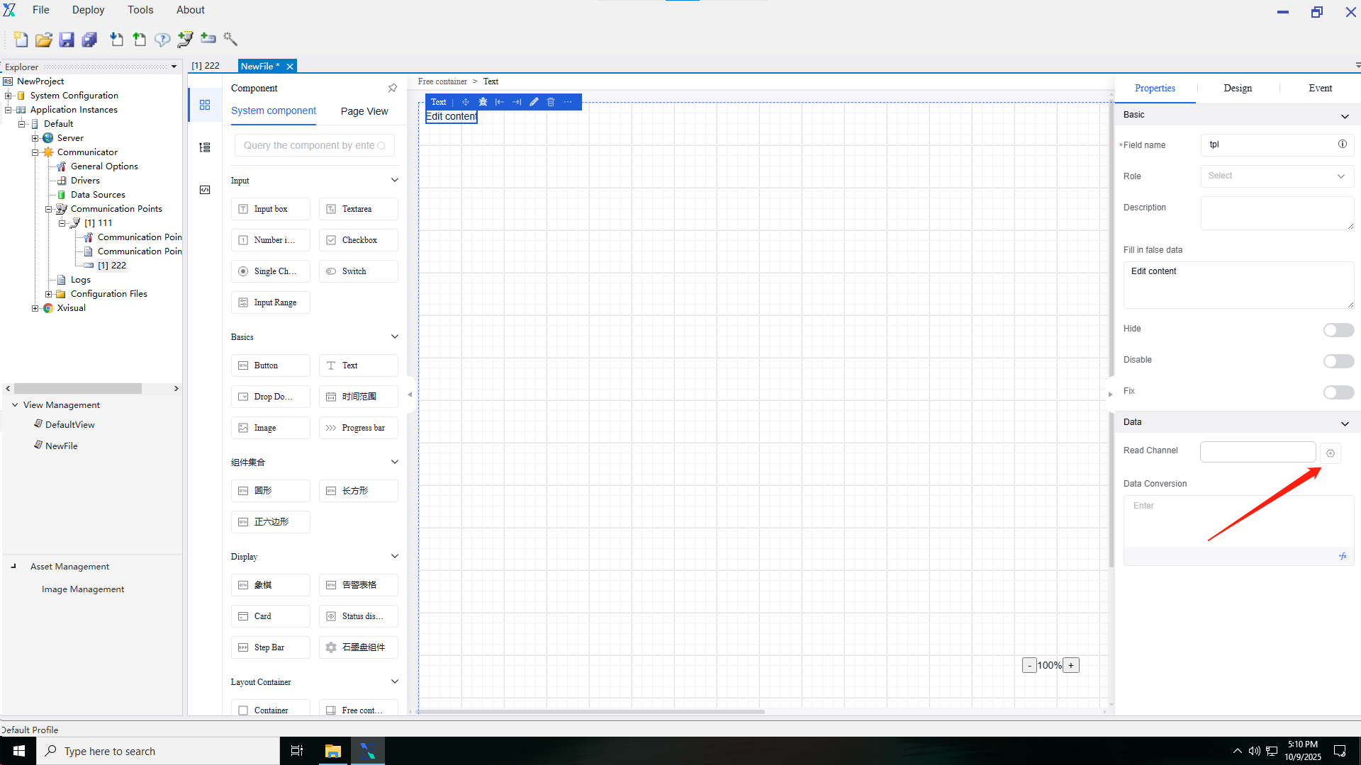
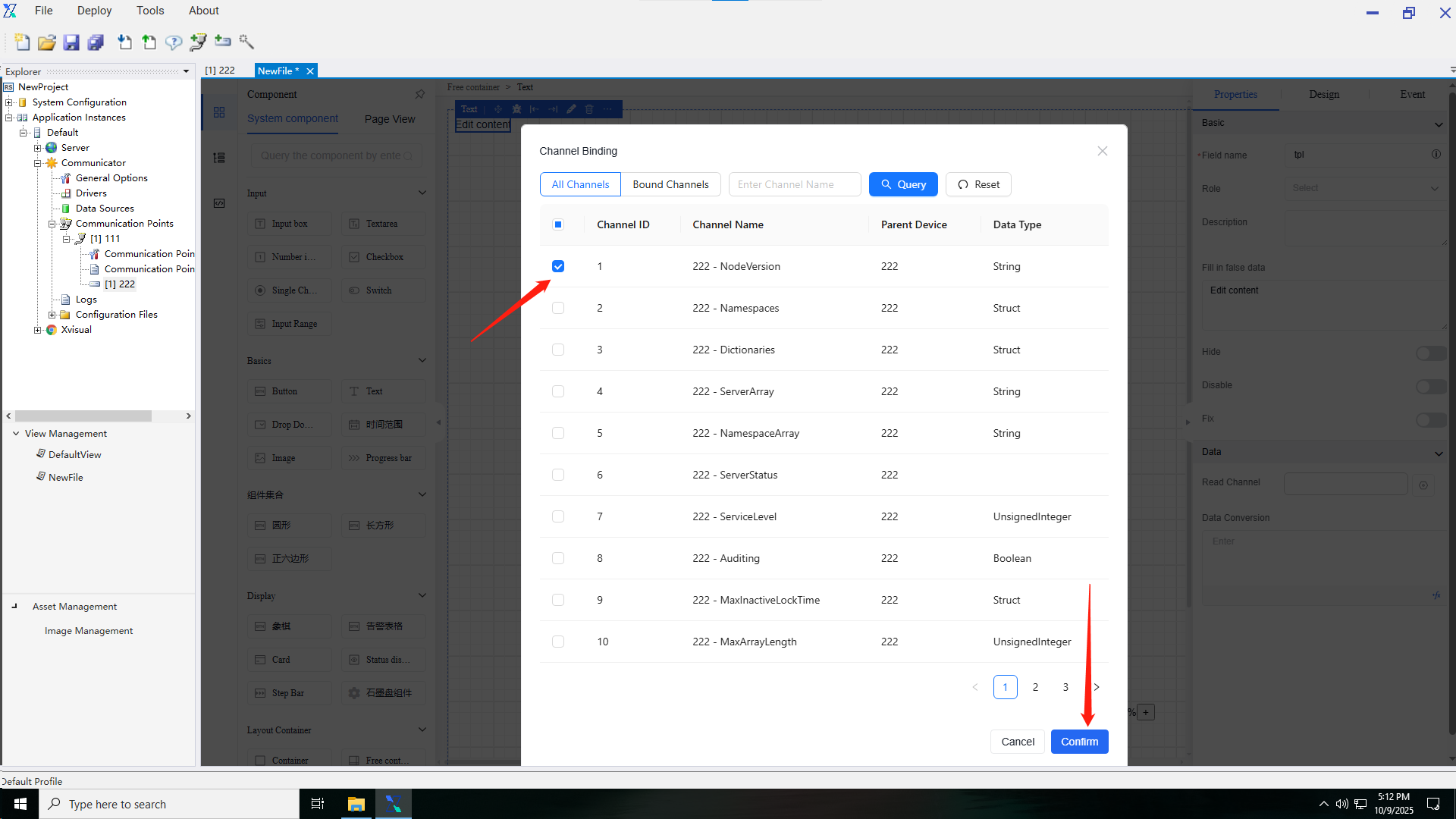
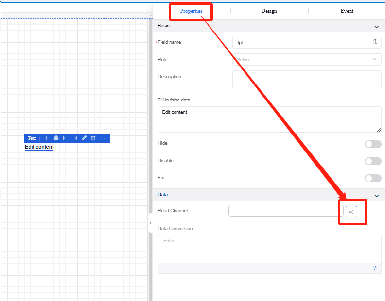
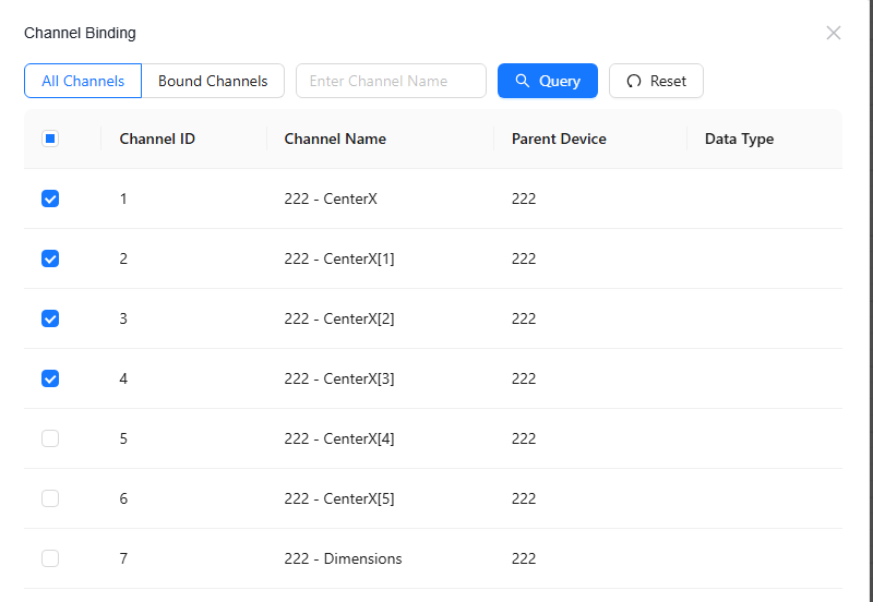
5.3.1.1 Binding read channels
-
Before binding the read channel for an individual component (such as Text Input Box), the read channel binding for the free container containing the individual component must be completed
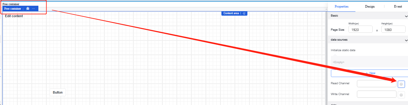
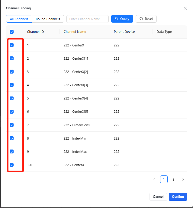
-
Click the “Text Input Box”, and then click the “Edit” button for the read channel in the “Data” section of the “Properties” section in the property bar.
-
On the "Channel Binding" interface, select the channel to be read and confirm it.
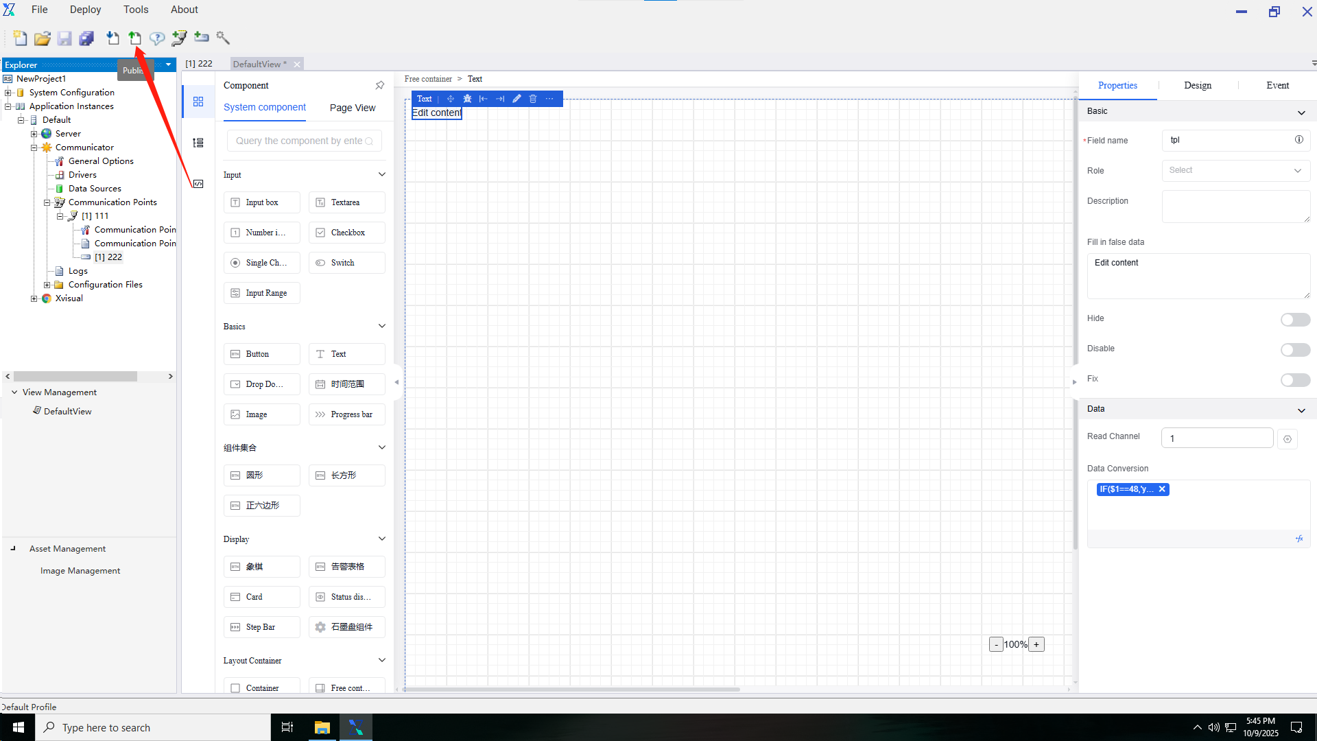
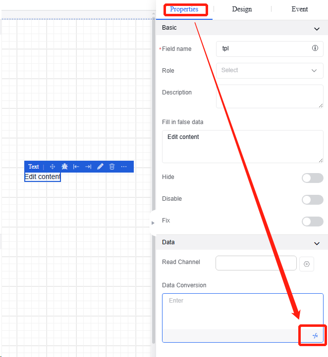
5.3.1.2 Data conversion
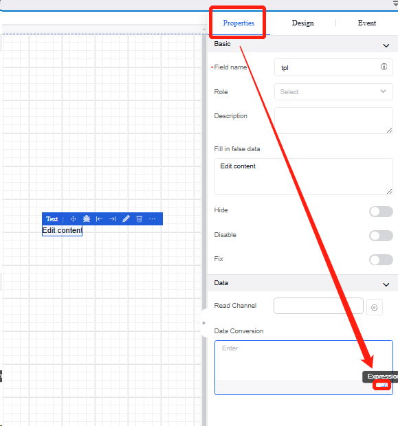
-
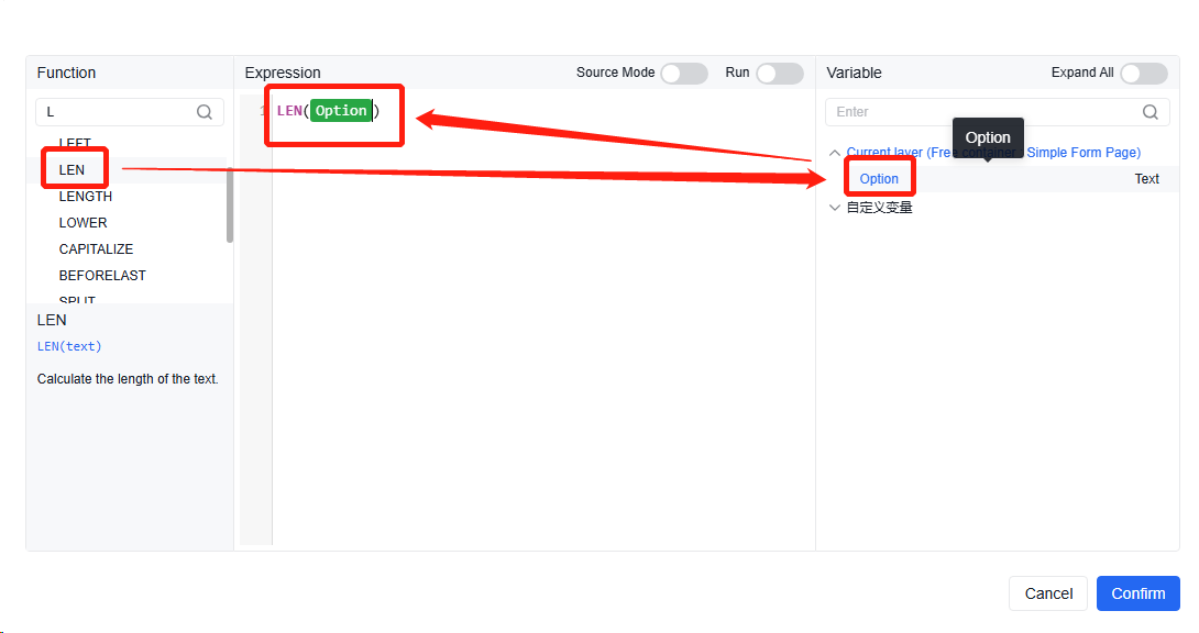
Click the "Text Input Box", and then in the "Properties" section of the property bar, click the fx button for data conversion in the "Data" section to enter the function setting page, or directly click the blank area to edit the data conversion format.
-
In the function setting interface, select the desired function type on the left side, and select the variables to participate in the function on the right side.
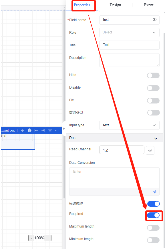
▪ Maximum length & minimum length
i. Click the "Text Input Box", and then in the "Properties" section of the property bar, click the button for maximum length or minimum length in the "Data" section to edit character limits and error prompts.
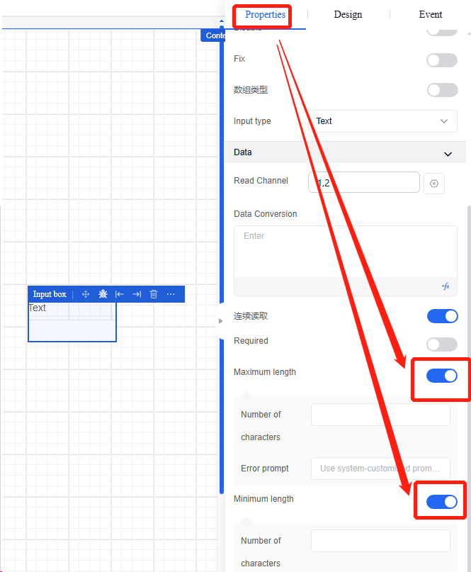
▪ Required
i. Click the "Text Input Box", and then in the "Properties" section of the property bar, click the "Required" button in the "Data" section.
5.3.2 Multi-line text box
It is a text component that requires line feed for input. It supports properties and events in the following table:
| Type | Content | Name |
|---|---|---|
| Property | Basic | Reference Position |
| Field Name | ||
| Title | ||
| Default Value | ||
| Trim Leading and Trailing Whitespace | ||
| Counter | ||
| Maximum Character Count | ||
| Title Prompt | ||
| Control Prompt | ||
| Placeholder Hint | ||
| Description | ||
| Data Entry | ||
| Data | Read Channel | |
| Data Conversion | ||
| Status | Visible | |
| Hidden | ||
| Disable | ||
| Fix | ||
| Delete Field When Hidden | ||
| Static Display | ||
| Read-Only | ||
| Validation | Required | |
| Minimum Length | ||
| Maximum Length | ||
| Event | Value Change | |
| Gaining Focus | ||
| Losing Focus | ||
| Validation Success | ||
| Validation Failure |
Operation Instance
5.3.2.1 Binding read channels
Refer to the binding read channel operation of text input box.
5.3.2.2 Data conversion
Refer to the data conversion operation of text input box.
5.3.3 Digital input
It is a component requiring numeric input, and it supports setting maximum and minimum values, step size, and precision. It supports properties and events in the following table:
| Type | Content | Name |
|---|---|---|
| Property | Basic | Reference Position |
| Field Name | ||
| Title | ||
| Keyboard Events | ||
| Thousand Separator | ||
| Default Value | ||
| Minimum Value | ||
| Maximum Value | ||
| Step Size | ||
| Decimal Places | ||
| Prefix | ||
| Suffix | ||
| Title Prompt | ||
| Control Prompt | ||
| Placeholder Hint | ||
| Description | ||
| Data Entry | ||
| Status | Visible | |
| Hidden | ||
| Disabled | ||
| Event | Value Change | |
| Validation Success | ||
| Validation Failure | ||
| Gaining Focus | ||
| Losing Focus |
5.3.3.1 New options
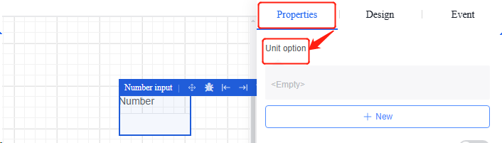
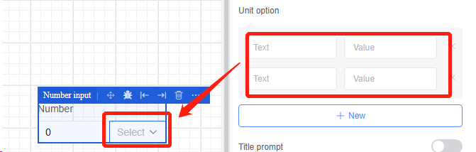
- Click the "Number Input Box" to edit unit options in the "Properties" section of the property bar.
5.3.4 Checkbox
A checkbox component that can be configured with multiple checkboxes through “options” or pull options via “source”. It supports properties and events in the following table:
| Type | Content | Name |
|---|---|---|
| Property | Basic | Reference Position |
| Field Name | ||
| Title | ||
| Select All | ||
| Concatenated Value | ||
| Delimiter | ||
| Title Prompt | ||
| Control Prompt | ||
| Description | ||
| Data Entry | ||
| Data | Data | |
| Option Template | ||
| Create | ||
| Edit | ||
| Delete | ||
| Status | Visible | |
| Hidden | ||
| Delete Field When Hidden | ||
| Static Display | ||
| Disable | ||
| Validation | Required | |
| Event | Value Change | |
| Confirm Creation | ||
| Confirm Editing | ||
| Confirm Deletion | ||
| Validation Success | ||
| Validation Failure |
Operation Instance
5.3.4.1 Custom options
-
Click the "Checkbox" and then click the custom option in the "Data" section of the "Properties" section in the property bar.
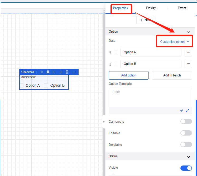
-
Edit the content and quantity of checkboxes. The options cannot be duplicated. If duplicated, the system will prompt 'This option already exists, please re-enter”.
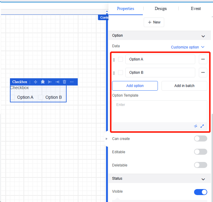
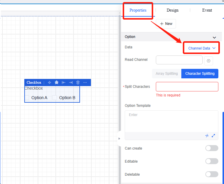
5.3.4.2 Channel data
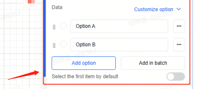
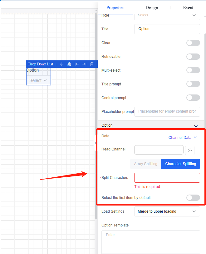
- Click “Checkbox”, and then in the “Properties” section of the property bar, click the channel data in “Data” section to bind the channel to a data point (refer to the binding read channel of text input boxes). When selecting the character split option, the split character field is required. The channel returns a string that is split according to the specified character, and the split elements are populated into the dropdown list.
5.3.4.3 New options
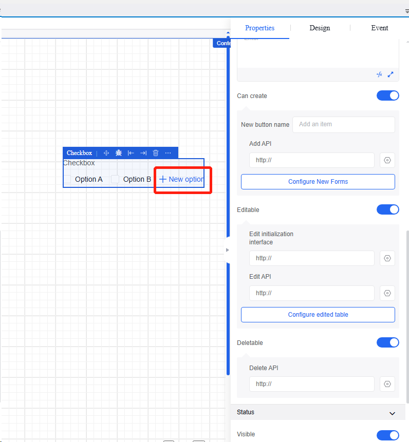
- Click the “Create” button to add “New Option” in the display section, allowing users to freely edit options.
5.3.5 Single choice
A single-choice component that allows configuring options via “options” or pulling options via “source”. It supports properties and events in the following table:
| Type | Content | Name |
|---|---|---|
| Property | Basic | Reference Position |
| Field Name | ||
| Title | ||
| Default Value | ||
| Title Prompt | ||
| Control Prompt | ||
| Data Entry | ||
| Data | Data | |
| Select the first item by default | ||
| Status | Visible | |
| Hidden | ||
| Delete Field When Hidden | ||
| Static Display | ||
| Disable | ||
| Validation | Required | |
| Event | Value Change | |
| Validation Success | ||
| Validation Failure |
Operation Instance
5.3.5.1 Custom options
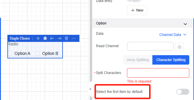
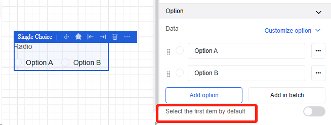
Refer to the custom operation of checkbox in Section 4.4.4. Add the “Select the first item by default'.
5.3.5.2 Channel data
Refer to the channel data operation of checkbox in Section 4.4.4. Add the “Select the first item by default”.
5.3.6 Switch
Switch control. Properties and events are shown in the following table:
| Type | Content | Name |
|---|---|---|
| Property | Basic | Field Name |
| Description | ||
| Visible | ||
| Fix | ||
| Disable | ||
| Data | Read Channel | |
| Data Conversion | ||
| Fill Text | ||
| Value Format | ||
| Event | Click | |
| Validation Success | ||
| Validation Failure |
Operation Instance
5.3.6.1 Binding read channels
Refer to the binding read channel operation of text box input in Section 4.4.1.
5.3.6.2 Data conversion
Refer to the data conversion operation of text box input in Section 4.4.1.
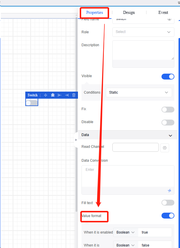
5.3.6.3 Value format
Click the "Switch", and then click the value format in the "Data" section under the "Properties" section of the property bar to set the parameter format when the switch changes, with Boolean being the default type.
5.3.7 Slider
A slider component that is used to select a specific value or range. Properties and events are shown in the following table:
| Type | Content | Name |
|---|---|---|
| Property | Basic | Reference Position |
| Field Name | ||
| Title | ||
| Dual Slider | ||
| Default Value | ||
| Minimum Value | ||
| Maximum Value | ||
| Step Size | ||
| Decimal Places | ||
| Unit | ||
| Value Label | ||
| Input Enabled | ||
| Data Entry | ||
| Track | Chunk | |
| Subscript | ||
| Select the first item by default | ||
| Data | Read Channel | |
| Data Conversion | ||
| Status | Visible | |
| Hidden | ||
| Delete Field When Hidden | ||
| Static Display | ||
| Disable | ||
| Validation | Required | |
| Event | Value Change | |
| Gaining Focus | ||
| Losing Focus | ||
| Validation Success | ||
| Validation Failure |
Operation Instance
5.3.7.1 Binding read channels
Refer to the binding read channel operation of text box input in Section 4.4.1.
5.3.7.2 Data conversion
Refer to the data conversion operation of text box input in Section 4.4.1.
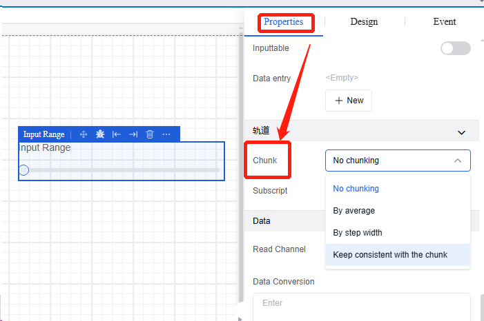
5.3.7.3 Slider chunk
Click "Slider", and then click the "Chunk" in the "Track" section in the "Properties" section in the property bar to configure chunk settings for the slider progress bar based on business needs.
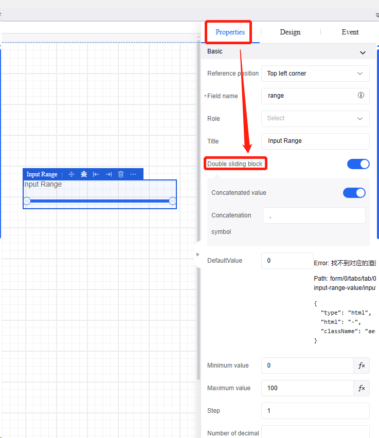
5.3.7.4 Dual slider
Click "Slider", and then click the "Dual Slider" in the "Data" section of the "Properties" section in the property bar to set sliders simultaneously at both ends of the progress bar.
5.4 Basic components
5.4.1 Button
A button component that can be configured with different display styles and click behaviors. Properties and events are shown in the following table:
| Type | Content | Name |
|---|---|---|
| Property | Basic | Content |
| Reference Position | ||
| Description | ||
| Visible | ||
| Disable | ||
| Fix | ||
| Event | Click | |
| Mouse over | ||
| Mouse out |
Operation Instance
5.4.1.1 Binding read channels
Refer to the binding read channel operation of text box input in Section 4.4.1.
5.4.1.2 Data conversion
Refer to the data conversion operation of text box input in Section 4.4.1.
5.4.1.3 Click event
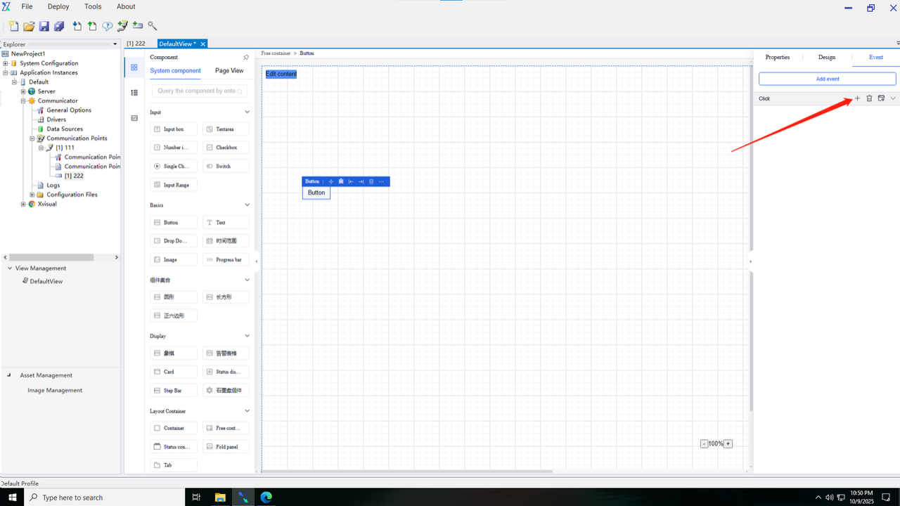
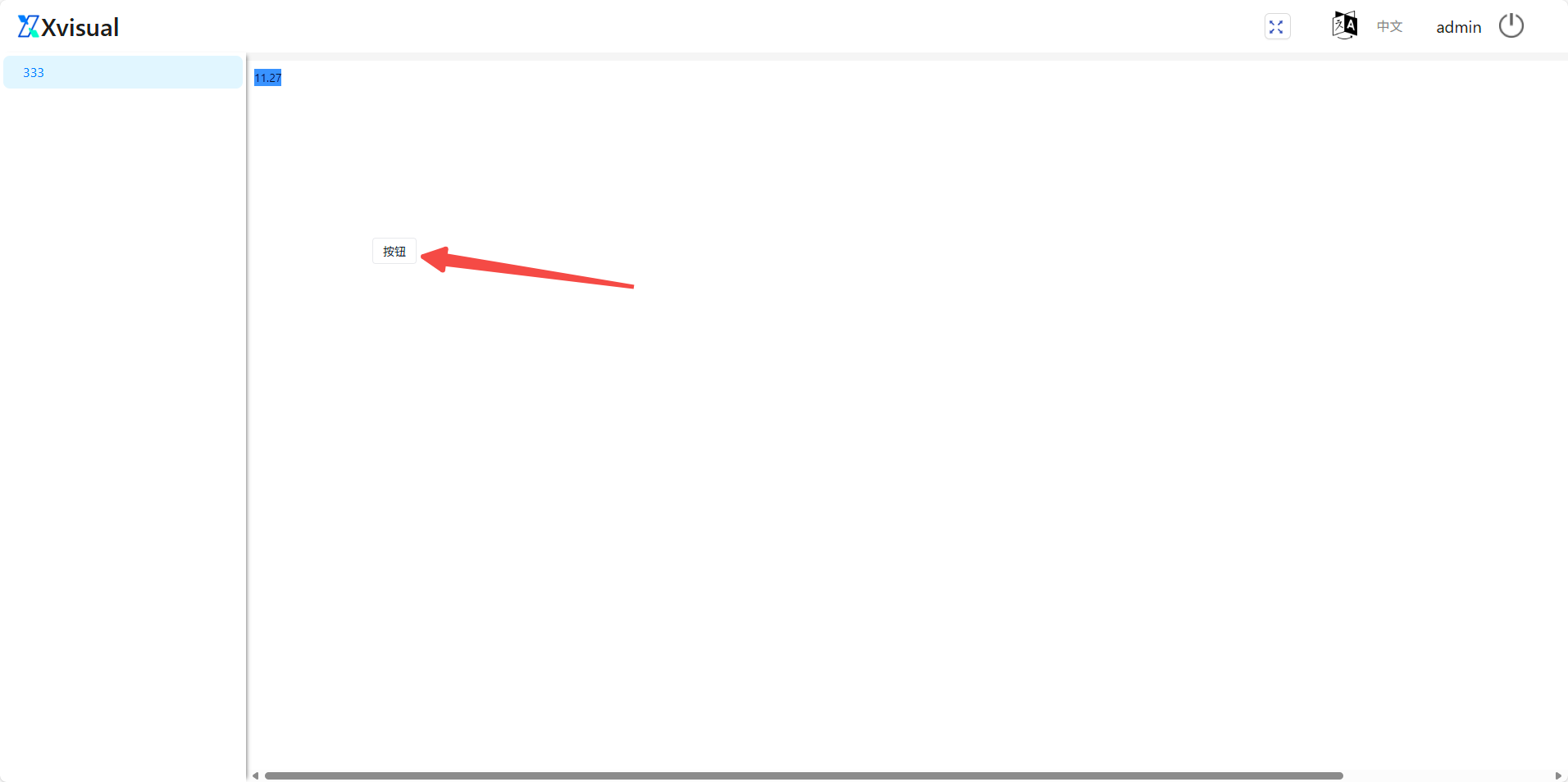
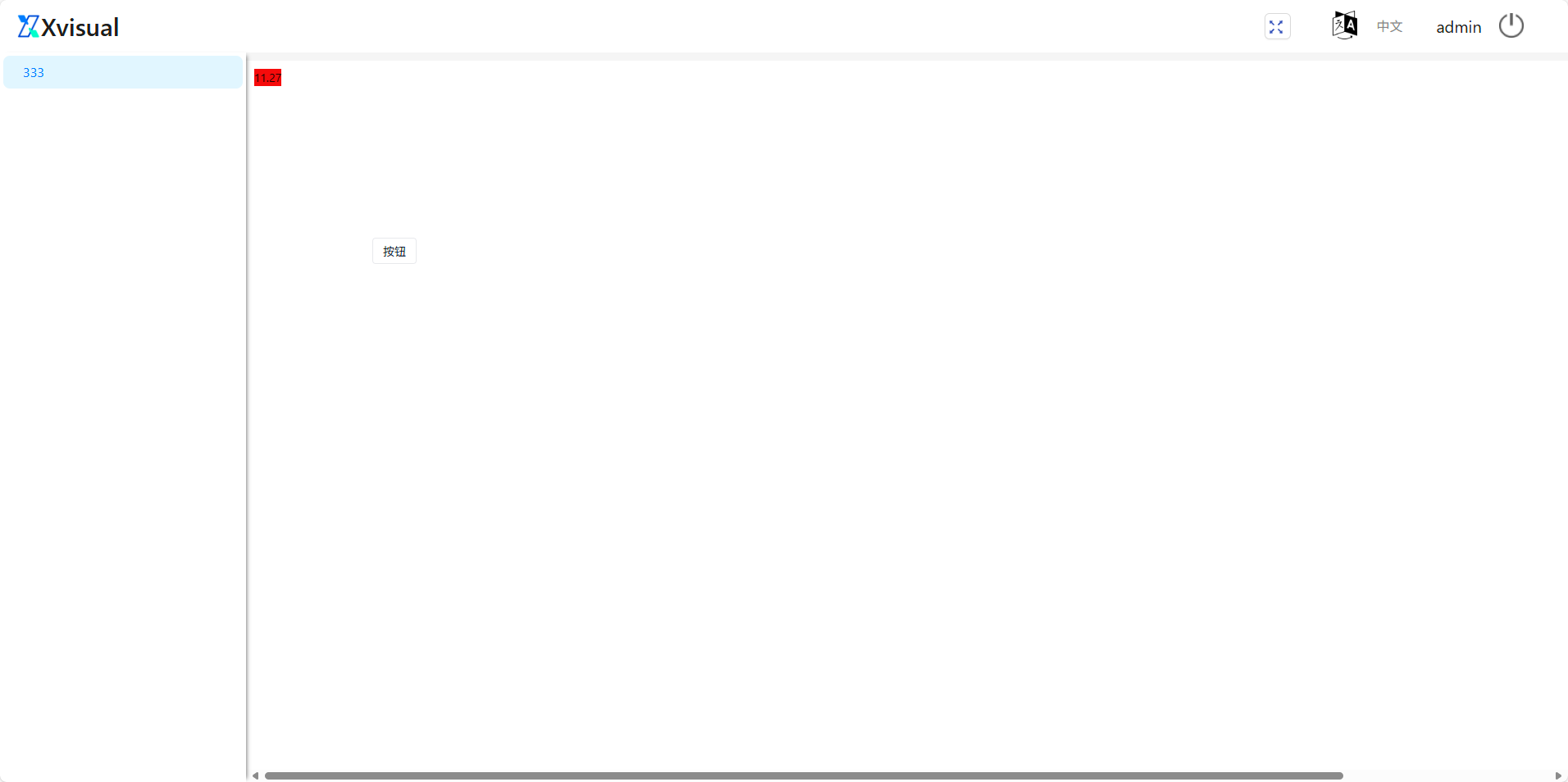
- Click the "Button". The "Click" event exists by default in the "Events" section of the property bar.
- Click the "+" to enter the action configuration page.
5.4.2 Word
It is a text component for displaying text or paragraphs. It supports template syntax and can be associated with dynamic data. Properties and events are shown in the following table:
| Type | Content | Name |
|---|---|---|
| Property | Basic | Content |
| Reference Position | ||
| Description | ||
| Visible | ||
| Disable | ||
| Fix | ||
| Event | Click | |
| Mouse over | ||
| Mouse out |
5.4.2.1 Binding read channels
a. Refer to the binding read channel operation of text input box.
5.4.2.2 Data conversion
a. Refer to the data conversion operation of text input box.
5.4.2.3 aximum length
a. Refer to the maximum length operation for text box input.
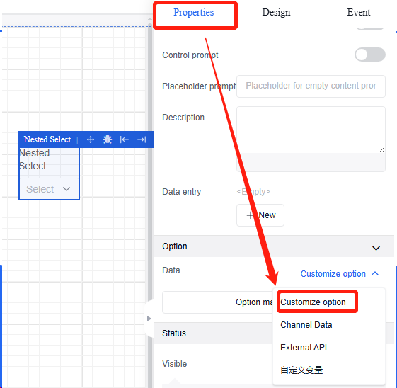
5.4.3 Drop-down list
5.4.3.1 Property
Basic property information allows setting the field name of the component (unique in canvas), customizing the component title (default “Option”), and configuring dropdown list options (through four methods: custom option, data channel, external interface, and custom variable).
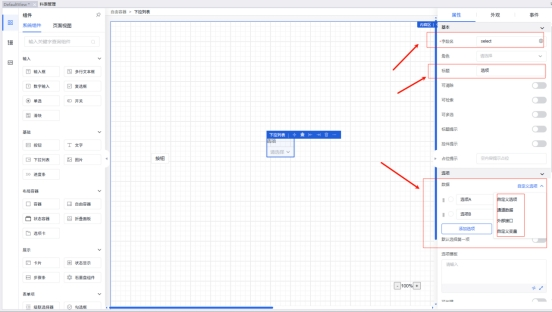
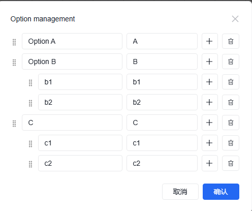
The custom option method is typically used to set fixed values for dropdown menus. If the dropdown menu is a dropdown list for administrative regions, users can independently add option values.
The channel data method for the configuration of the dropdown list allows users to select channel data and then perform specific character splitting to obtain the information of the dropdown list. Currently, only string-type data is supported.
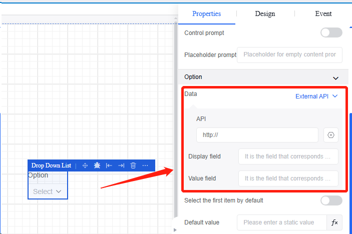
The external interface method is to obtain the return results by filling external APIs and then display them in the dropdown menu (this function is currently unavailable).
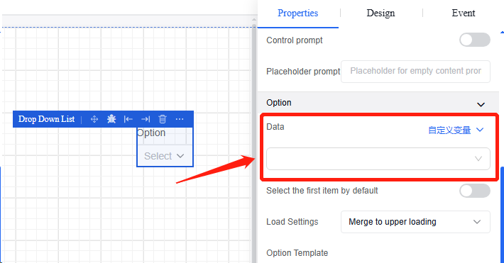
The custom variables method can be used to obtain the values of the dropdown list. By selecting the desired custom variables in the input field, the assigned variable values will appear in the dropdown list.
5.4.3.2 Appearance
The appearance module is primarily used to adjust the component appearance, including form item size, title style, font style, and checkbox style.
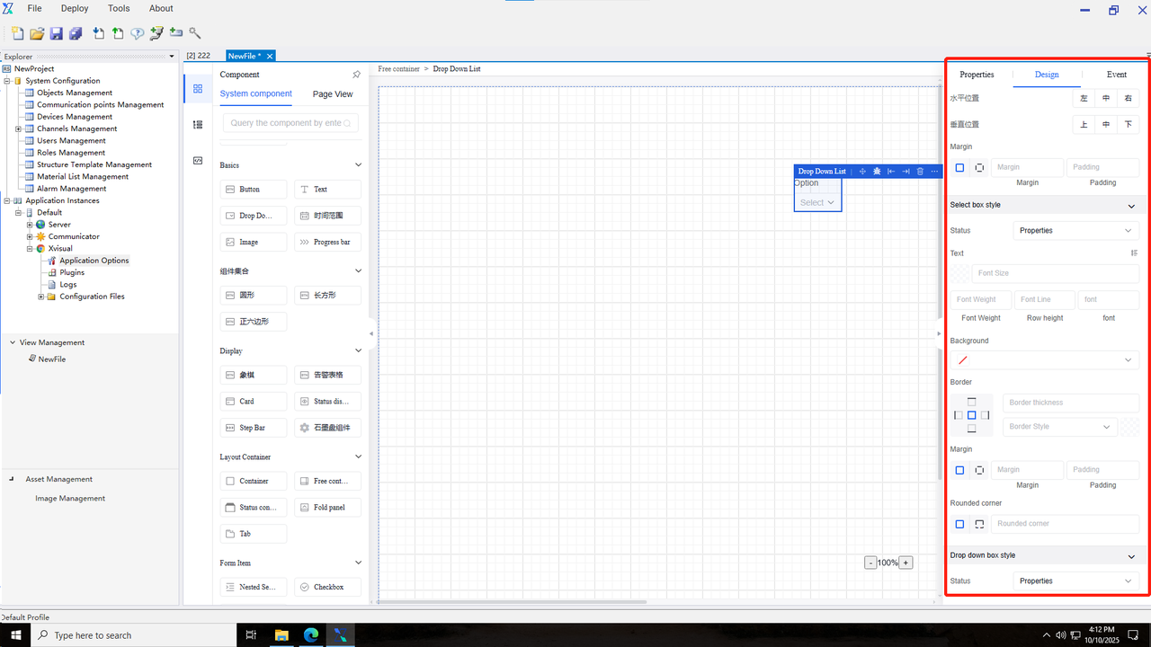
5.4.3.3 Event
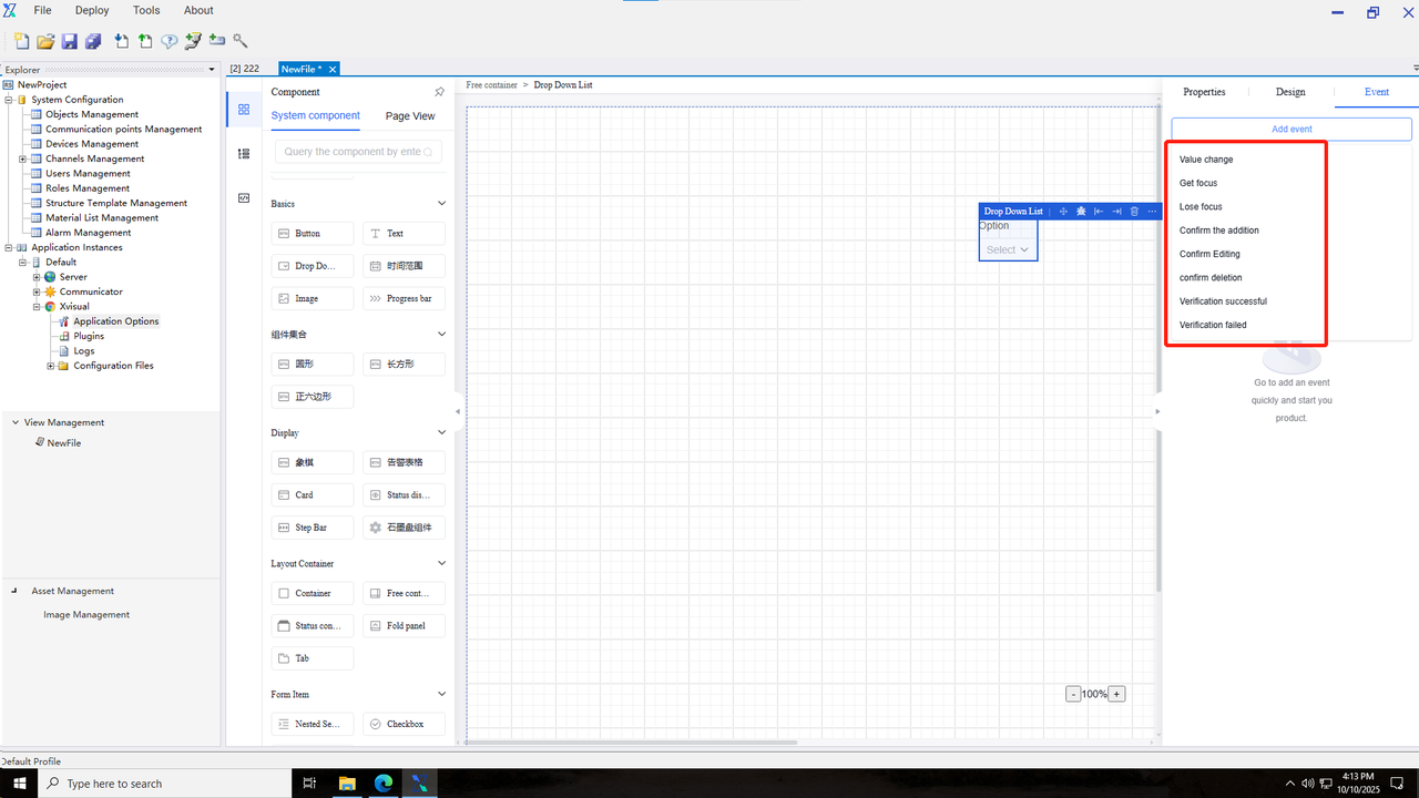
The event types supported in the dropdown list include “value change”, “gaining focus”, “losing focus”, “confirm creation”, “confirm editing”, “confirm deletion”, “validation success”, and “validation failure”.
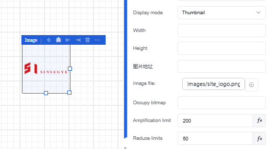
5.4.4 Image
An image component that supports the static settings of image URL and can be configured with name and variable associations. Properties and events are shown in the following table:
| Type | Content | Name* |
|---|---|---|
| Property | Basic | Image Title |
| Image Description | ||
| Display Mode | ||
| Width | ||
| Height | ||
| Image File | ||
| Placeholder Image | ||
| Maximum Zoom Level | ||
| Minimum Zoom Level | ||
| Status | Visible | |
| Hidden | ||
| Event | Click | |
| Mouse over | ||
| Mouse out |
Operation Instance
5.4.4.1 Read channel binding
Refer to the read channel binding operation of text input box in Section 4.4.1.
5.4.4.2 Data conversion
Refer to the data conversion operation of text input box in Section 4.4.1.
5.4.4.3 Image management
○ Click to enter the image management in resource management.
○ Click “Add Image Resource” to perform the image addition operation or batch addition operations.
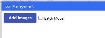
○ Successfully added images will be displayed in the image management.
5.4.4.4 Image use
-
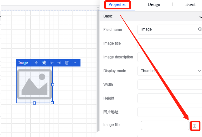
Click the “Image” component, and then click the “Edit” button on the image file in the “Properties” section of the property bar.
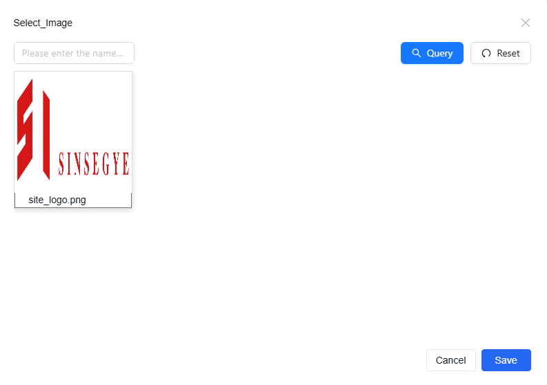
-
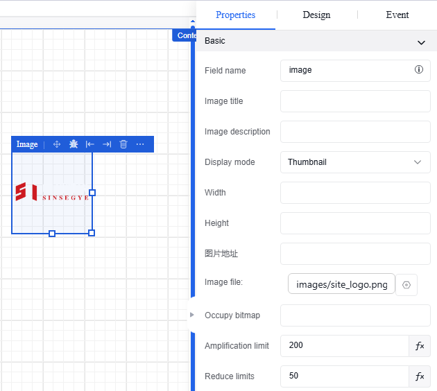
Enter the image selection interface to choose the desired image to upload, and then click “Save” to complete the operation.
-
After completing the upload process, the content of the image component in the view will be updated to the image selected by the user.
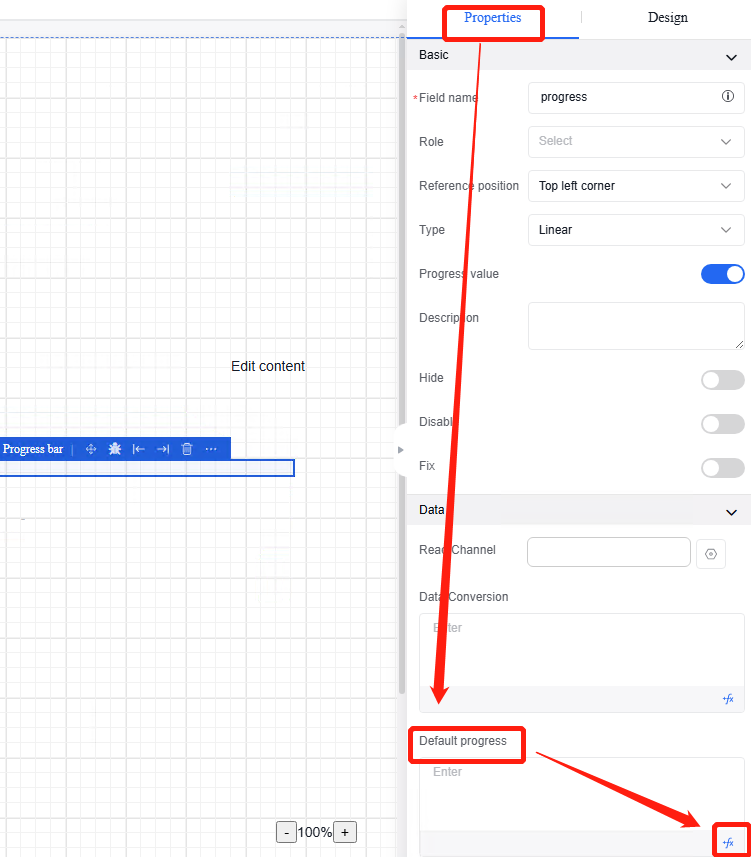
5.4.5 Progress bar
A progress bar component that displays percentages or current progress, with no event function. Properties and events are shown in the following table:
| Type | Content | Name |
|---|---|---|
| Property | Basic | Field Name |
| Reference Position | ||
| Type | ||
| Progress Value | ||
| Description | ||
| Visible | ||
| Disable | ||
| Fix | ||
| Data | Read Channel | |
| Data Conversion | ||
| Default Progress Bar | ||
| Appearance | Dimensions | |
| Line Width | ||
| Display Animation | ||
| Style | ||
| Color |
Operation Instance
5.4.5.1 Read channel binding
Refer to the read channel binding operation of text input box.
5.4.5.2 Data conversion
Refer to the data conversion operation of text input box.
5.4.5.3 Default progress
Click the "progress Bar" to set the “Default Progress” in the “Data” section under the "Properties" section of the property bar. Parameters or functions can be directly entered.
5.5 Graphic component
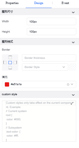
5.5.1 Circle
| Type | Content | Name |
|---|---|---|
| Property | Basic | Field Name |
| Description | ||
| Status | Hidden | |
| Disable | ||
| Fix | ||
| Appearance | Graphic Dimensions | Width |
| Height | ||
| Graphic Style | Border | |
| Filling | ||
| Custom Style | ||
| Event | Click | |
| Initialization |
5.5.2 Rectangle
| Type | Content | Name |
|---|---|---|
| Property | Basic | Field Name |
| Description | ||
| Status | Hidden | |
| Disable | ||
| Fix | ||
| Appearance | Graphic Dimensions | Width |
| Height | ||
| Graphic Style | Border | |
| Filling | ||
| Custom Style | ||
| Event | Click | |
| Initialization |
5.6 Layout container
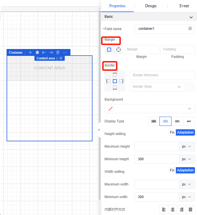
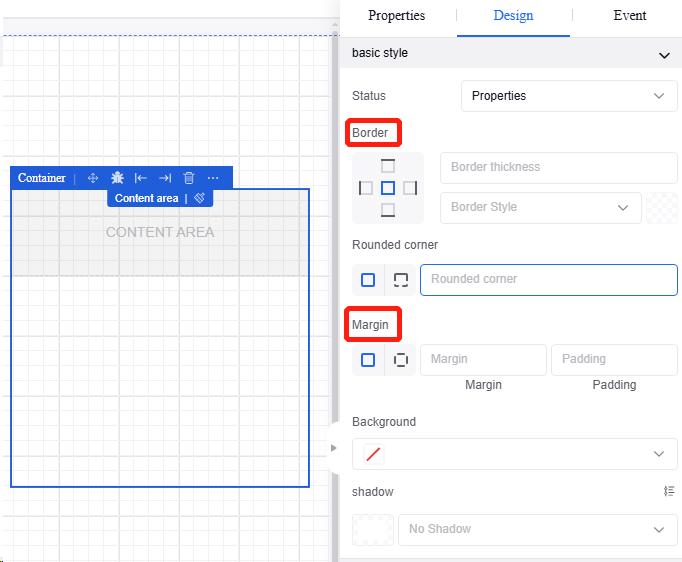
5.6.1 Container
A container component that can hold multiple components together. Properties and events are shown in the following table:
| Type | Content | Name |
|---|---|---|
| Property | Basic | Field Name |
| Margin | ||
| Border | ||
| Background | ||
| Height Configuration | ||
| Height | ||
| Vertical Content Overflow | ||
| Width Settings | ||
| Width | ||
| Horizontal Content Overflow | ||
| Alignment | ||
| Status | Visible | |
| Hidden | ||
| Event | Click | |
| Mouse over | ||
| Mouse out |
Operation Instance*
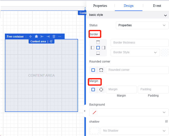
5.6.1.1 Margin and border settings
Click "Container" to set "Margin" and "Border" in the "Properties" and "Appearance" sections of the property bar.
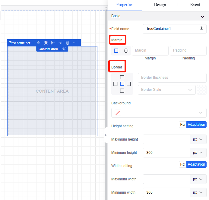
5.6.2 Free Container
A free container component that supports drag-and-drop position adjustment for direct child elements. Properties and events are shown in the following table:
| Type | Content | Name |
|---|---|---|
| Property | Basic | Margin |
| Border | ||
| Background | ||
| Height Configuration | ||
| Height | ||
| Vertical Content Overflow | ||
| Width Settings | ||
| Width | ||
| Horizontal Content Overflow | ||
| Alignment | ||
| Status | Visible | |
| Hidden | ||
| Event | Click | |
| Mouse over | ||
| Mouse out |
Operation Instance
5.6.2.1 Margin and border settings
Click "Free Container" to set "Margin" and "Border" in the "Properties" and "Appearance" sections of the property bar.
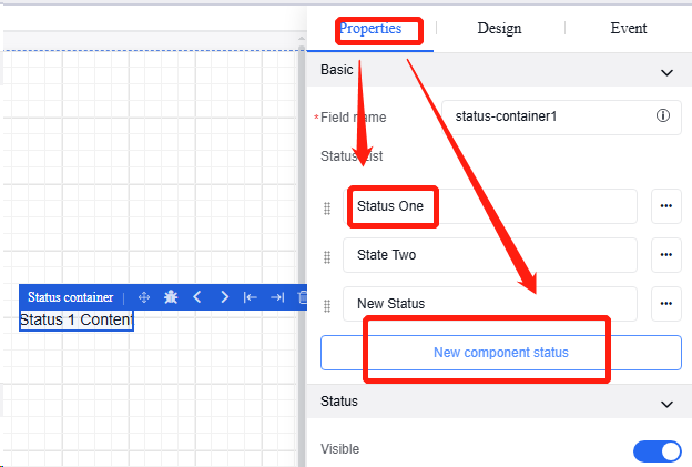
5.6.3 State container
A state container component for conditional rendering of components based on states, facilitating the design of multi-state components. Properties and events are shown in the following table:
| Type | Content | Name |
|---|---|---|
| Property | Basic | Field Name |
| State List | ||
| Status | Visible | |
| Hidden | ||
| Event | Click | |
| Mouse over | ||
| Mouse out |
Operation Instance
5.6.3.1 State settings
Click "State Container" to modify or add new state in the "Properties" of the property bar.
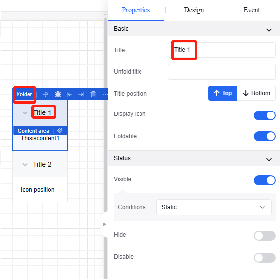
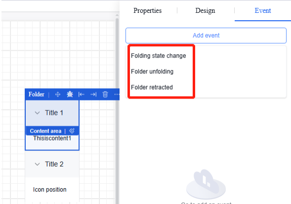
5.6.4 Collapsible panel
A collapsible panel component used for categorizing and housing large amounts of information when there are many categories. Properties and events are shown in the table below
| Type | Content | Name |
|---|---|---|
| Property | Basic | Field Name |
| Reference Position | ||
| Icon Position | ||
| Custom Icon | ||
| Accordion Mode | ||
| Panel Management | ||
| Event | Collapse State Change | |
| Collapser Unfolded | ||
| Collapser Folded |
Operation Instance
5.6.4.1 Content modification
Click the part that needs modification inside the "Collapser". The right property bar allows position adjustment.
5.6.4.2 Collapser events
New collapser events: folding state change, collapser unfolded, and collapser folded.
5.6.5 Tab
Tab component that can be used for content grouping. Properties and events are shown in the following table:
| Type | Content | Name |
|---|---|---|
| Property | Basic | Reference Position |
| Field Name | ||
| Tab | ||
| Title Prompt | ||
| Initial Tab | ||
| Active Tab | ||
| Status | Visible | |
| Hidden | ||
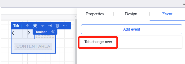
| Event | Tab Switching |
Operation Instance
5.6.5.1 Tab editing
Click the "Tab" to edit the tab content in the "Properties" section of the property bar.
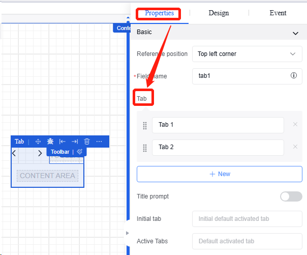
5.6.5.2 Tab switching
Click the "Tab" to add the event “Tab Switching” in the "Events" section of the property bar for tab switching.
5.7 Form item components
5.7.1 Cascading selectors
A cascading selector component that supports sub-items in options, allows fetching options via “source”, and supports multi-selection. Properties and events are shown in the following table:
| Type | Content | Name |
|---|---|---|
| Property | Basic | Field Name |
| Title | ||
| Description | ||
| Visible | ||
| Disable | ||
| Fix | ||
| Option | Custom Options | |
| Channel Data | ||
| External Interface | ||
| Event | Value Change | |
| Gaining Focus | ||
| Losing Focus | ||
| Validation Success | ||
| Validation Failure |
Operation Instance
5.7.1.1 Custom options
-
Click the “Cascading Selectors” component, and then click the custom option in the “Data” section in the “Properties” section of the property bar.
-
Add required cascading options on the selection management page, and then click “Confirm” to save.
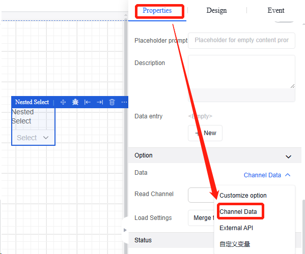
5.7.1.2 Channel data
-
Click "Cascading Selectors", and then select the channel data in the "Data" section under the "Properties" section in the property bar.
-
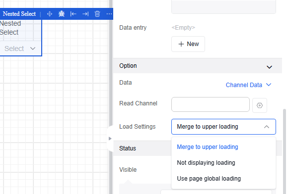
For the use of the read channel, refer to the read channel binding operation of text input box in Section 4.4.1. Loading states include "Merge with parent loading", "Hide loading", and "Use global page loading".
5.7.2 Checkbox
Checkbox component. Properties and events are shown in the following table:
| Type | Content | Name |
|---|---|---|
| Property | Basic | Reference Position |
| Field Name | ||
| Title | ||
| Instructions | ||
| Value Format | ||
| Default Selection | ||
| Title Prompt | ||
| Control Prompt | ||
| Description | ||
| Data Entry | ||
| Status | Visible | |
| Hidden | ||
| Disabled | ||
| Event | Value Change | |
| Validation Success | ||
| Validation Failure |
5.7.2.1 Value format
Refer to the value format setting operation of switch in Section 4.4.6.
5.7.2.2 Verification rules
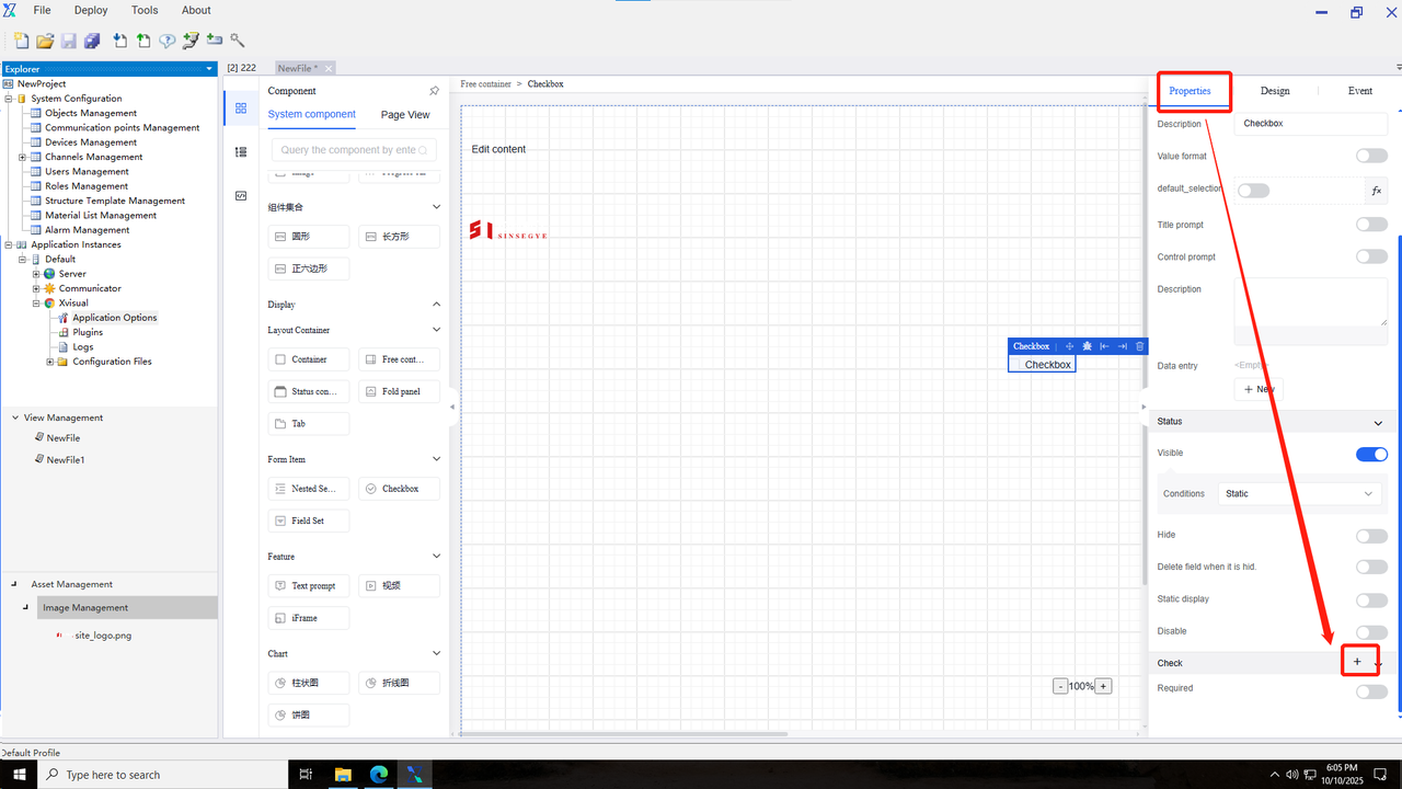
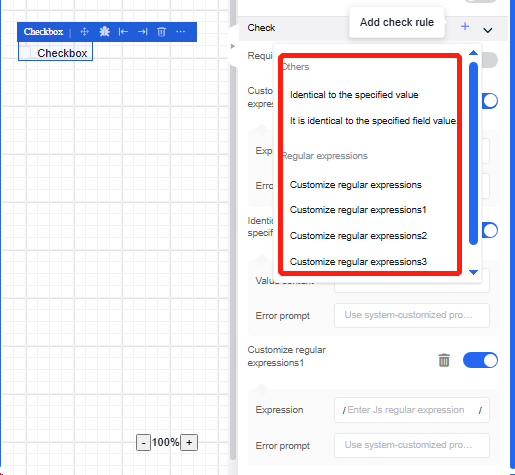
-
Click the "Checkbox", and then click the "+" in the "Validation" section under the "Properties" in the property bar.
-
Multiple validation rules can be selected.
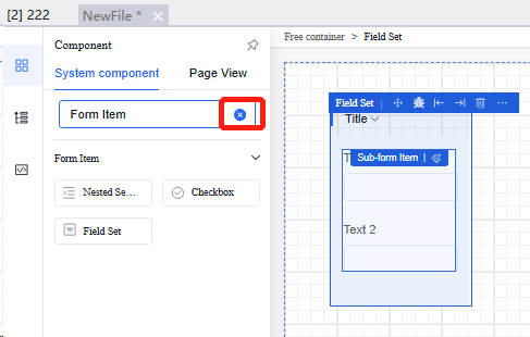
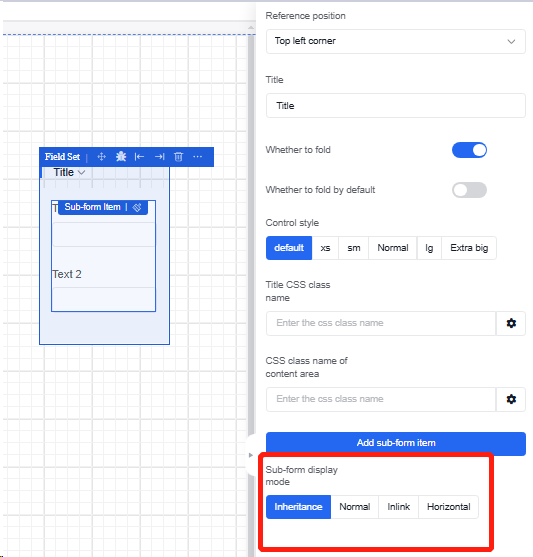
5.7.3 Field set
It supports embedding of other components, but does not support appearance or other settings. Properties and events are shown in the following table:
| Property |
|---|
| Title |
| Collapsible |
| Default Collapsed |
| Control Style |
| Title CSS Style |
| Content Area CSS Style |
| Add Sub-Form Item |
| Subform Display Mode |
5.7.3.1 Adding and modifying subcomponents
-
Click "Field Set", and then in the "Properties" section, click "Add Sub-Form Item" to select the required form items from the form items of the left component.
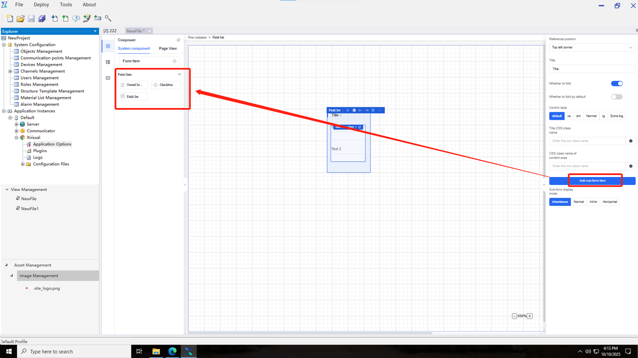
-
Delete the "Display" entry in the search box of the component bar to show all components that can be added to the card.
-
Click the component outline in the left view structure, and then click the component title you want to edit. The property bar for the individual component will appear on the right. The operation methods for each component are the same as the original component.
-
After clicking "Field Set", you can select the display relationships of components in the sub-form display mode.
5.8 Functional components
5.8.1 Text prompt
Text display component. Similar to a container, it can hold multiple renderers together. When users hover or click on the container, a text tooltip overlay will appear. Properties and events are shown in the following table:
| Type | Content | Name |
|---|---|---|
| Property | Basic | Reference Position |
| Prompt Title | ||
| Prompt Content | ||
| Trigger Method | ||
| Prompt Position | ||
| Theme Color | ||
| Container Embedding |
5.8.2 iFrame
A component that can be embedded into existing pages. Properties and events are shown in the following table:
| Type | Content | Name |
|---|---|---|
| Property | Basic | Reference Position |
| Prompt Title | ||
| Page URL | ||
| Status | Visible | |
| Hidden |
5.9 Display components
5.9.1 Card
A card component that supports embedding other components. Properties and events are shown in the following table:
| Type | Content | Name |
|---|---|---|
| Property | Basic | Reference Position |
| Title | ||
| Subtitle | ||
| Image URL | ||
| Open External Link | ||
| Description | ||
| Highlight Expression | ||
| Status | Visible | |
| Hidden |
Operation Instance
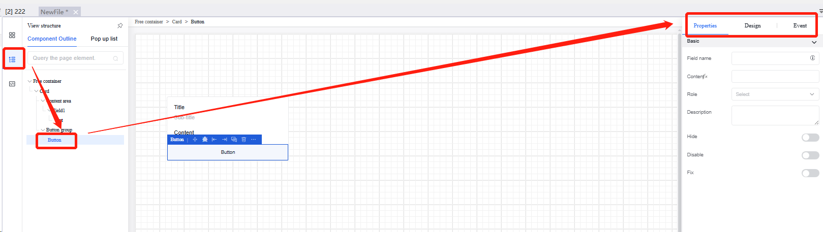
5.9.1.1 Adding and modifying subcomponents
-
Click "Card", and then click "Add" in the "Properties" section of the property bar to select the form items to be added from the form items of the left component.
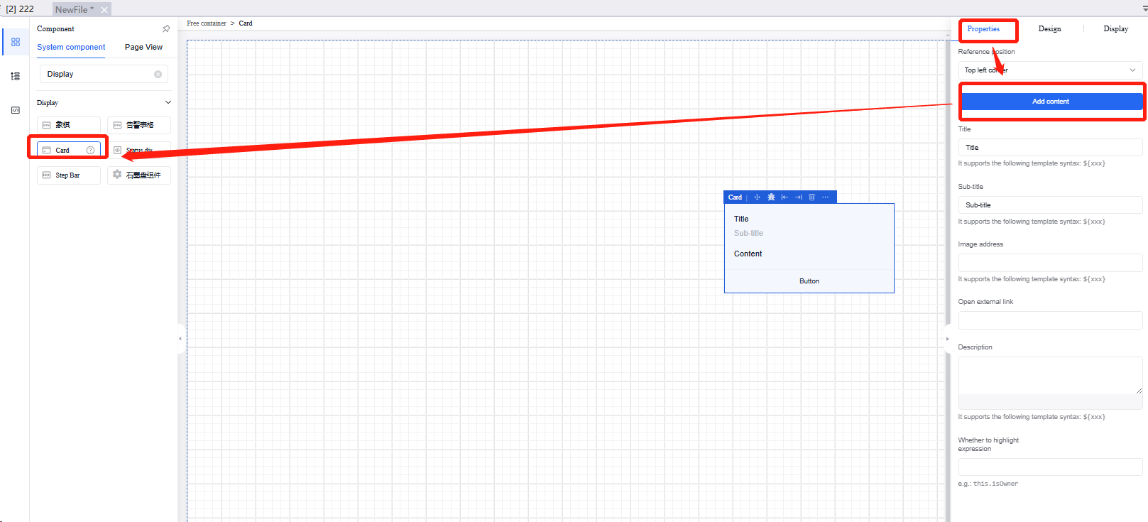
-
Delete the "Display" entry in the search box of the component bar to show all components that can be added to the card.
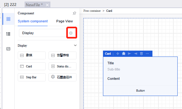
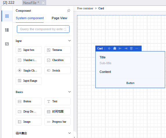
-
Click the component outline in the left view structure, and then click the component title you want to edit. The property bar for the individual component will appear on the right. The operation methods for each component are the same as the original component.
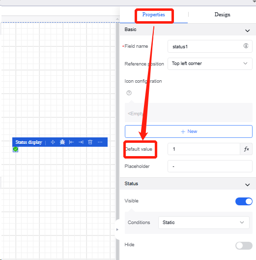
5.9.2 Status display
An icon component that displays status based on associated fields, such as showing √ for 1 and x for 0. Properties and events are shown in the following table:
| Type | Content | Name |
|---|---|---|
| Property | Basic | Reference Position |
| Title | ||
| Icon Configuration | ||
| Default Value | ||
| Placeholder | ||
| Status | Visible | |
| Hidden |
Operation Instance
5.9.2.1 Status change
Click "Status Display", and then modify the default value in the "Properties" section of the property bar. When the default value is 1, it is showed as √; when it is 0, it is showed as x.
5.9.3 Step bar
Steps component. Properties and events are shown in the following table:
| *Type | Content | Name |
|---|---|---|
| Property | Basic | Field Name |
| Reference Position | ||
| Step List | ||
| Current Step | ||
| Current Status | ||
| Status | Visible | |
| Hidden |
Operation Instance
5.9.3.1 Modify the step list
Click the "Step Bar" to modify the Step List in the "General" section of the property bar. You can edit subtitles and descriptions, or add new steps.
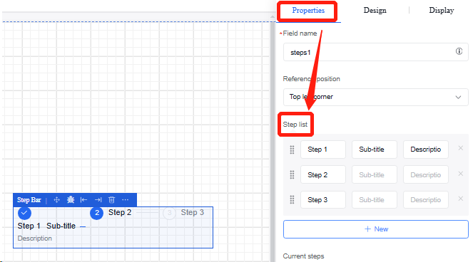
5.9.3.2 Modify step states
-
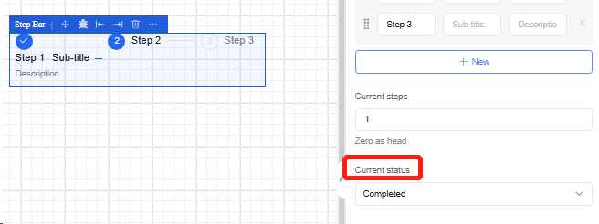
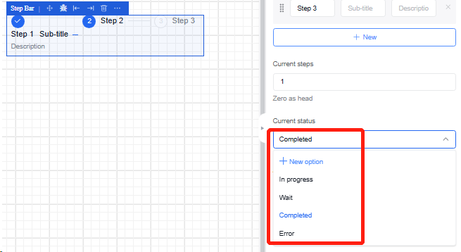
Click the "Step Bar" to edit the sequence number of the current step in the "General" section of the property bar.
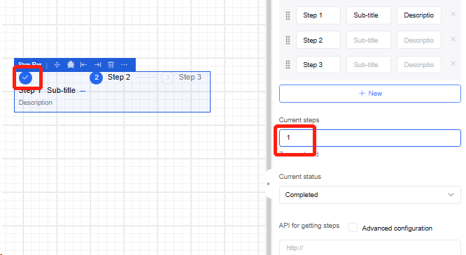
-
In the "Current Step" section, edit the selected sequence step, including four states: "In Progress", "Waiting", "Completed", and "Error".
5.9.4 Graphite disk component
The graphite disk cutting component is mainly used to help users preview and display, set different parameters, and render machine cutting effects.
5.9.4.1 Component introduction
Enter the canvas drawing page, select the "Graphite Disk Component", and the component will be added to the canvas with the default field name "plate".
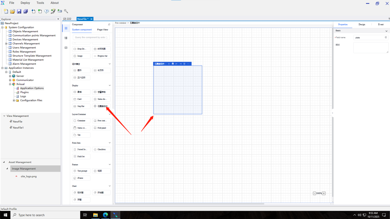
The initial width and height of the component can be set through the appearance properties.
Component events include “value change”, “validation success”, and “validation failure”.
5.9.4.2 Component usage
The graphite disk component is used in conjunction with the “Bind Data” function in the “Event-Action Configuration”. It utilizes the built-in graphite disk data interface of the system to send different parameters, obtain the returned results, and render the result information.
5.9.5 Alarm Table
The alarm table component. Its properties and events are shown in the following table:
| Type | Content | Name |
|---|---|---|
| Property | Basic | Field Name |
| Title | ||
| Initialize and Load Data | ||
| Refresh Periodically | ||
| Alarm Type | ||
| Alarm Level | ||
| Status | Hidden | |
| Disabled | ||
| Fixed | ||
| Operation Example |
5.9.5.1 Properties
1.Modify the Alarm Type
Enter the canvas drawing page, select the "Alarm Table", and the component will be added to the canvas. Click on the "Alarm Table", and edit the alarm type in the "Properties" section of the property bar. The available options are "All", "Custom Rule Alarm", "Communication Alarm", and "System Alarm".
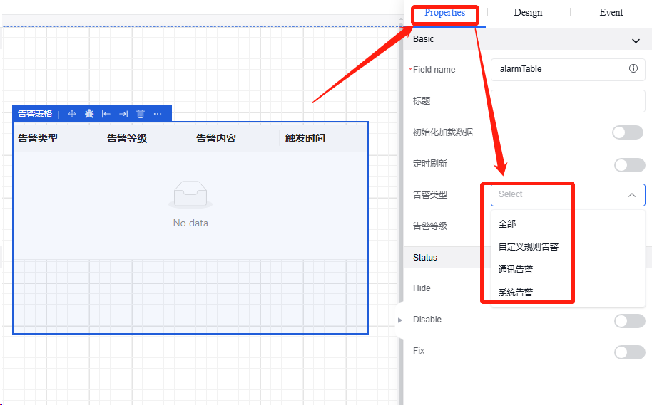
2.Modify the Alarm Level
Click on the "Alarm Table", and edit the alarm level in the "Properties" section of the property bar. There are four options: "All", "info", "warning", and "error".
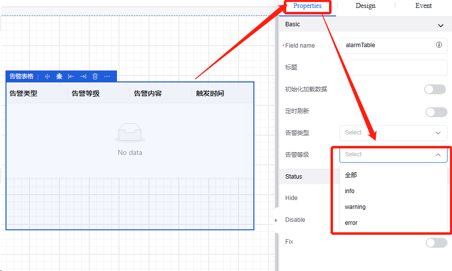
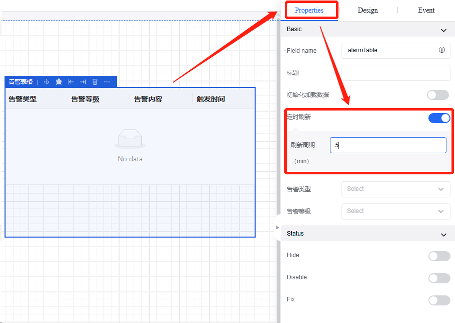
3.Periodic Refresh
Click on "Properties", find the "Periodic Refresh" button. After turning it on, you can set the refresh cycle (in minutes).
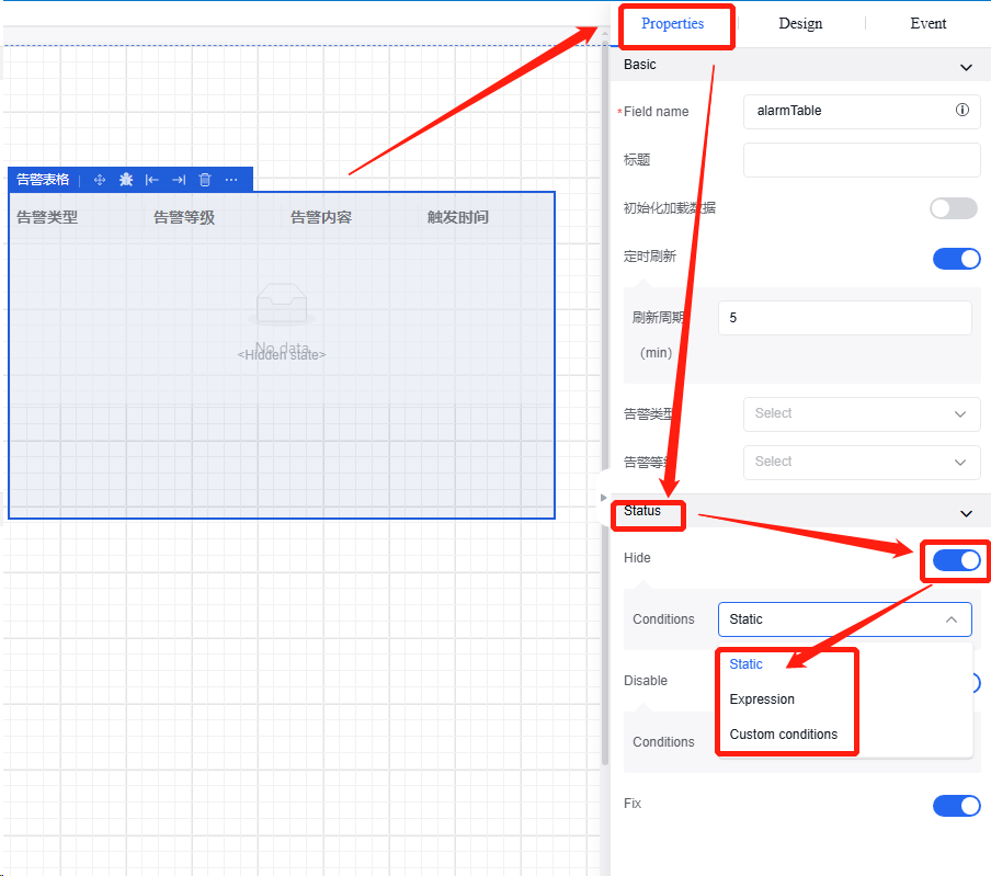
4.Modify the Alarm Status
Click on "Properties", find the status bar. You can modify the status of the alarm table. There are three statuses: "Hidden", "Disabled", and "Fixed". Click the relevant buttons behind to enable them. At the same time, you can set conditions, for example, "Static".
5.9.5.2 Appearance
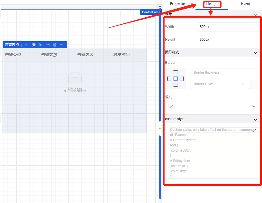
The initial appearance of the alarm table can be set through the appearance properties, including length, width, border style, and background fill.In the "Border" option of the graphic style, you can adjust the thickness and style of the border.In the graphic style bar under "Appearance", find "Fill" to change the background color of the table.
5.9.5.3 Events
Add events in the "Events" section. There are two types of alarm table events: "Click" and "Initialization".To add the "Click" event, click on the "+" sign, and an "Action Configuration" pop - up window will appear for configuring the relevant execution actions.
5.10 Chart Components
5.10.1Histogram
Histogram component. Properties and events are shown in the following table:
| Type | Content | Name |
|---|---|---|
| Property | Basic | Field Name |
| Data | Initialize and Load Data | |
| Timed Refresh | ||
| Data Type | ||
| Data Content | ||
| Time Range | ||
| Style Settings | Animation Duration | |
| Animation Type | ||
| Color Settings | ||
| Title Settings | Title Display | |
| Title Name | ||
| Title Size | ||
| Subtitle | ||
| Subtitle Size | ||
| Horizontal Position | ||
| Vertical Position | ||
| Tag Settings | Tag Display | |
| Tag Size | ||
| Tag Position | ||
| Status | Visible | |
| Hidden | ||
| Event | Initialization | |
| Mouse Click | ||
| Mouse Hover | ||
| Toggle Legend Selection State |
Operation Instance
5.10.1.1 Data type
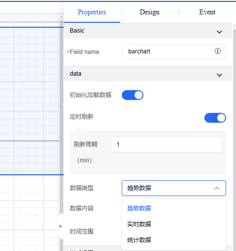
| Comparison Dimension | Trend Data | Real - time Data | Statistical Data |
|---|---|---|---|
| Core Purpose | Reveal long - term change directions and patterns | Reflect the current instantaneous state | Summarize the overall historical performance |
| Data Dynamics | Dynamic change (focus on trend) | High - frequency refresh (changing in an instant) | Static solidification (generated after the period ends) |
| Analysis Value | Predict the future and discover patterns | Real - time monitoring and quick response to anomalies | Effect evaluation and review of goal achievement |
Click the image to view the complete spreadsheet
5.10.2 Line chart
Line chart component. Properties and events are shown in the following table:
| Type | Content | Name |
|---|---|---|
| Property | Basic | Field Name |
| Data | Initialize and Load Data | |
| Timed Refresh | ||
| Data Type | ||
| Data Content | ||
| Time Range | ||
| Style Settings | Animation Duration | |
| Animation Type | ||
| Smooth curve | ||
| Color Settings | ||
| Title Settings | Title Display | |
| Title Name | ||
| Title Size | ||
| Subtitle | ||
| Subtitle Size | ||
| Horizontal Position | ||
| Vertical Position | ||
| Tag Settings | Tag Display | |
| Tag Size | ||
| Tag Position | ||
| Status | Visible | |
| Hidden | ||
| Event | Initialization | |
| Mouse Click | ||
| Mouse Hover | ||
| Toggle Legend Selection State |
5.10.3 Pie chart
Pie chart component. Properties and events are shown in the following table:
| Type | Content | Name |
|---|---|---|
| Property | Basic | Field Name |
| Data | Initialize and Load Data | |
| Timed Refresh | ||
| Data Type | ||
| Data Content | ||
| Time Range | ||
| Style Settings | Animation Duration | |
| Animation Type | ||
| Color Settings | ||
| Horizontal Position | ||
| Vertical Position | ||
| Diameter size | ||
| Title Settings | Title Display | |
| Title Name | ||
| Title Size | ||
| Subtitle | ||
| Subtitle Size | ||
| Horizontal Position | ||
| Vertical Position | ||
| Tag Settings | Tag Display | |
| Tag Size | ||
| Tag Position | ||
| Status | Visible | |
| Hidden | ||
| Event | Initialization | |
| Mouse Click | ||
| Mouse Hover | ||
| Toggle Legend Selection State |
6. Event-Action Configuration
6.1 Pop-up message
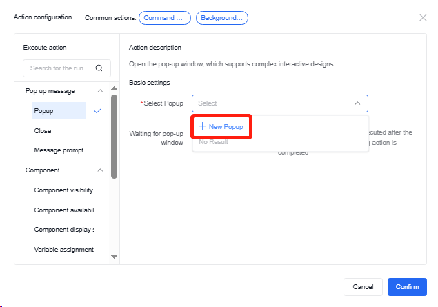
6.1.1 Open pop-up window
The main operation of this event is to open a pop-up window, which supports complex interactive design.
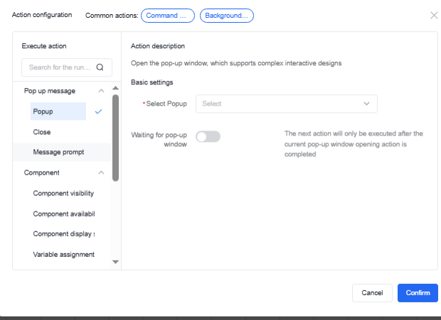
When selecting a pop-up window, if it has not been created yet, you can either create a new pop-up window or choose from other existing pop-up windows within the same page. The operation for creating a pop-up window is consistent with other those for other components on the page.
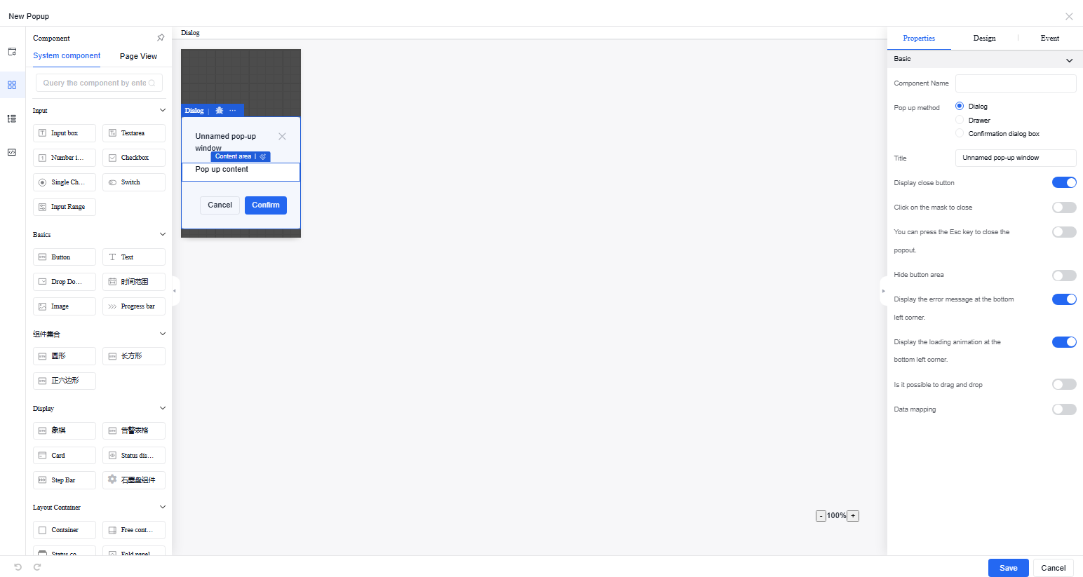
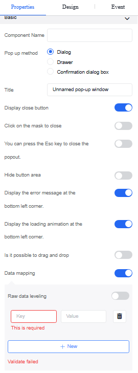
The pop-up window can support complex interactive operations, such as embedded buttons, input fields, charts, and tables. The component properties, appearance, and event settings within a pop-up window are the same as those on the external page. Popup properties can be set for popup method, title, draggability, shortcut key closing, etc.
The appearance and event settings of the pop-up window follow the same operations as other components.
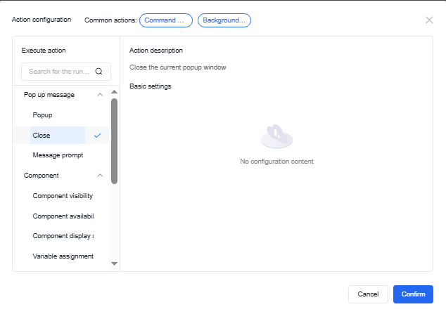
6.1.2 Close pop-up window
No additional settings are required to close the pop-up window; just create this event.

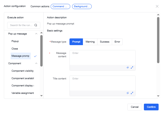
6.1.3 Message reminder
For message reminder, you need to set the message type and fill in the message content. The message content supports custom function input. For details on the custom function content, refer to the chapter involving the custom function operations. You can also set style information such as popup position and duration. The title content also supports custom functions.
6.2 Components
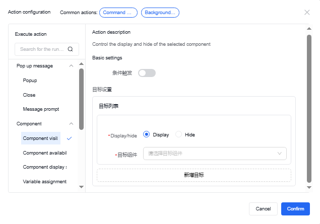
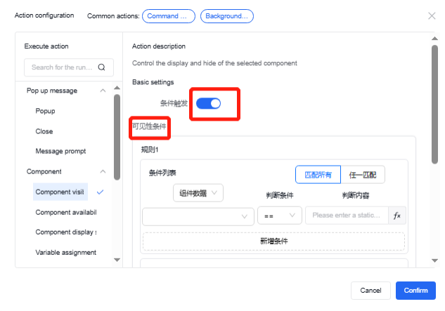
6.2.1 Component visibility
It can control the visibility or hidden state of selected components and their condition maintenance.
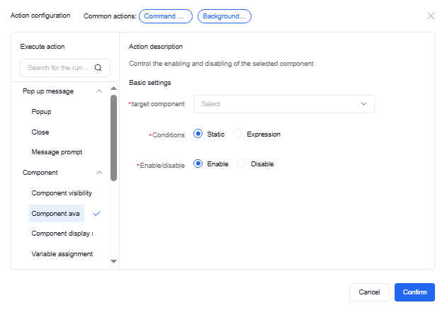
6.2.2 Component availability
It can control the enabled or disabled state of selected components and their condition maintenance.
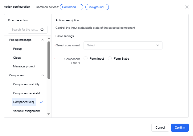
6.2.3 Component display state
It can control whether the selected component is in a form input or static state.
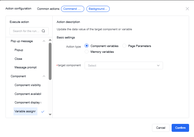
6.2.4 Variable assignment
The data values of target components or variables can be updated through component variables, page parameters, or memory variable actions.
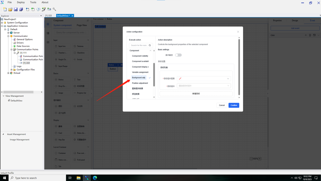
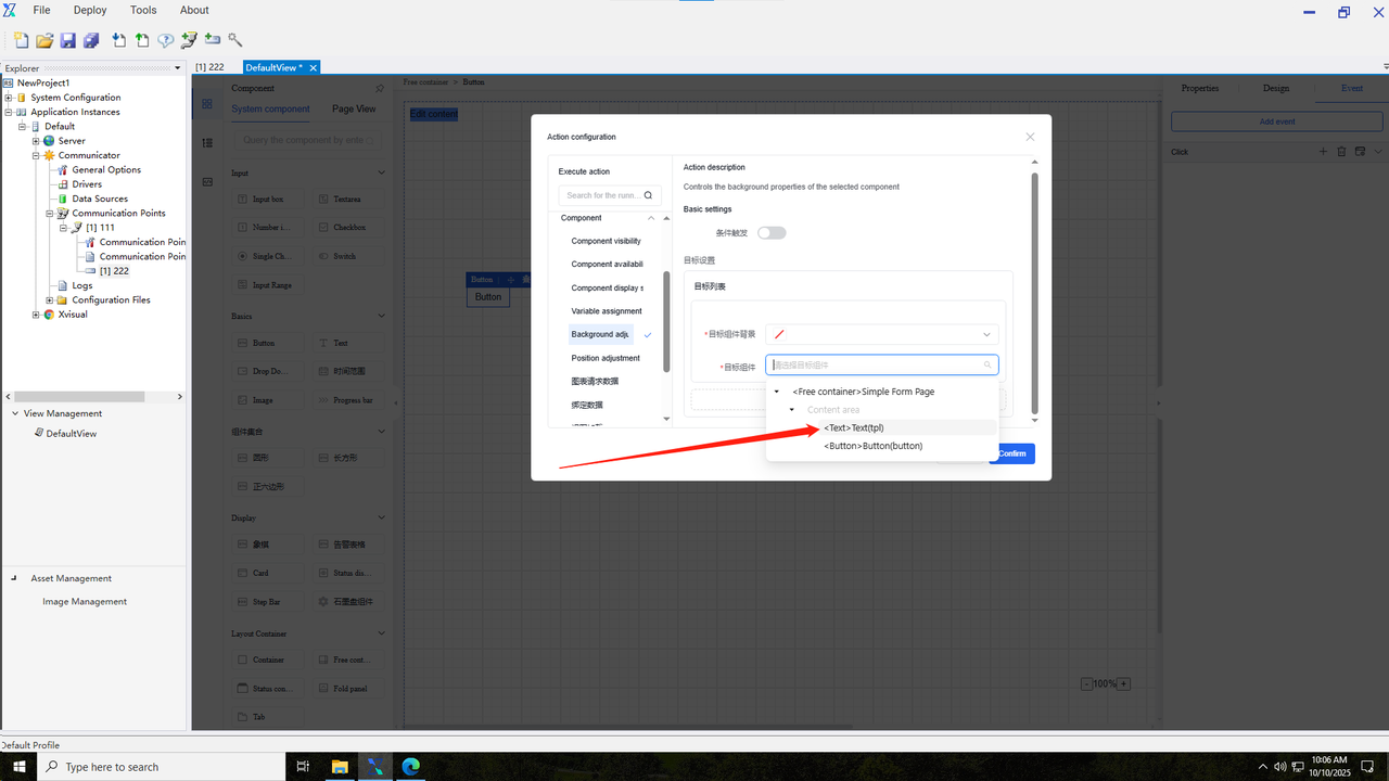
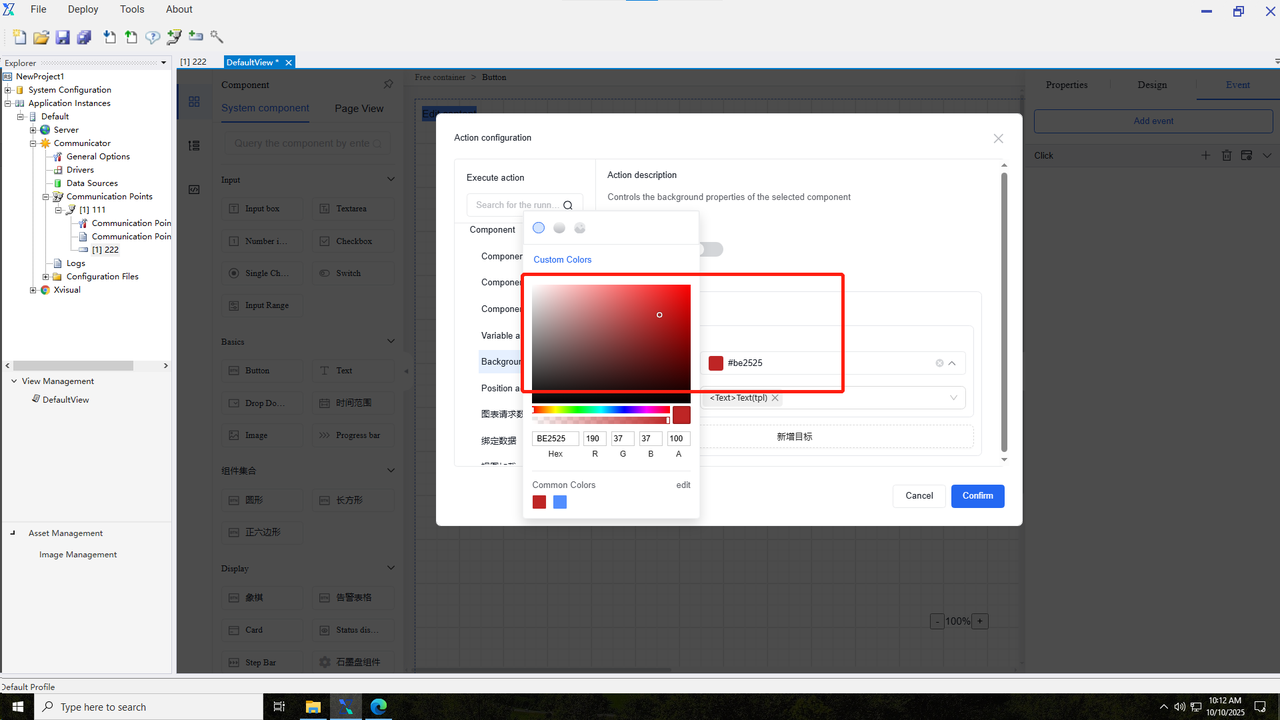
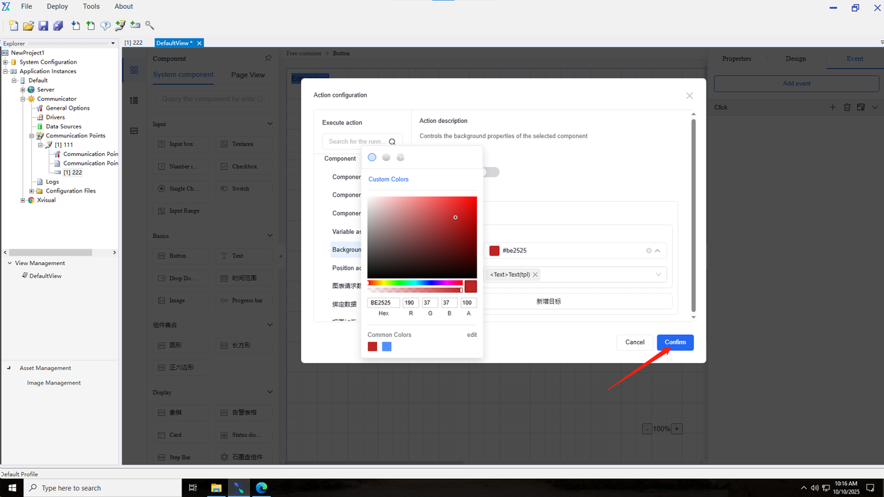
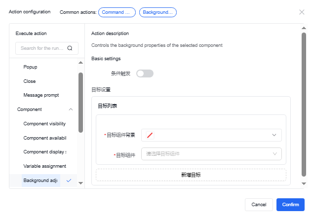
6.2.5 Background adjustment
It can set the background properties of the selected component, including background color configuration.
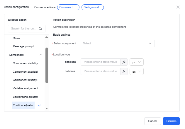
6.2.6 Position Adjustment
It can configure the position properties of the selected component, allowing selection of the component requiring positioning and specifying its exact position.
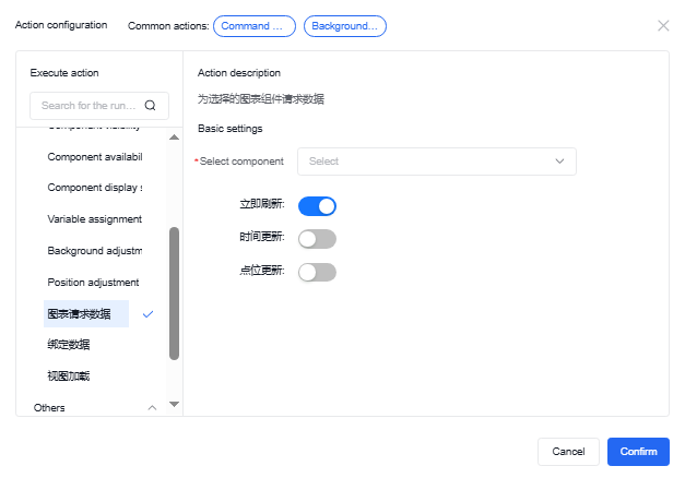
6.2.7 Chart request data
The chart data request action enables refreshing data for chart components in the current view, resetting the time range of the chart, and reconfiguring data point channels.
6.2.8 Binding data
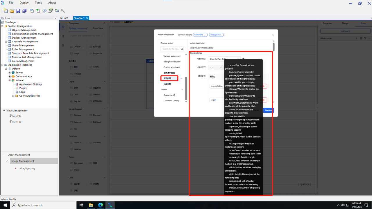
By the binding data component, users can request the desired interfaces through the settings of the request parameter, assign the returned results to specified components or custom variables, and display them on the designed view pages. The system currently has three built-in service interfaces: graphite disk data, material lists, and material list details, which return graphite disk rendering results, material list data, and material list details respectively. Users can also use custom interfaces for result binding and display.
6.2.8.1 Graphite disk data
Users can set component events to request the graphite disk data interface and assign the returned results to the graphite disk component for preview or rendering.
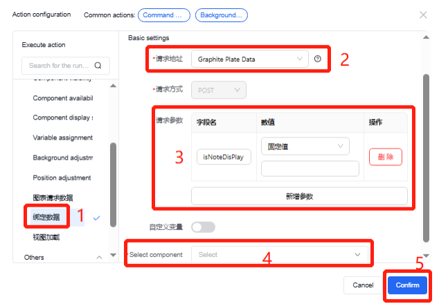
In the first step, select the action for the component event (such as click event and initialization event), and select “Bind Data”.
In the second step, select the graphite disk data request interface. By hovering the mouse over the question mark icon on the right, the interface request parameter fields will be displayed, and the request parameters below will automatically bring out the parameter information.
In the third step, fill in the parameter value information. Users can choose fixed value data, custom function data, or component data as the numerical information for the request parameters;
In the fourth step, assign the result information obtained from the request interface to the components that need to be displayed or to custom variables;
Finally, click the “Confirm” button to save the event action.
6.2.8.2 Material lists
The material list interface requires no request parameters. The returned data is the material list from “'System Configuration - Material List Management” in the current project. For specific data binding interface and returned value assignment operations, please refer to the “Graphite Disk Data” interface.
6.2.8.3 Material list details
The interface for material list details returns the detailed data based on the material list ID request parameter provided by the user. For specific data binding interface and returned value assignment operations, please refer to the “Graphite Disk Data” interface.
6.2.8.4 Custom interface
After selecting a custom interface, an input box will appear below where users can enter their own pre-configured service request URL, choose the request method, add request parameters, and configure the returned value assignments to complete practical usage scenarios.
6.2.9 View loading
The view loading action allows other view loads when a container on the current view page meets the triggering conditions. For example, click different buttons in the central position of the main page to display different view pages.
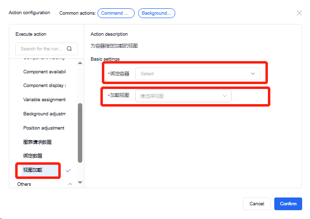
6.3 Other
6.3.1 Custom JS
In the custom JS section, users can write their own function contents, such as assigning values to specific objects or adjusting object styles. However, when using the value change methods or operations that may cause circular nested triggers, users shall pay attention to the changes in the called components to avoid circular recursion issues.
The “data” within the function refers to the global data object in the current configuration editor page. To use a custom key object, just input “data.key” and set its value. To use numbers from other pages, input the field name of the corresponding component for use. To use the channels bound within the component, append “.$ Channel Number” to the field name of the component.
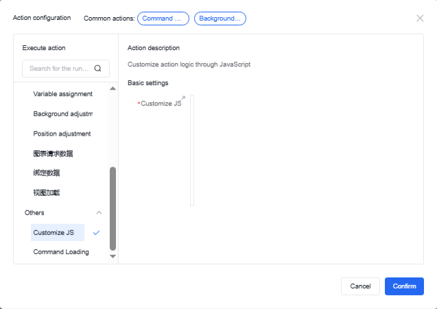
6.3.2 Command issuance
In the command issuance content, users can complete downward data transmission. The issued data can be customized or set as specific values. The specific operation steps are as follows:
-
Before setting the data issuance to the channel, the target channel must be checked in the write channel option within the property interface of the free container property bar.
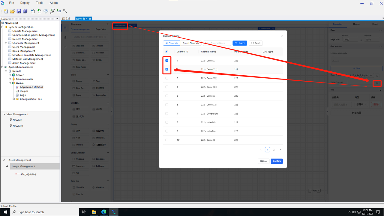
-
Open the event pop-up window and select the command issuance.
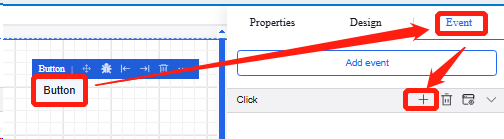
-
Click “Add Issuance Point”, and then click the channel selection to open the channel selection pop-up window. Check the channels requiring corresponding command issuance in the pop-up window and click “Confirm”. The command pop-up window displays only the write channel list already added in the free container within the current page. Only one channel can be selected in the pop-up window. During the same command issuance operation, one channel can only be bound once.
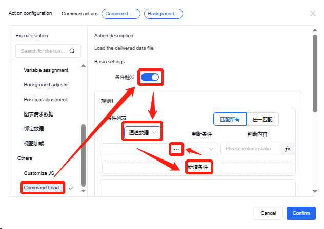
-
Enter the issuance value or set it via the custom function. Click the Custom Function button to access the custom function setting page.
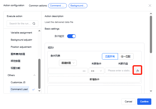
-
Select the command mode and set the command delay time.
The delay in command issuance is set to the fixed mode by default, with a delay time of 0. Command content and command time support either fixed values or custom function modes. When the command delay time is set in the custom function mode, users must ensure the final output value of the function is of integer type.
Command issuance time units include milliseconds, seconds, and minutes, with specific time ranges as follows:
▪ When selecting milliseconds, the minimum shall not be less than 100, and the maximum shall not exceed 1000. If the input is outside this range and the input box loses focus, the nearest value will be displayed (e.g., when 99 is input, 100 will be displayed; when 1001 is input, 1000 will be displayed).
▪ When selecting seconds, the minimum shall not be less than 1, and the maximum shall not exceed 60
▪ When selecting minutes, the minimum shall not be less than 1, and the maximum shall not
7. Resource management
7.1 Add a picture
1.Click to enter the picture management in the resource management.
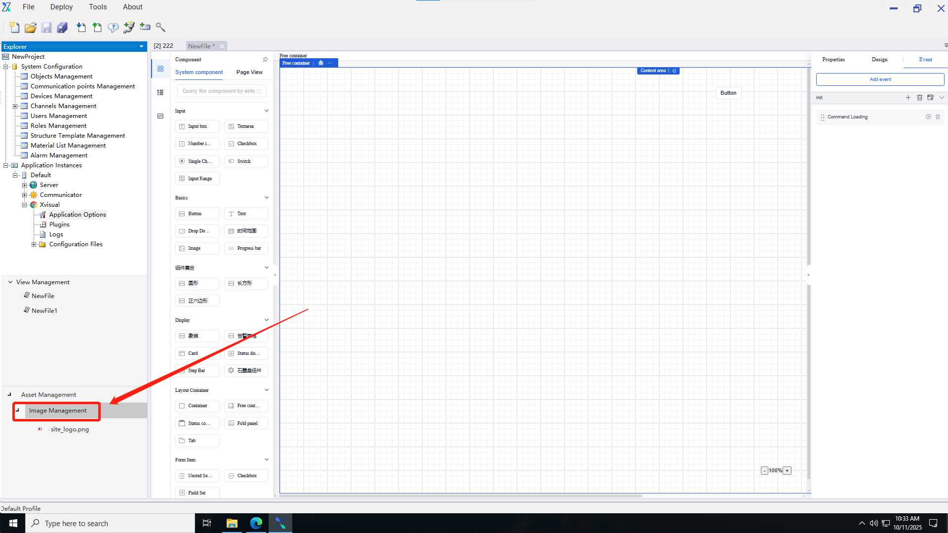
2.Click “Add Picture Resource” to add pictures, or add pictures in batches.
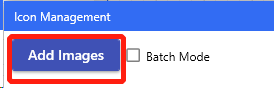
3.After the picture is added successfully, it will be displayed in the icon management.
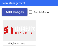
7.2 Use a picture
1.Click the “Picture” component and click the “Edit” button on the picture file in the “Properties” section of the property bar.
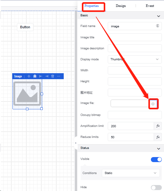
2.Enter the picture selection interface, select the picture you want to upload, and click “Save” to complete the operation.
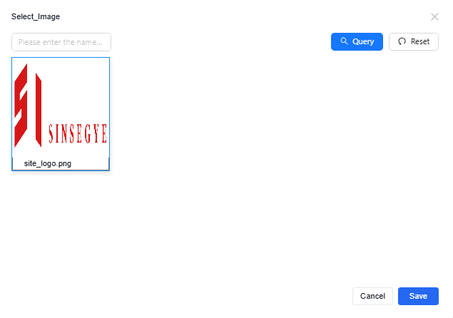
3.Upon completion of the upload, the picture component content in the view is updated to the picture of the user's choice.